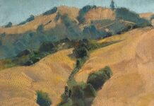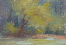

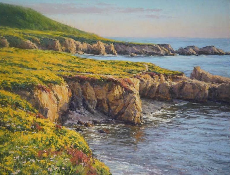
Aaron Schuerr paints the landscapes around his home in Montana.
His Go-To Pastel Stick
Surprise! He doesn’t have one. He resists the idea of a single go-to color — because for him, “color exists in relationship — one to another.”
That philosophy shapes the way he builds and organizes his field kit. He breaks his pastels in half and arranges them by color family and temperature rather than by brand. “Once they are in, I generally don’t know what brand I’m grabbing,” he says. “As long as it’s a soft pastel, there are so many good brands out there.” What matters is not the name on the stick but its position in the sequence — because in Schuerr’s kit, every color has a neighbor, and that neighbor is chosen deliberately.
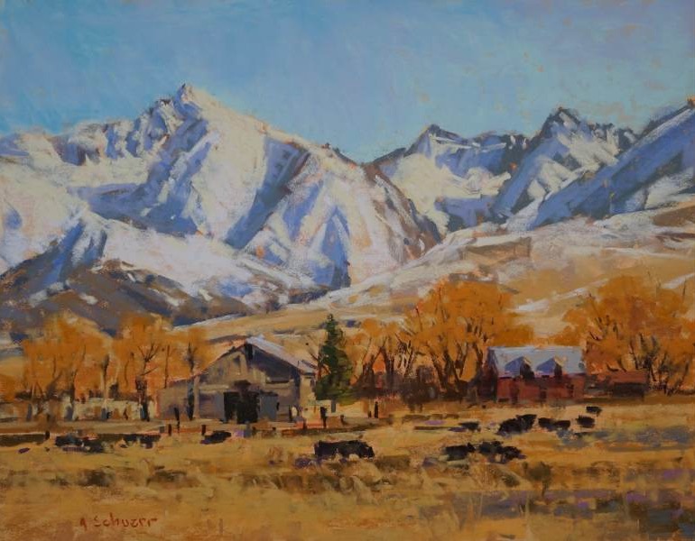
How He Organizes His Pastel Box
Warm and cool versions of any given hue sit side by side across a full range of values — light, medium, and dark. Warm greens, which lean yellow, sit beside cool greens, which lean blue — a physical reminder that a deciduous tree in light is not just lighter in value than its shadow, but warmer in temperature. For skies, turquoise sits beside cobalt and blue-violet, mirroring the natural transition from horizon to zenith and making it easy to find the right blue at any point in the gradient. For highlights, a creamy yellow-white sits beside a cool bluish-white — overlapped on the painting surface, the two create an optical buzz that no single white can achieve alone, the closest thing in pastel to the sensation of direct sunlight.
His Universal Color Rule
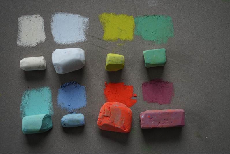
Saturation is the last variable Schuerr considers — and one of the most powerful. Rather than automatically reaching for the most intense colors in his pastel box, he looks for the relationship between saturation and neutrality. “Pair a saturated color with a neutral and you have a chord,” he says, “and a chord makes music.” The principle applies regardless of region, subject, or medium. After all, “a color is only as good as the company it keeps.”