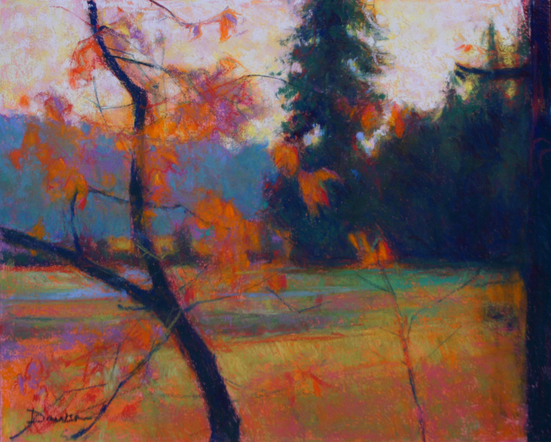
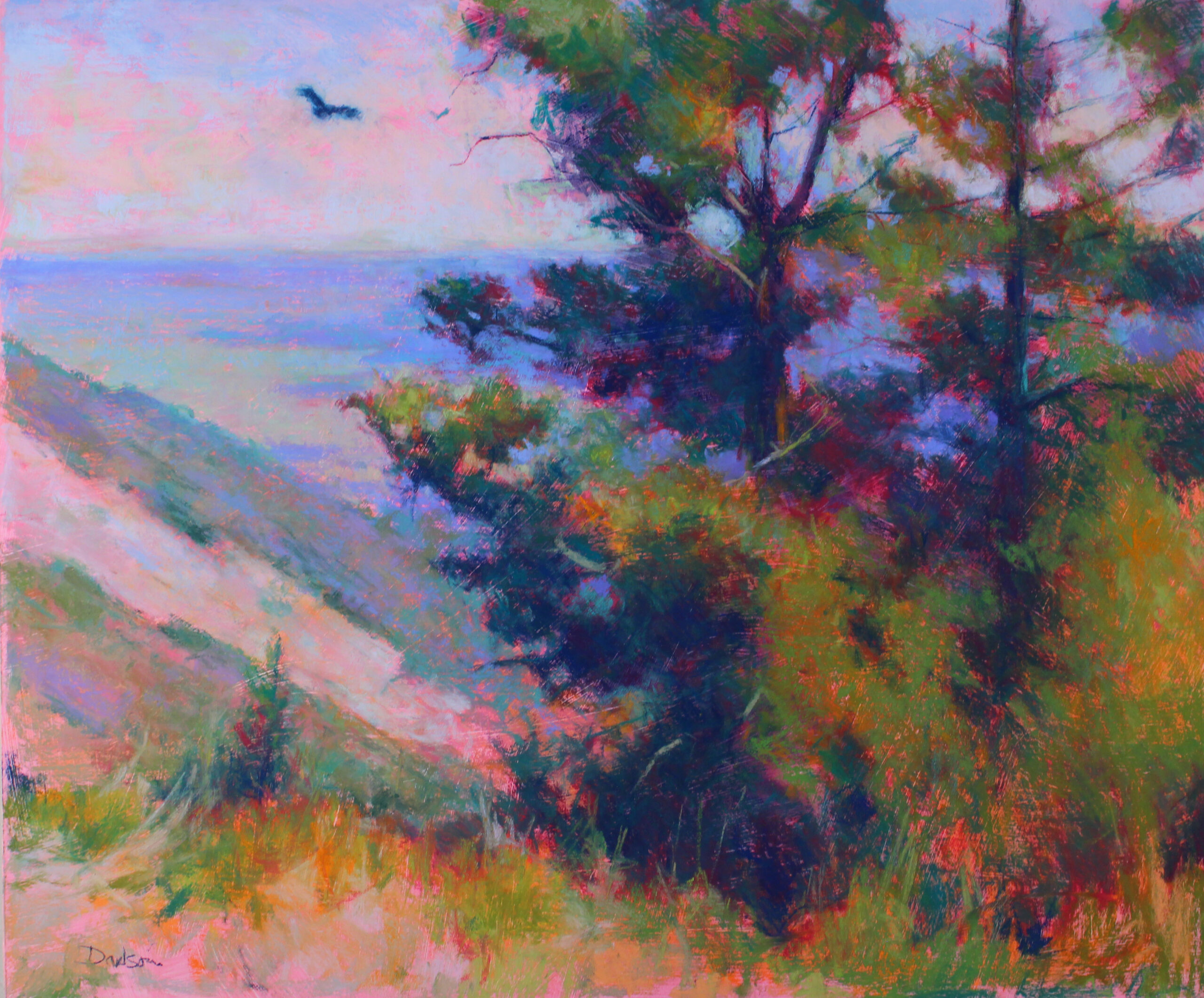
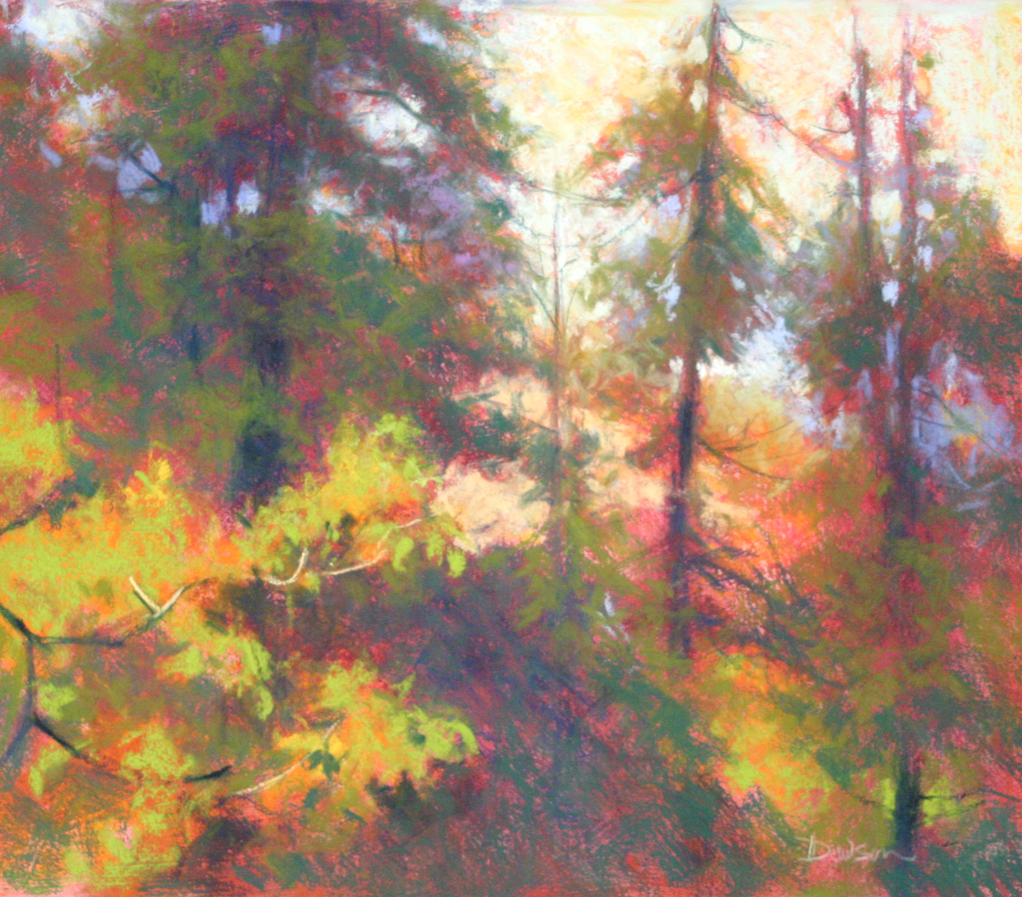
“There are several mistakes beginners make when painting vegetation,” says Doug Dawson. “A common one is to jump to the details without first building the large shapes of the trees or plants, and then using the edges of those big shapes to suggest the nature of the leaves or branches that make up those forms. Only then should details, such as individual leaves, be added if need be. This last step is like adding sprinkles to the frosting. I rarely add sprinkles, but when I do, I do it sparingly.
“Another mistake is to paint trees and fail to paint the forest. If I’m faced with a grouping of trees, I paint the group, then paint the edges of the group. Representing a forest by painting the individual trees will work only if you are after a naive style.
“A third mistake I see is students painting a tree trunk like a telephone pole, and then adding the larger branches. When someone works this way, it’s as if they are building the frame for a house and intend to eventually nail on the siding. These tree trunks and branches are usually dark in value. When the canopy of leaves and needles are painted on top of the trunk and branches, these darker shapes often show up like bones in an x-ray. I see this happen frequently when artists paint blue spruce. There is something about a pine tree that causes people to want to paint a dark tree trunk, and then attach dark branches on both sides — perhaps it reminds them of a Christmas tree. Unless you want your painting to look like Grandma Moses did it, you need to block in the whole shape of the tree or trees.
“Knowing these two characteristics of trees can prevent additional mistakes: Tree trunks are typically wider at the base and get narrower as they grow up from the ground. Branches are usually widest where they join the trunk and become narrower as they grow away from the trunk. Towards the end of the painting process, I check my painting, to make sure everything is working. If it looks like the trunk or branches are getting inappropriately wider, I correct them.
“Another common mistake occurs when the trunks diminish in width too quickly, so that the trees resemble carrots — the only trees I know of that actually look this way are Baobob trees in Africa. Typically this happens because the artist compresses the trees to make them fit into the painting. To avoid this distortion, it’s better to let the trees extend off the top of the picture.
“The last mistake is what I describe as “rubber banding.” This happens when branches or tree trunks are excessively fluid or curvaceous. If the vegetation seems too fluid it’s best to insert an occasional straight segment that breaks up this fluidity. Vegetation that is too rubbery looks like you made a mistake.
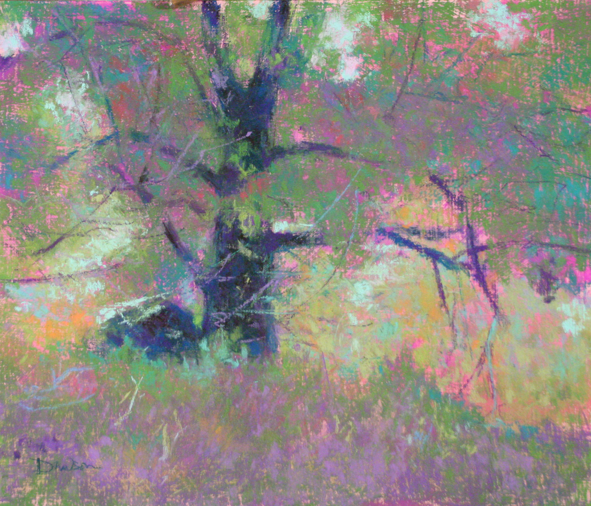
“Finally, I’ll add some thoughts about color. For me, summer trees are more difficult to paint than fall trees. In the summer there is just too much green. To solve this problem I under paint the green vegetation with reds, oranges, or violets. Where the top layer of green mixes with the color of the underpainting, the greens are duller. Where top layers fail to mix, allowing bright spots of the underpainting show up, the green appears more intense by contrast.”
THE ARTIST’S PROCESS
Doug Dawson prepared this simple demo for one of his classes at the Art Students League to illustrate the two basic steps he typically follows.
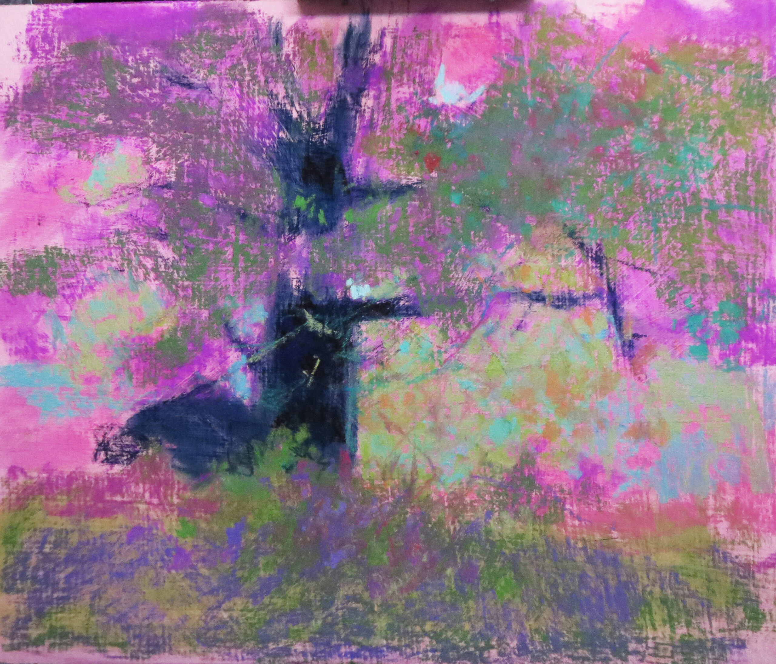
Step 1: He blocked in the big shapes.
Step 2: He developed the edges to suggest the nature of the vegetation.
Learn from over 30 top pastel artists from around the world at Pastel Live!


