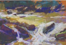
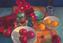
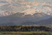
“My favourite pastel sticks – among others – seems to be an odd choice: Olive Green 620.2 and 620.3 by Rembrandt,” says Sally Strand.
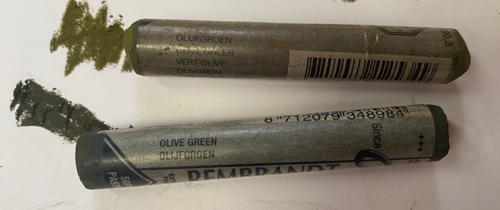
“When I started seriously using pastels, in the late 70s and early 80s, I only knew of one pastel brand that was affordable and accessible – Rembrandts pastels. They were pastels I still had from my student art school days.
“I was a watercolorist at the time but one day when I felt I had hit a plateau with my watercolour painting, I picked up some old pastel sticks and started scribbling over my painting on watercolour paper. I used that old pastel set exclusively for over 15 years to start my art career.
“In those early days, my colour choices using the Rembrandt set were limited. I started using paint to paint the dark areas in darker than the sticks in my pastel box would allow. However, the great benefit from those years is that I learned, out of necessity, to directly mix the colour I saw in nature on my paper in layers. I did not have those specific colours in my pastel box. Nor did I have the great variety of colours and brands now available on the market.
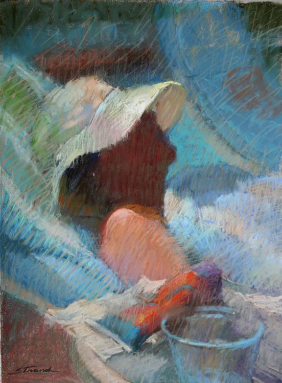
“And so to the use of Olive Green No. 620… I found myself using it with linear strokes to neutralize colour, similar to the use of a “mother colour” for oil painting. In that it’s a harder type of pastel, I use it often as a sort of glaze, sometimes over entire areas or masses, both to pull the values together or to change the colour – mixing colours directly on the paper. I can’t do that with a soft pastel. Alternatively, I sometimes use the side of the Olive Green to scumble over large areas.
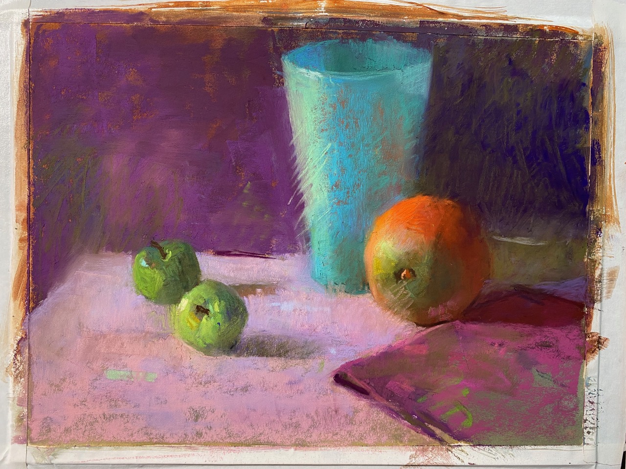
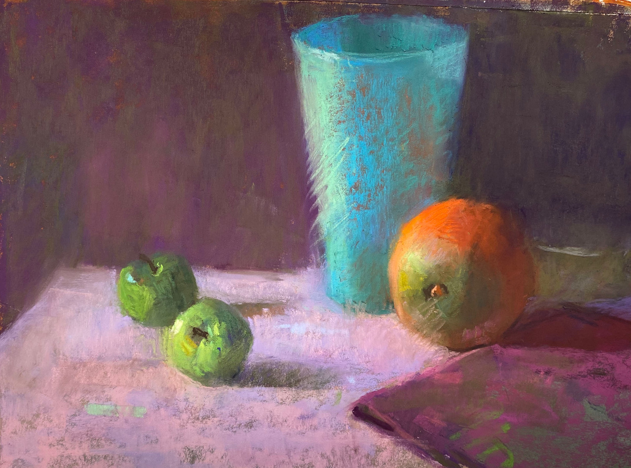
“Beautiful colour results from colour relationships. Olive Green No.620 helps me achieve those subtle mixtures found in perceptual painting but not otherwise found directly in the pastel box!”
Take your pastel skills to the next level with Albert Handell, Karen Margulis, and other top pastel painters at this year’s Plein Air Convention & Expo in the Smoky Mountains!
