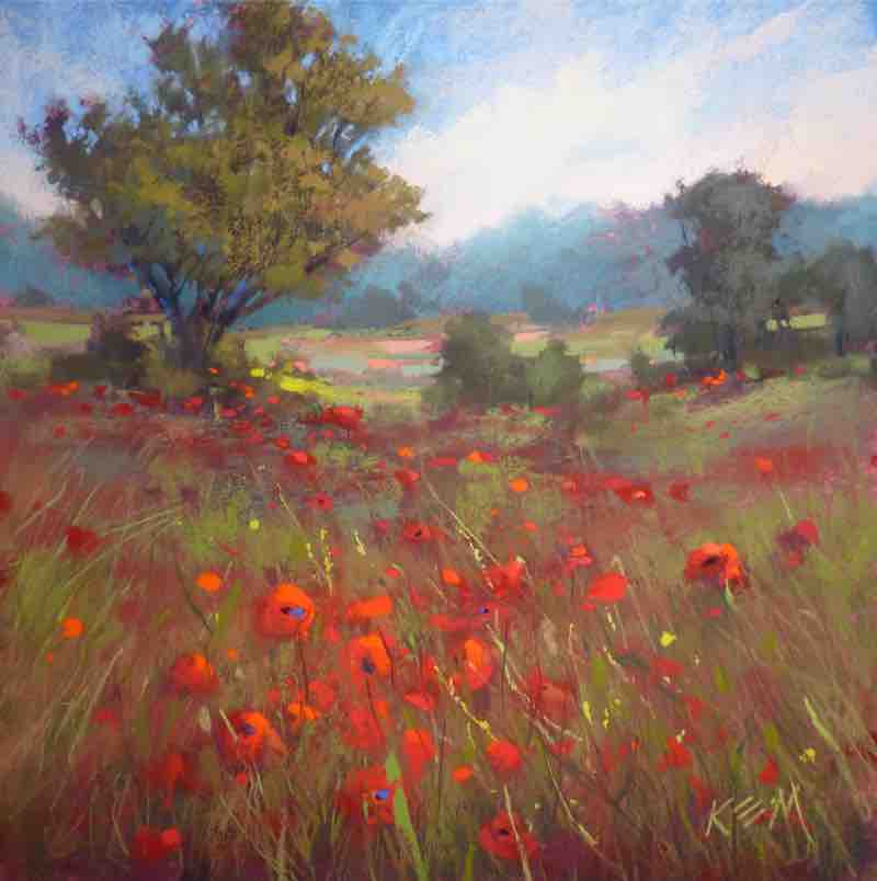
“Early in my art journey I avoided painting wildflowers,” says Karen Margulis. “I was afraid they would make my landscapes too sweet or too pretty. But the muse kept calling me until finally I embraced my truth and chose to showcase the wild tangles of grasses and wildflowers that captured my imagination.”
PASTEL TUTORIAL
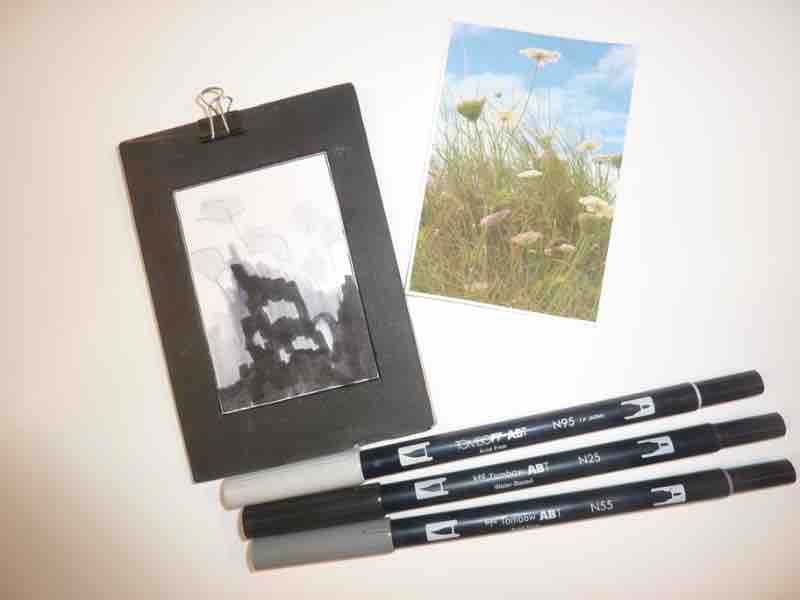
THUMBNAIL SKETCH
I begin by making a quick thumbnail sketch on an index card, simplifying the subject into a few big shapes and assigning a value to each shape. I limit the total number of values in the study to three or four.
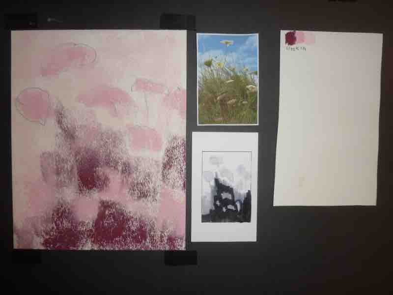
STEP 1
Referring to my thumbnail, I block in the first layer of the painting. I use three values of a single color — red violet — to add interest to the greens to come. I use the side of the pastel to block in each value shape and make a record of the colors I use on a separate piece of paper. I don’t look at my reference until I’ve completed this step.
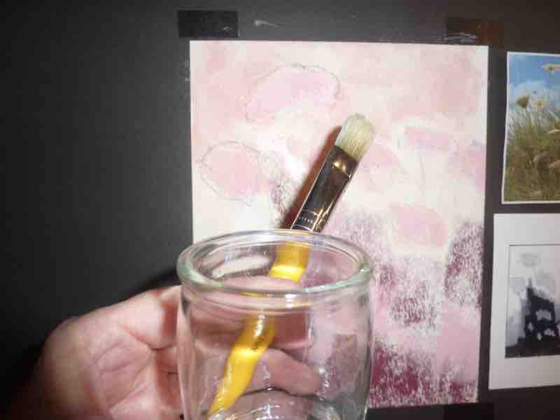
STEP 2
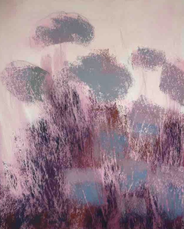
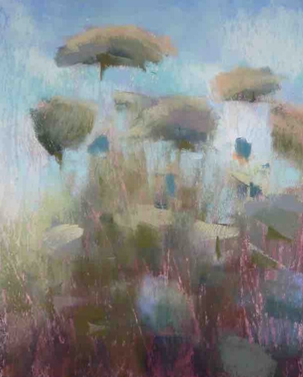
I liquify the pastel underpainting with rubbing alcohol and a bristle brush to create an interesting wet wash. [See the result at right.]
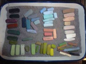
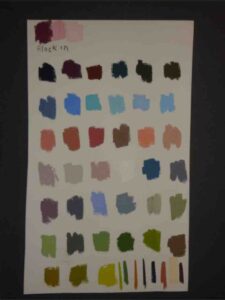
COLOR PALETTE
I like to work with a limited palette of pastels. In the studio, I often pick out the sticks I plan to use in advance rather than work directly from my my large box. For plein air outings, I keep a small set of pastels ready to go. As I work, I keep track of the colors I use on my swatch sheet (at right).
STEP 3
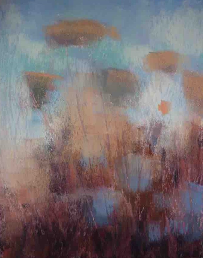
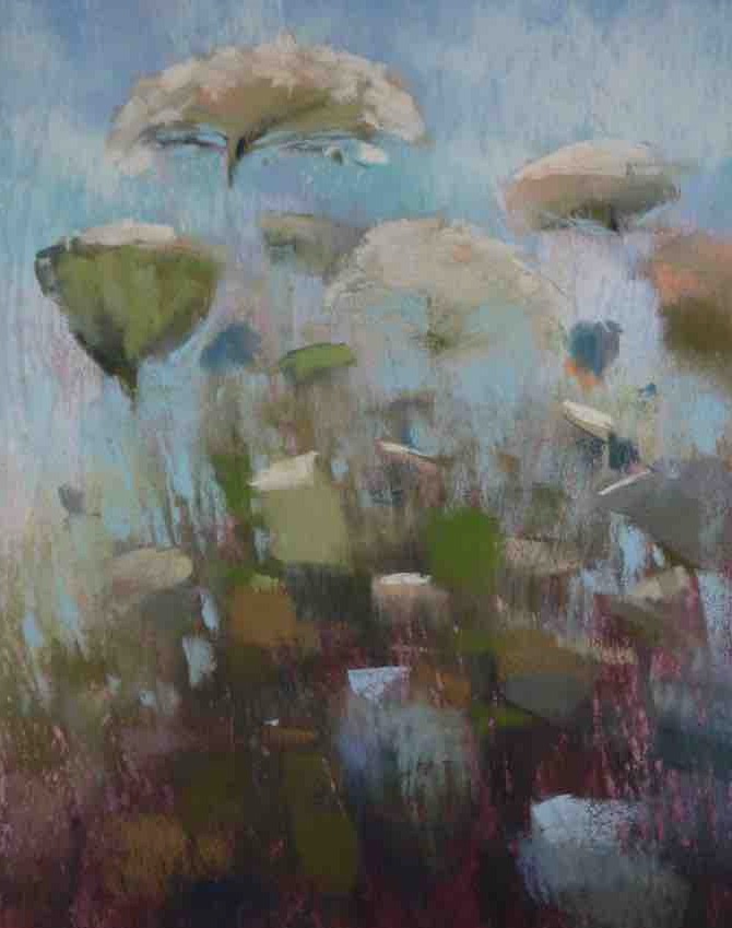
Now that the underpainting is dry, I go back in to reinforce the dark shapes, referring to my reference. I use a few light layers of dark-value pastels to create interesting optical blends of color, and add warm colors to the grass and foliage. I think of these dark and warm areas as dirt — if it’s green and growing, it needs dirt, right? I can easily layer greens on top of these areas later.
STEP 4
The sky sets the mood of the painting so I like to put it in early. I also add middle-light values to the flower shapes. For the blooms in the shadows, I use cool colors.
STEP 5
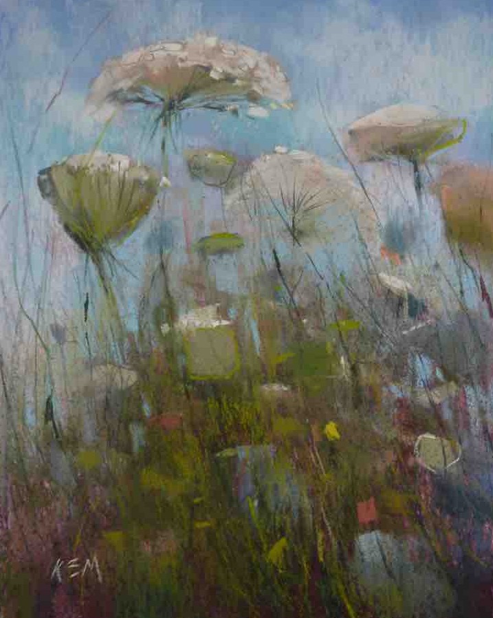
Staring with big simple shapes, I build up the grasses and flowers, gradually increasing the amount of detail. I work from the background to the foreground to create believable depth.
STEP 6
I add more clarity to the areas of interest, using heavier “shouting” marks and thinner linear marks to add detail. I think about creating a visual pathway through the painting by using contrast.
In Karen Margulis’s “Expressive Pastel Painting” video workshop you’ll learn how to loosen up and be more free with your landscape references.


Karen, this article is so clear and the photos allow me to track the changes you made at each step. Thank you!!
I learn so much from Karen. She is so kind to share her talents with us.