
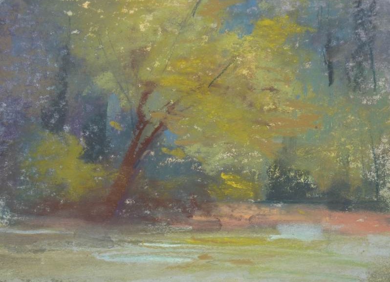
Painting in the Southeast, Karen Margulis has learned, is an exercise in looking past the obvious. “At first glance everything feels lush and saturated,” she says, “but when you slow down, you start to notice how much variety is present in all of those greens — warm, cool, muted, and intense.”
The light here is softened by humidity, which pushes atmospheric perspective further than painters from drier climates might expect. Over time, that quality has led Margulis to reach more often for muted gray-greens than saturated ones. “That softness in the air becomes part of the painting,” she says.
Her Go-To Pastel Stick
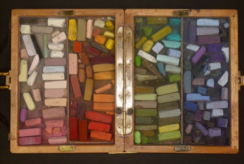
A mid-value olive green from her Terry Ludwig Floral Landscape set — specifically G390, a slightly grayed, yellow-leaning green — would be her pick, if she had to choose just one. “It’s not a flashy color, but that’s exactly why it works so well,” she says. “It sits comfortably in the landscape and plays nicely with everything around it.” She uses it to establish simple shapes in the early stages of a painting, layering it over an underpainting to build value structure without getting locked into detail. As the painting develops, she pushes it warmer in the lights and cooler in the shadows by layering other colors on top. It can be used to suggest sunlit grass, distant trees, or even act as a transition between passages. “If something feels too busy or disconnected at the end,” she adds, “a few well-placed strokes of that olive can pull everything back together.”
Another Color She Can’t Live Without
For the red clay and warm earth that define the region, Margulis reaches for R280 — a warm peach from the Terry Ludwig Floral Landscape set. “I like to use it in the underpainting and let it peek through in places,” she says. “It breaks up all that green and adds a sense of warmth and place that really feels like the Southeast.”
Her Surprising Color
V270, a soft muted blue-violet, is Margulis’s most unconventional essential. “It doesn’t look like a landscape color at first,” she acknowledges, “but the shadows here are influenced by moisture in the air, and the hazy mountains lean cool and blue. V270 is perfect for cooling down greens and creating depth in tree masses and mountains. It also helps suggest atmosphere and keeps the greens feeling natural.”