By Connie Lynn Reilly
Every artist has a story to tell about his or her art journey. My own began with my dear kindergarten teacher Mrs. Smith who started me off with coloring shapes in crayon and finger painting with tempera paint. … When I began seriously learning to paint in my spare time as an adult, I took workshops and classes with various renowned artists including oil painting from life classes in portraiture. As a beginner, I struggled with painting flesh tones so my instructor, Irving Lawhon, introduced me to pastels and said they would help me with color.
When I bought my first three-tray set of Rembrandt Pastels, which at that time included over 100 pastel sticks, I was in heaven. And Irv was right; as I used them, they helped me understand color.
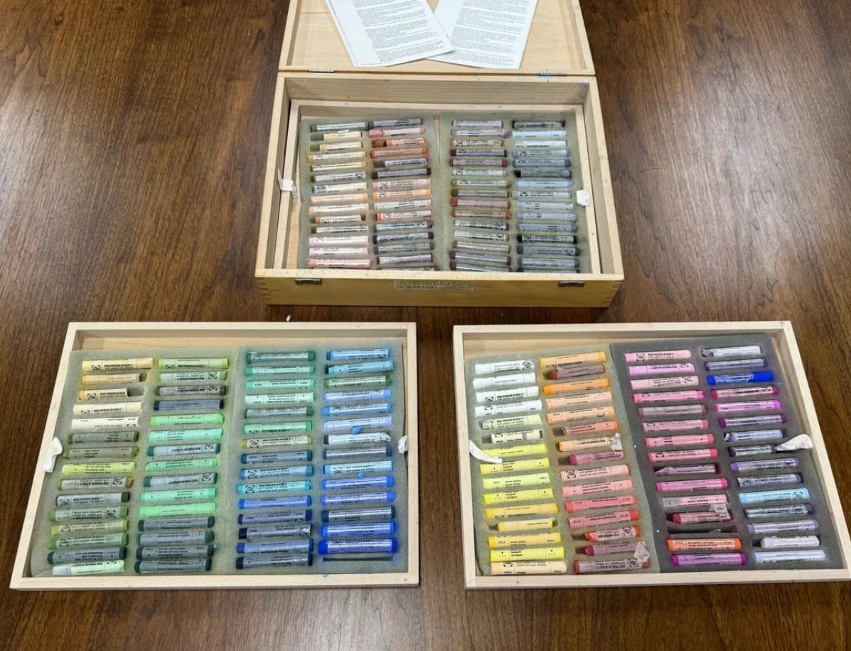
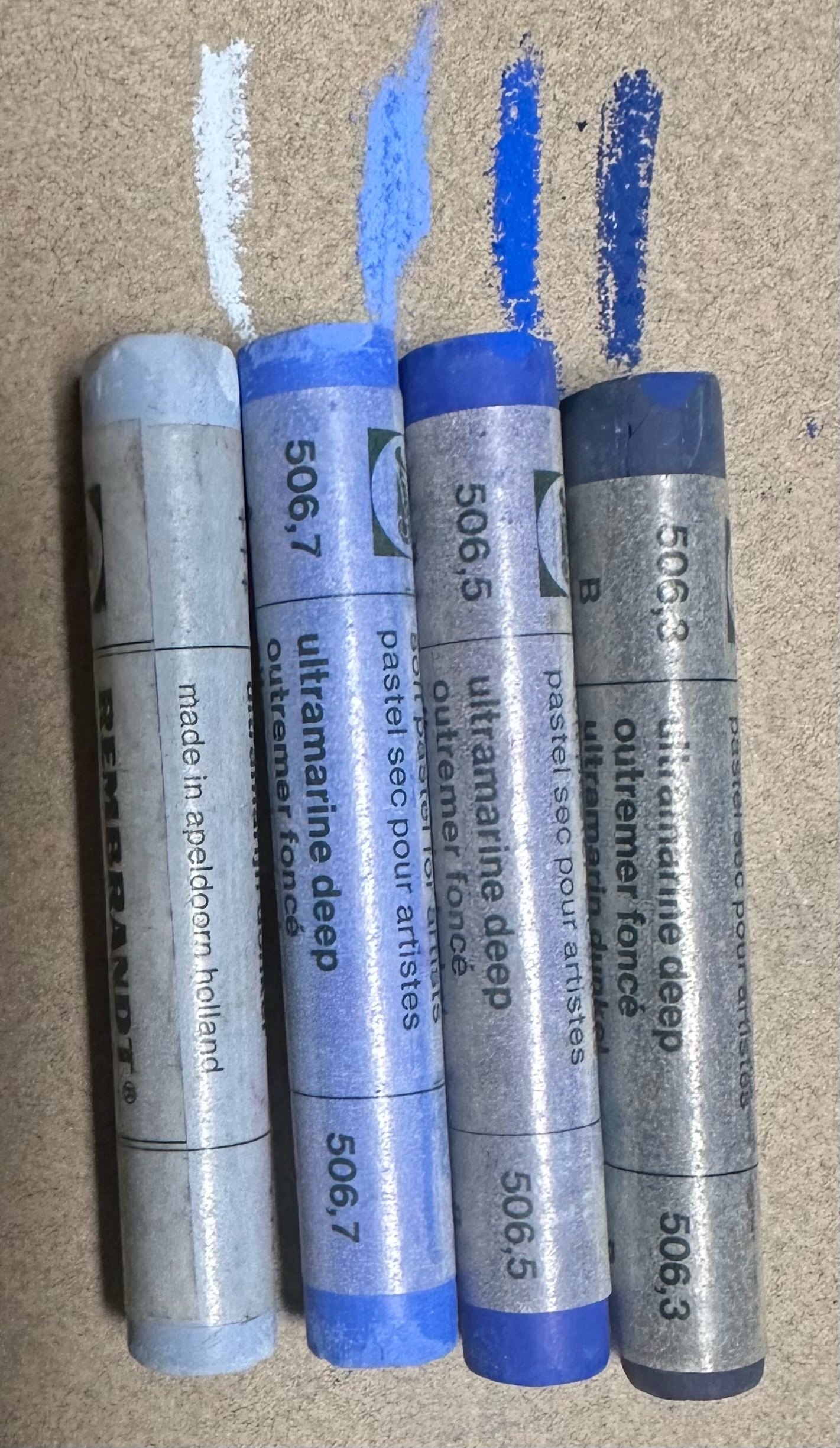
Here’s how: The Rembrandt pastel set was — and still is — set up with a 4-5 value range for each color, from the darkest tone to the lightest. For example, ultramarine blue has at least 4 values from dark to light. With the Rembrandt three-tray set I was able to see the values all laid out in front of me like a color chart, making my mixing and layering of color easier. Yes! I saw the color values. It was one of those aha moments. Thus, my love for pastels began, and I took another step on my journey that over time improved my painting skills tremendously.
The next important step was a watercolor workshop I took with Tony Couch, where I learned about the seven elements of design. Of those, I believe value is the most important. It’s the glue that holds everything else together in a painting. No matter what your painting style is — realistic, impressionistic, or abstract — value applies to all. The old masters knew this, and many started their paintings with a grisaille or gray underpainting and then painted color on top of it.
VALUE AT WORK
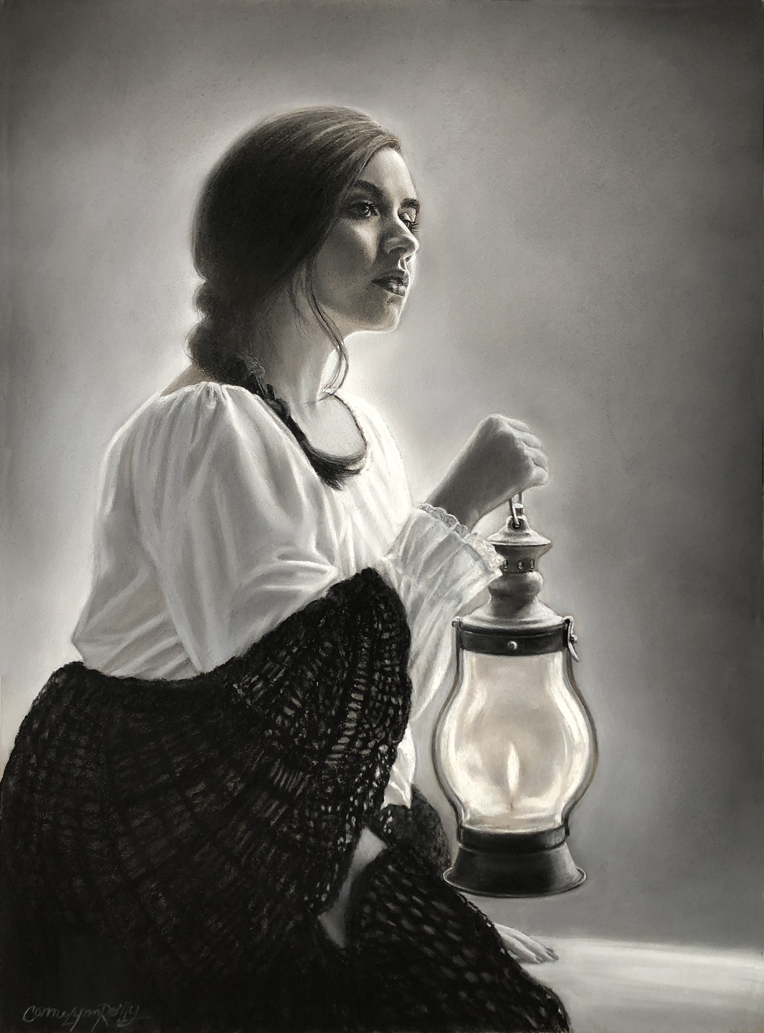
Painted in black, white, and shades of gray, Lamp Light (pastel, 23 x 19 in.) shows you how I used value and design to create light and form. Within this painting you will see six of the seven elements of design (color is absent, of course), but upon closer study you can also see depth, dimension, form, contour, emotion, mood, space, proportion, pattern, movement, gradation, unity, contrast, and light.
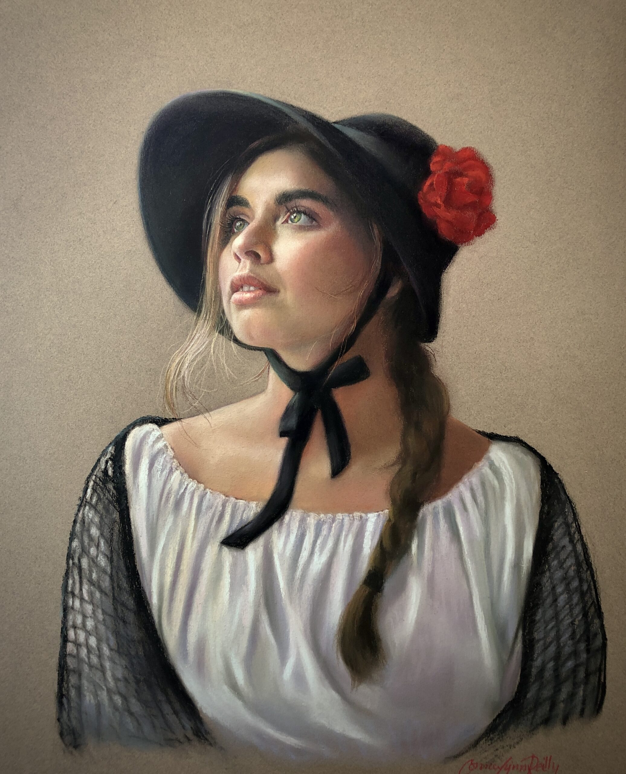
“Hope” (pastel on Canson mi Tientes Felt gray, 22 x 18 in.) was painted from the same model as “Lamp Light.”
The takeaway is this: If you can master this one element of design and understand “the value of value” in black and white first, you will be able to create a stronger piece of art, no matter what medium you use or what your style or subject. When you advance to incorporating color, value and color will be merged intuitively in your thought process when you are painting. Components of color include hue, temperature, chroma/saturation, and value, so starting with color first can be much more complicated and confusing than starting simply in black and white. I also recommend doing a small value study of your composition in order to solve any design issues before painting in color.
Happy Pasteling!
Connie Lynn Reilly
Connie Lynn Reilly is the founder and current president of the Southeastern Pastel Society/SPS. She is also a master pastelist of SPS, Master instructor, Signature member of the Pastel Society of America, American Women Artist and Also American Artist Professional League. She has won numerous National and International awards. Her studio and home is in Buford, Georgia, where she paints portraits and other art commissions.

