Another fine online show to inspire us!! The Pastel Society of the West Coast (PSWC) now has its members-only online show posted for all of us to view.
I’ve chosen four pieces from all the winners to talk about, two from each level – signature/distinguished pastellist level and general membership in PSWC. The paintings are all very different from each other in style and genre. Enjoy!
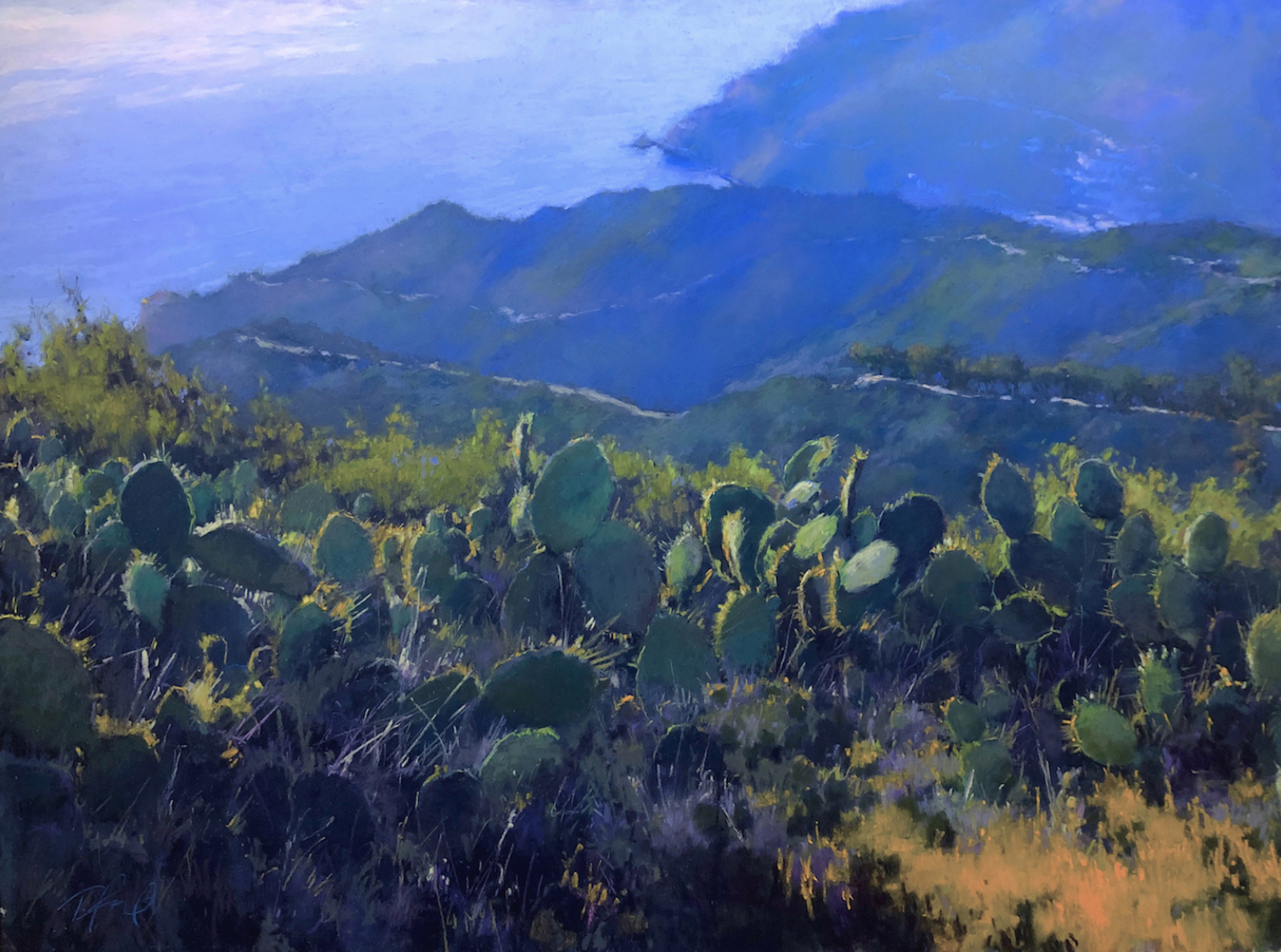
First up is Terri Ford’s painting. The value structure is bold and simple with the main light areas at top left and bottom right corners. The predominant colours of cool blues and greens are balanced out by the small areas of warm colours in those two aforementioned corners – a pinky colour upper left and a mostly subdued orange at the bottom right. Our eye is taken directly to the most lit and detailed cacti as it sits in the sweet spot of the rule of thirds (yes, these guidelines can work for you!). And then, we’re taken on a journey through the piece – exploring more cacti leaves and plants along the land until we connect with the diagonal line of the coast that drives us to the upper boundary. An inlet, a distant road, a dark line of trees, and warm green hills subtly catch our attention and we’re moved downward back to the star plant and that splash of orange. A satisfying adventure of exploration!
Next, we have Stan Bloomfield.
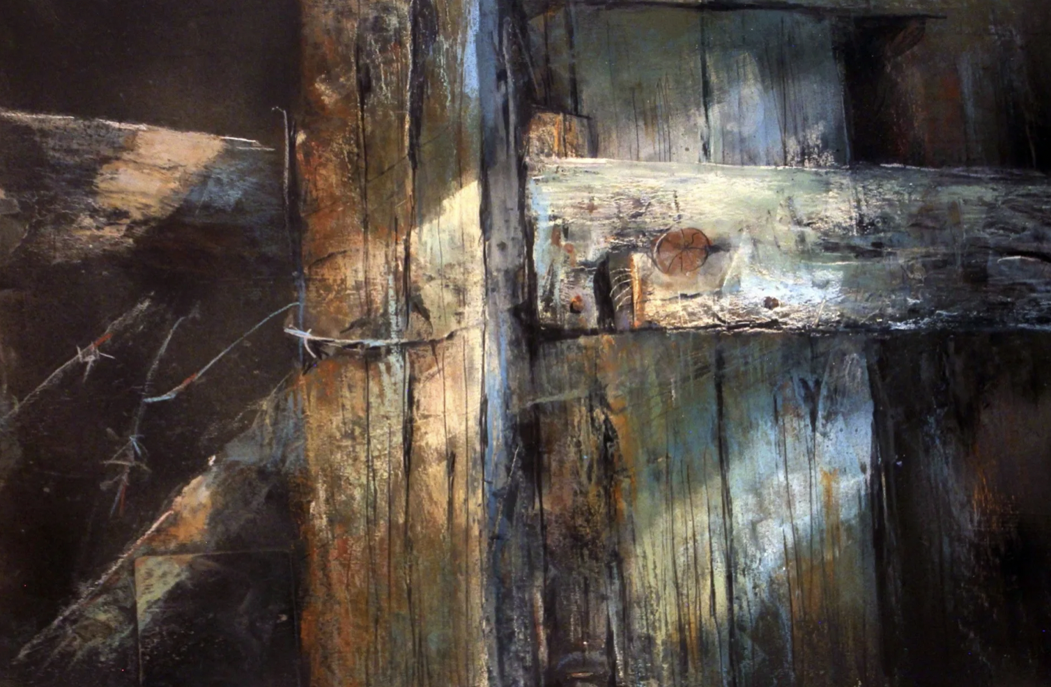
In his painting, Stan Bloomfield conveys the texture of worn wood yet he doesn’t do it in a highly detailed way. The value pattern creates a clear underlying structure for the colour and detail to sit over. The diagonal shaft of light rakes over the knots and scratches in the wood. There’s something about the angle and quality of the light that brings to mind Caravaggio’s painting, The Calling of St Matthew. It’s easy to be taken towards a Christian narrative. Added to the side light, the vertical and horizontal wood pieces form a cross and we see, as we explore, a tangle of barbed wire. Whether the artist had this intention, these visual indicators, once noted, can move one in the direction of the crucifixion. The colour temperature appears mostly warm but on deeper exploration, we see the blues and greens balancing out the oranges and browns. The viewer is invited in, to feel and notice initially unseen parts – the bullseye knot (in the sweet spot), the vertical scores and wearing in the wood, the curl of the wire.
Otto Stürcke is next.
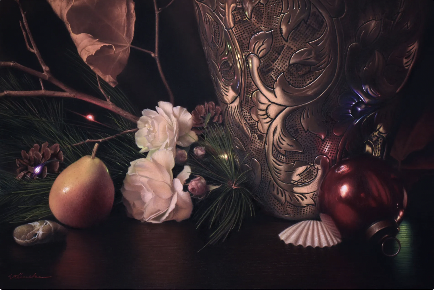
I’m mesmerized by this piece by Otto Stürcke. It’s complex but ordered. It’s so much about textures – you can feel the roughness of the shell, the softness of rose petals, the dry crispness of an old leaf, the prickle of evergreen, the smoothness of the pear, the cold hardness of the metal, the coarse texture of rock. A limited colour scheme of mostly reds, from very dark to the palest pink, holds everything together. The light-coloured and lit objects glow in the predominantly dark piece. There’s much to look at and discover, and so much to make a story from.
Finally, we have Shuk Lee’s painting.
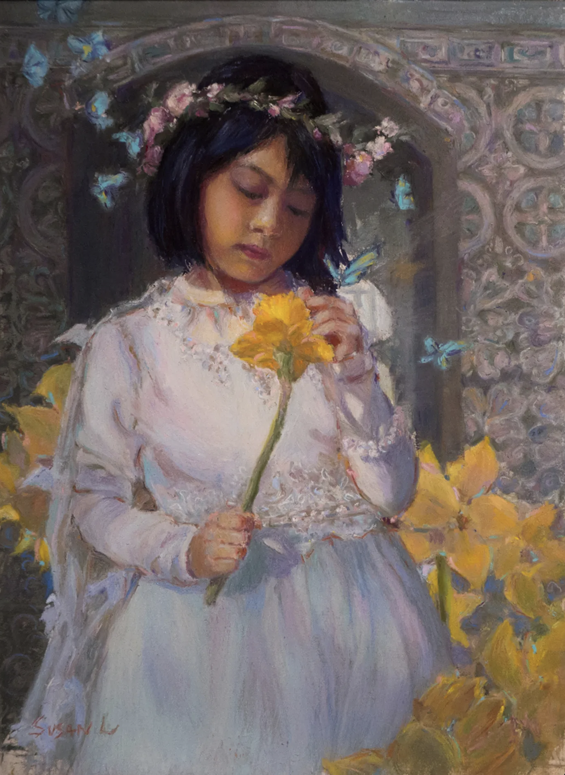
I always feel a happy glow when I see an artist I’ve mentored grow and become successful – this is certainly true of Shuk Lee! In her winning painting, a young girl appears lost in her thoughts. There’s a feeling of magical realism, where reality and fantasy blend easily. Without knowing the title, we can easily put our own spin on what all this means. It could be saying something about this young girl, her personality, her orientation towards nature. This could also lead us to a bigger metaphor – about climate change and how it may affect this child. The wistful look on the girl’s face and the intense examination of the flower could lead us to these thoughts. The soft delicacy of the fabric and lace in the dress contrast with the formal hardness of the arch behind her. Look more deeply and you’ll see the echoes of butterflies and flower petals in the architecture.
Congratulations to these artists and all the winners at the PSWC exhibition. Make sure to check out the entire PSWC show HERE.
_______________________________________________________________________
Botticelli in Minneapolis!
I know, I know, it’s not pastel but hooooleeeeee, it’s Botticelli!!!
Sandro Botticelli (1445–1510) has got to be up there among my fav Rennaissance artists! And you can see his work along with his contemporaries at this exhibition until 8 January 2023.
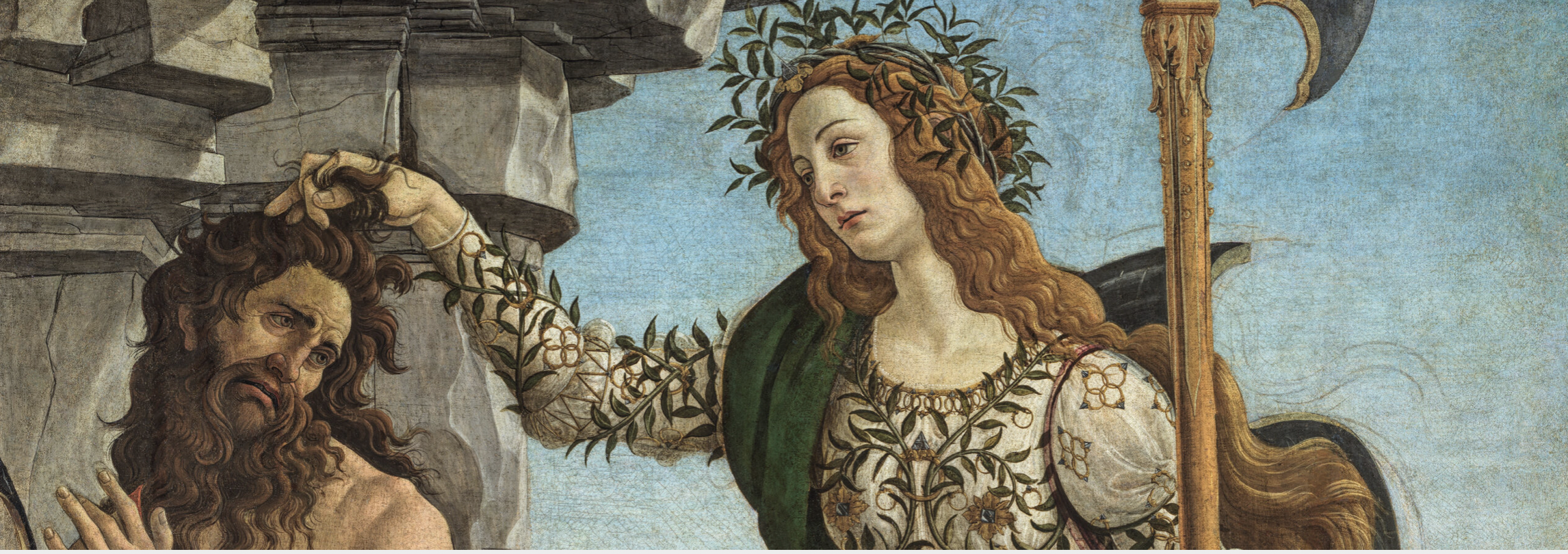
The exhibition – Botticelli and Renaissance Florence Masterpieces – examines through paintings, sculptures, drawings, and prints this influential and vibrant time in history in the city of Florence. It includes work from the Uffizi and if you are anywhere nearby or travelling to Minneapolis, should not be missed! If you’ve been to see the show or plan to go, do let us know in the comments.
You can read a bit more about this show in our sister publication, FineArt Connoisseur.
And that’s it for this time!
Gail


 show caught editor Gail Sibley’s eye. She delves into each.)