And….the November PleinAir Salon Best Plein Air pastel award goes to….Christopher Copeland! Queue the applause!
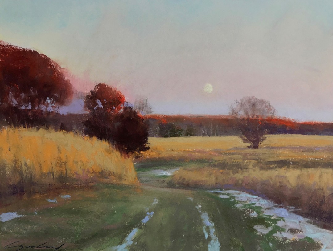
Let’s get into the inspiration behind his painting. Here’s Christopher.
“Foremost, my plein air work is to express the light. I usually work quickly due to the persistent changes outdoors. “November Moonrise,” like all of my work, is done en plein air. Painted at a location where I frequent for my oil painting landscapes, this nature park provides acres of the subject matter of prairies and woods.”
I asked Christopher Copeland about the challenges he faced painting the rising moon while on location.
“Where I stood, one can look over the expansive fields to view the entire sky. On this particular evening, the full moon began rising faintly over the trees. This provided a worthy challenge to capture the subtle and pervading tonality of light and atmosphere. When composing the foreground path as a lead-in to the distance, I thought to position the moon where the trail ends, just off centre.”
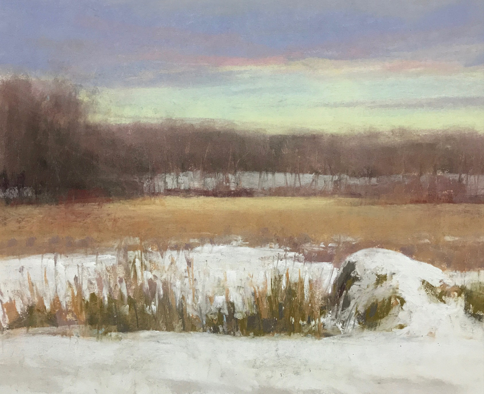
“The twilight hour lends me a focused and deepened sensitivity to convey the mood and soft palette of the landscape. But there’s a challenge, being, at this hour, the diffused light is brief. Working in pastel allows me to best record quickly what is necessary.”
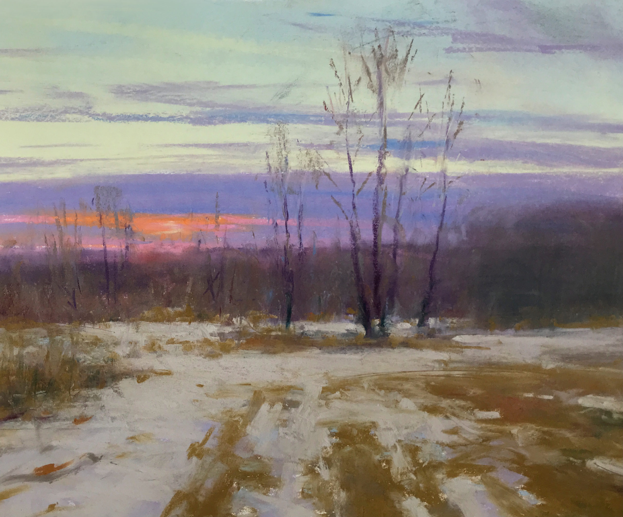
Christopher shared his thoughts about winning this award.
“The PleinAir Magazine Salon award is revered by plein air painters. Personally, the recognition of this award is of great value and distinction, and also of fulfilling gratification. I would encourage those who paint outdoors to make visible your best work for all of us to appreciate.”
I love that encouraging idea Christopher!
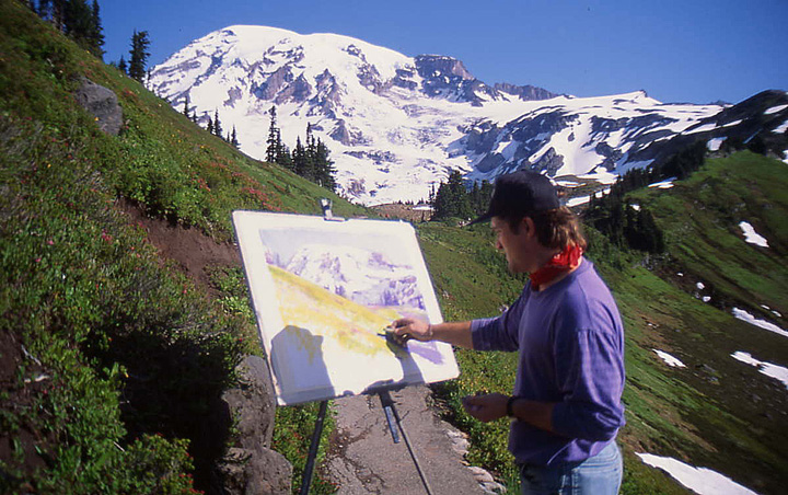
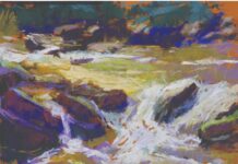
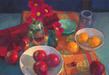
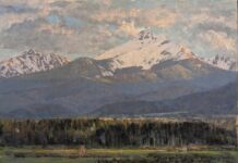
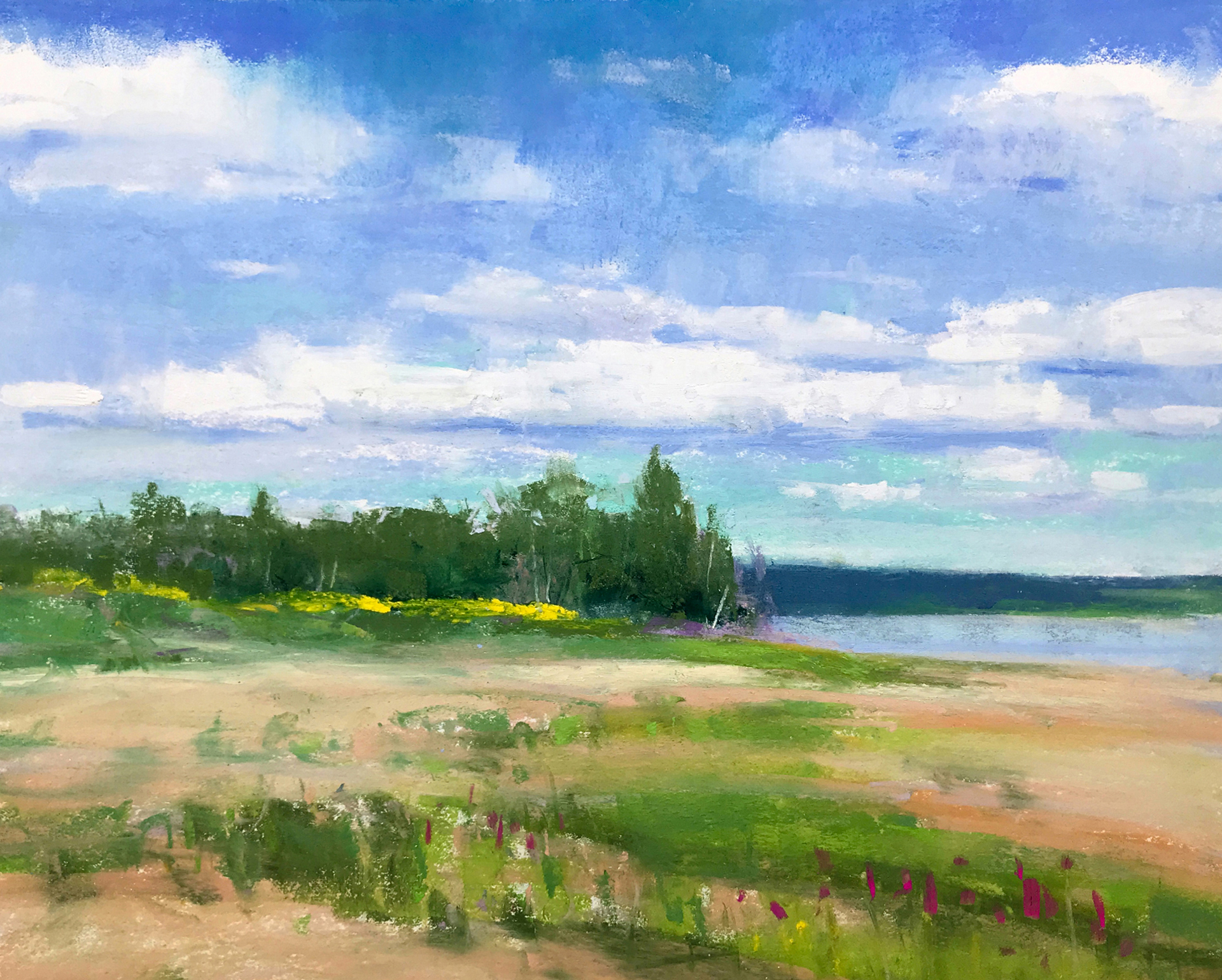
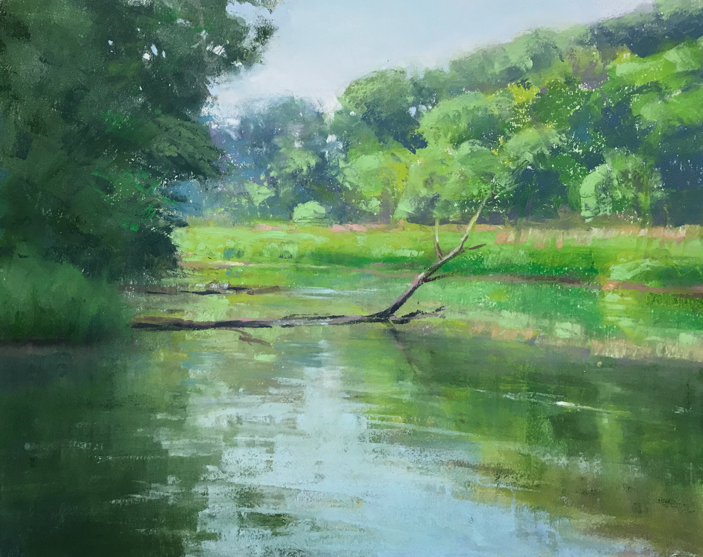
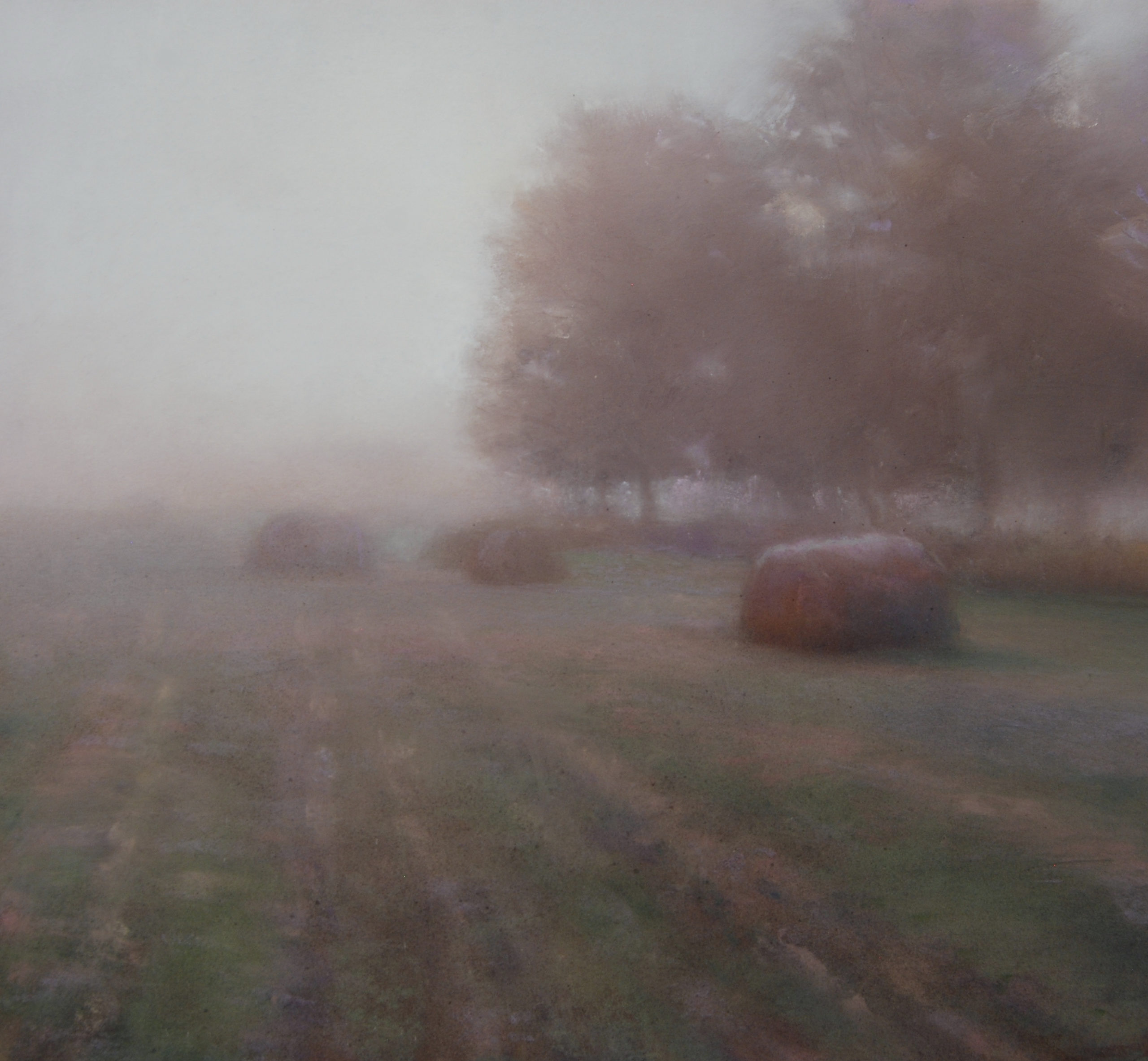
Here are a few more pastel paintings done en plein air by winning artist Christopher Copeland.
_______________________________________________________________________
A powerful painting by Jane McGraw-Teubner
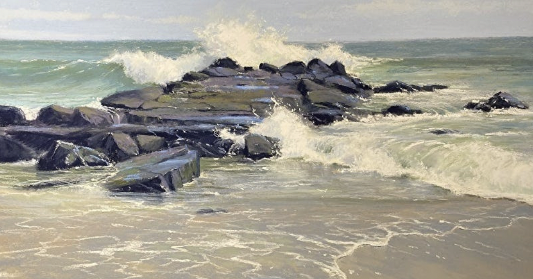
This painting, “Spring Lake Jetty” by artist Jane McGraw-Teubner, was a finalist in October’s BoldBrush Contest. To tell you the truth, I’m surprised it didn’t win an award!
With a muted palette that’s still full of colour, McGraw-Teubner conveys the milky greens of the water and the soft warmth of the foreground contrasted with the deep greens and purples of the rocks. More contrasts: movement and stillness, flow and rigidity, soft and hard, curved and jagged, power and gentleness. My legs can feel the water moving against them as I smell the air and hear the pounding of the waves on rocks. Ahhhhhh.
Check out this video of Jane speaking with Eric Rhoads for tips on using analogous colours in your painting!
And that’s it for this time,
Gail
