By Kim Lordier
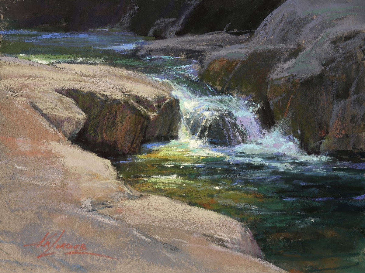
I was commissioned by collectors in Utah to create a large fall painting for their home along the Weber River. They had seen a painting similar to what they were looking for on my website, and fell in love with the color palette, but it was too small. After a zoom meeting to talk about their needs and to “show” me around the room where the painting would hang, I got to work.
To start, I set out several fall plein air paintings to bring up memories of being on location and combed through my photo files for design inspiration.
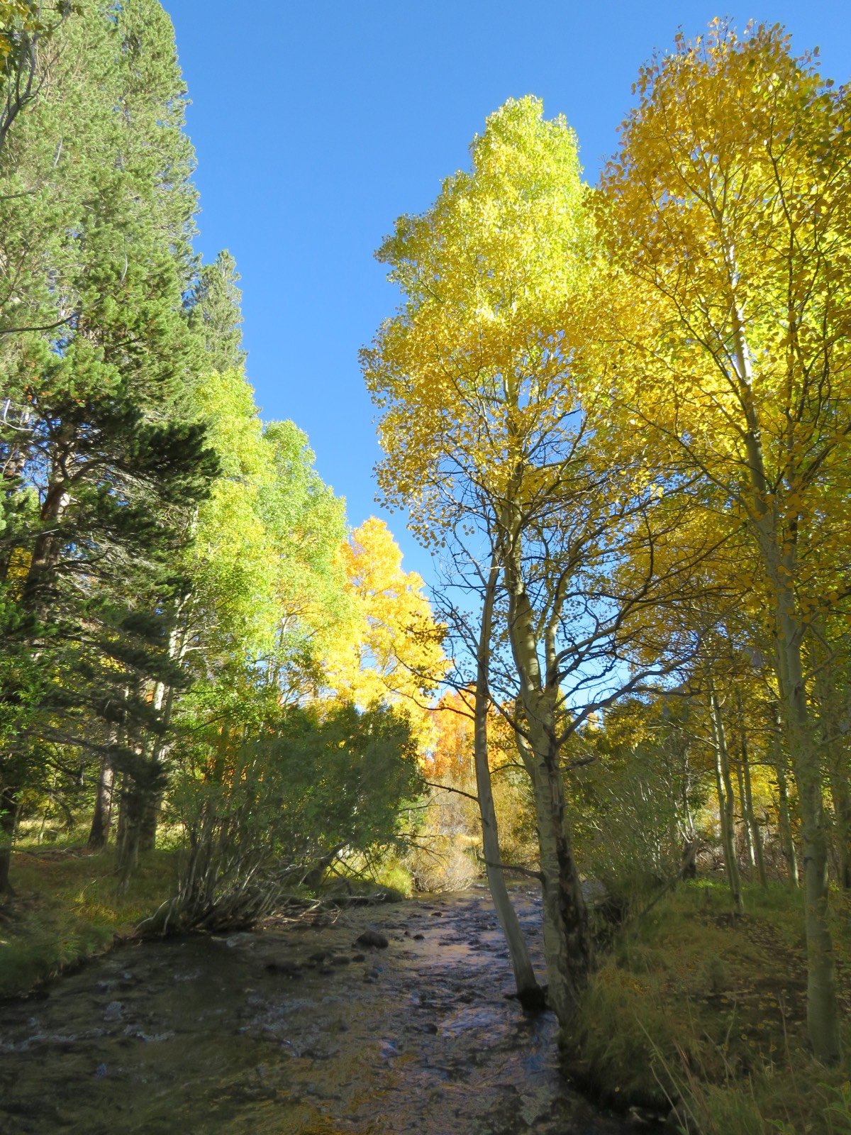
REFERENCE PHOTO
I chose this image because I loved the interaction between the family of aspen trees on the right, and the heavily shadowed foreground with the lit aspens behind on the left. The large pines didn’t work as well for me, however, nor did the river bank on that side. This was an instance where the photo provided a helpful starting point, but didn’t fully complete the concept. With a confidence earned from working on location for the past 25 years, I reconfigured the vertical image into a horizontal format and took a number of liberties with the elements to strengthen and simplify my design.
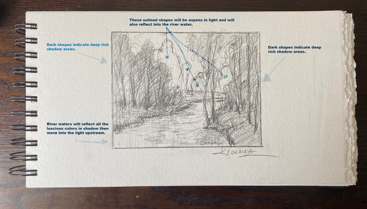
THUMBNAIL SKETCH
Next, I made a simple pencil sketch to express my idea and added notes for the clients describing my intentions.
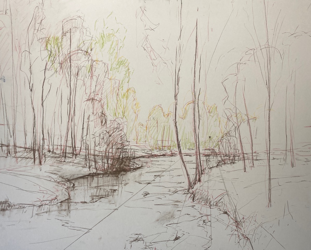
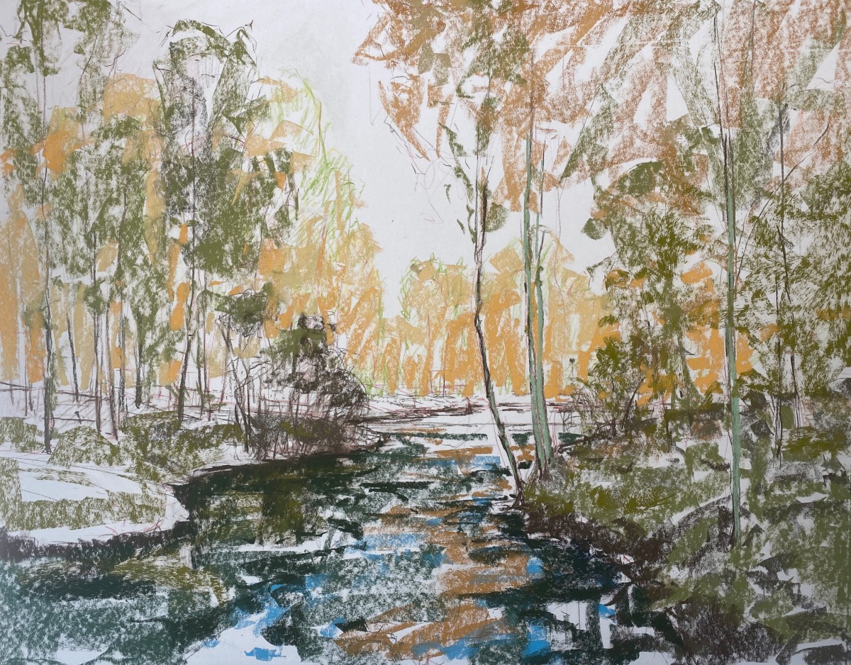
INITIAL DRAWING
Working on a 32 x 40-inch sheet of UART 320 grit sanded paper dry mounted to gator board, I made preliminary marks, and indicated perspective lines and halfway points on the board. Then I went in with a dark brown NuPastel to lightly sketch in the shapes that were to be in shadow. Bringing in a lighter warm green NuPastel, I faintly sketched in the shapes that would be in the light. At that point I was thinking mostly of the large masses, and making sure I had varying rhythms in my shapes.
PREPARATION FOR UNDERPAINTING
I lightly glazed warm dark greens into the foreground shadow shapes. For the light aspen shapes, I used a middle-value ochre and cooler darker greens. I added a couple pops of cerulean blue in the water, and made sure to keep my darkest darks where the water met the land. Thinking in terms of large masses, not details, my goal was to create an overall value and color plan. I used a light touch with my pastel sticks, careful not to fill the tooth of the paper.
UNDERPAINTING
I dipped my large hog-bristle filbert brush, size 16, into a small jar of Turpenoid and “melted” the pastel, starting with the light yellow shapes in the back then moving into the shadow shapes in the foreground. I made large sweeping brushstrokes that mimicked the gesture of the elements I was painting. The greens averaged out to a nice medium value with subtle temperature shifts.
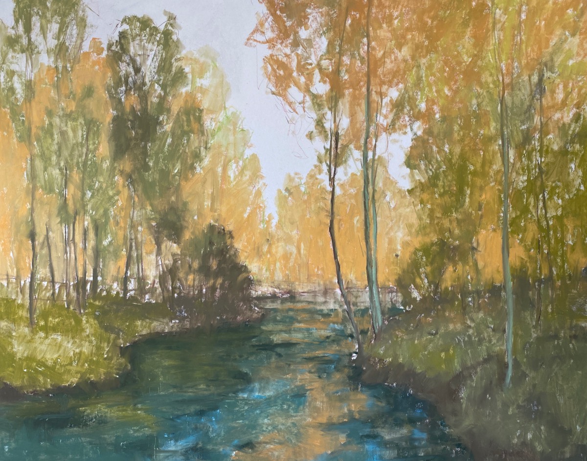
FIRST STEP
At this stage I redefined my drawing and started introducing richer colors. I added the purple notes to counterbalance the warm yellows, but knew they would eventually get grayed down. As you can see, there isn’t much that’s a duplication of the original reference with the exception of that graceful bend in the aspen.
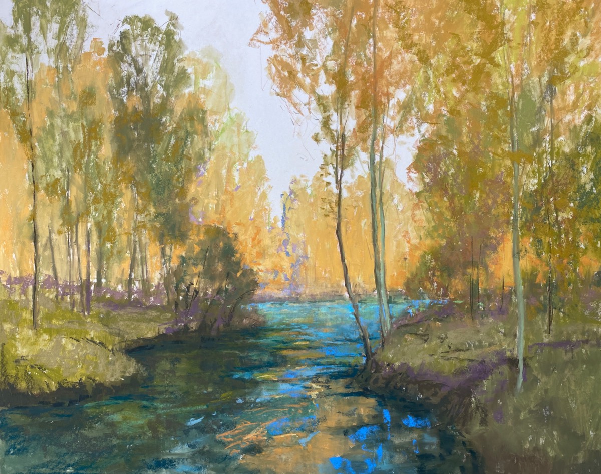
SECOND STEP
Here I introduced the turquoise color of the sky and started bringing in the warms of the foliage. I was still working with an average middle-value at this point, knowing that I had plenty of lighter values in my pastel box to create the sunlit shapes. Looking for the abstracted rhythms in the water, I kept the values close and utilized temperature shifts to create interest. I visualized how the swirls and eddies of the water created movement, and imagined where the water would be calmer as it hit a turn in the embankment.
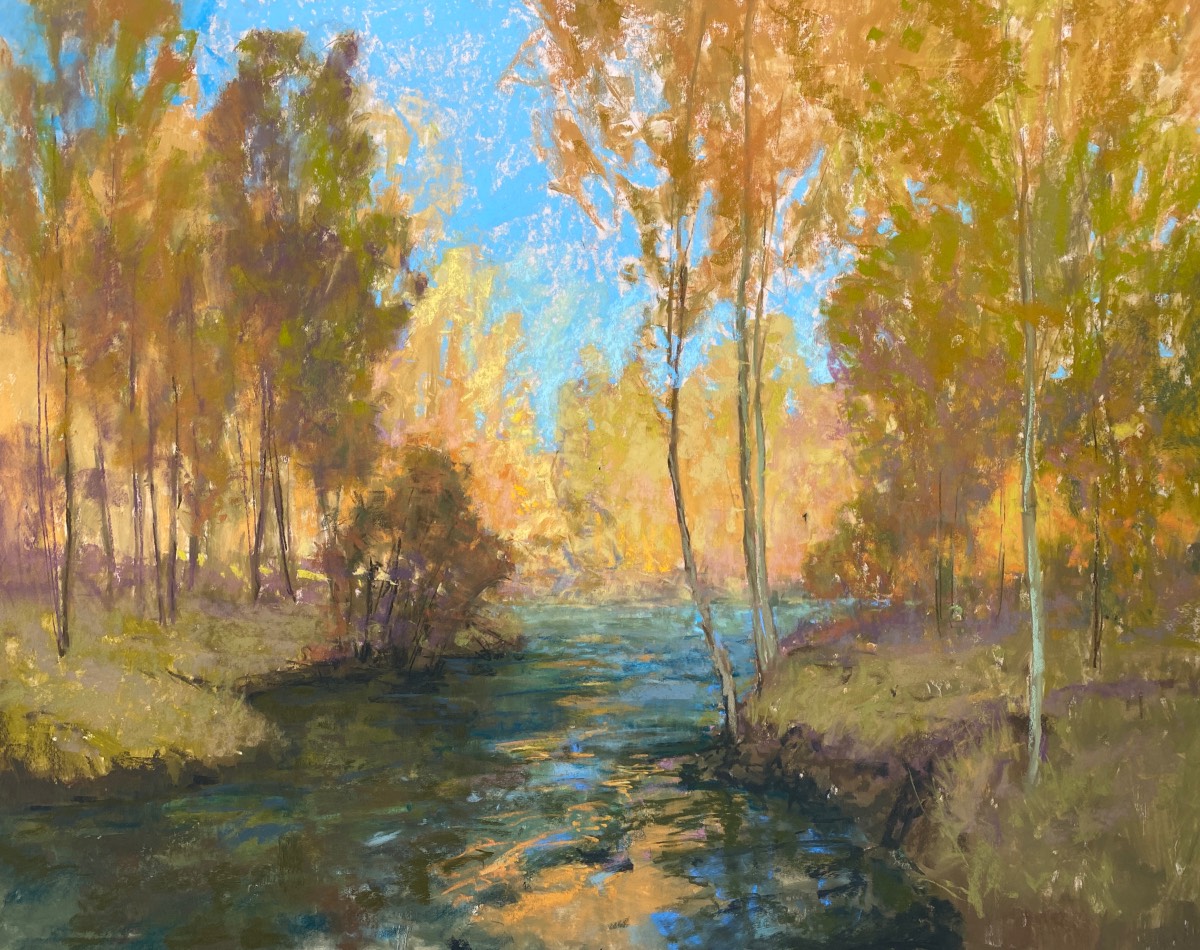
THIRD STEP
At this point, the painting began to tell me what it needed — some dappled and filtered light. To start, I introduced the light passage that rakes horizontally through the foreground trees, then created the dappled highlights on a few of the trunks. I could see then that the light hitting the left aspen trunk was too bright, and the left side of the painting needed to be anchored more solidly.
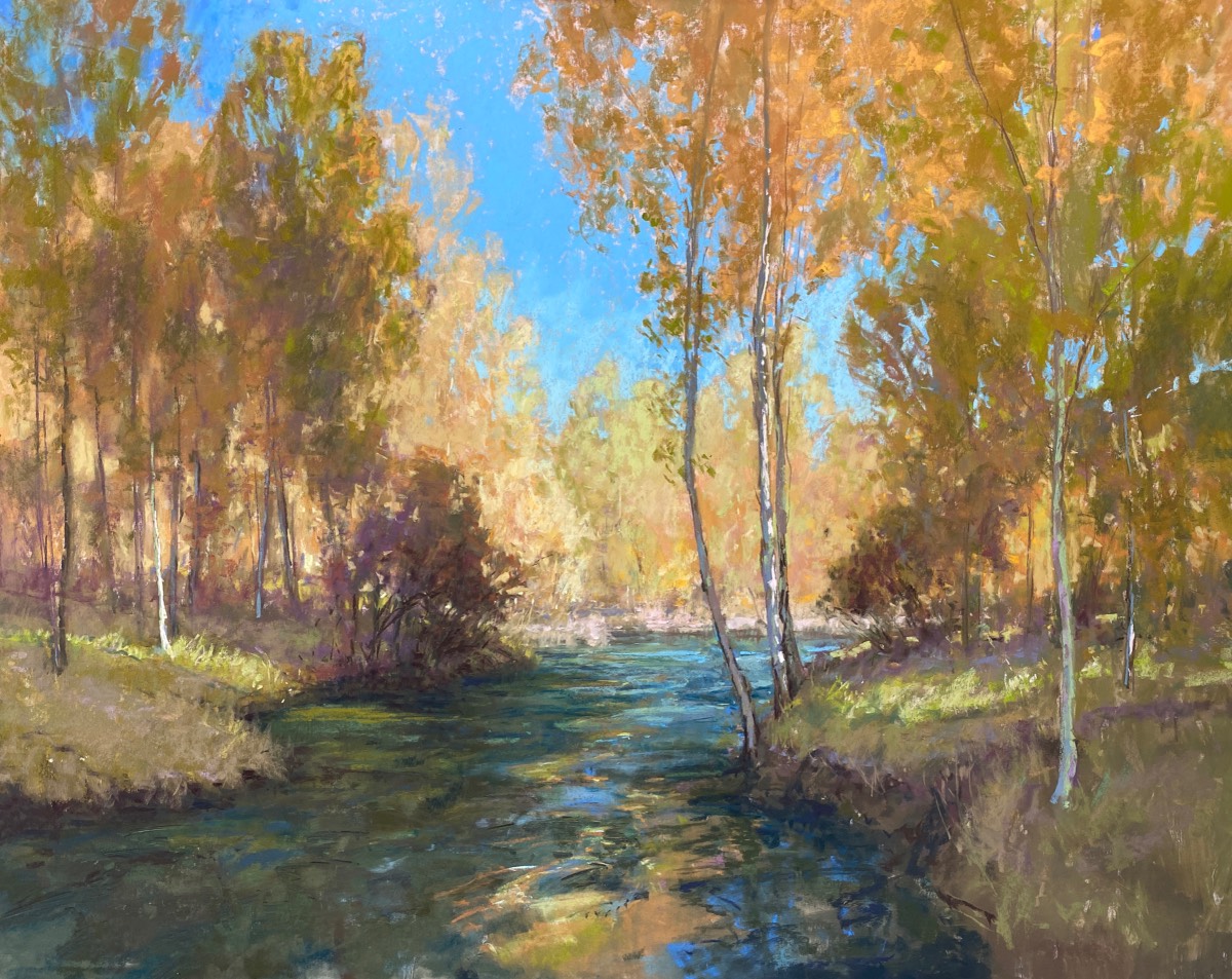
FINAL STEP
I suggested the darker pines on the left, creating depth in the piece and balancing the darker waterway. Next, I popped that warm little aspen just above the eddy in the water where I’m sure the trout were hanging out. All these additions would help me move the viewer’s eye around the painting.
Get ready for the magic of winter landscapes with paintings tips and techniques from Aaron Schuerr in Winter Sunset in Pastel.


