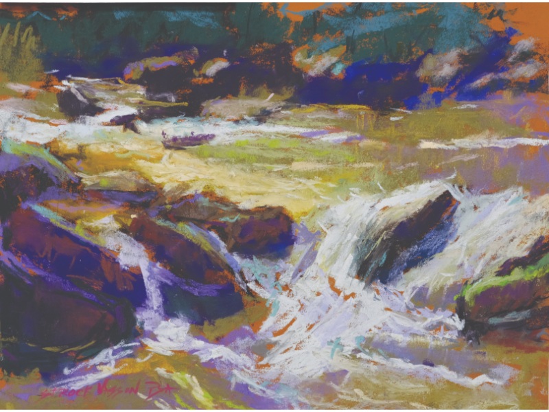
For Carol Strock Wasson, waterfalls are about structure — not spectacle.
Before color, before texture, before the seductive pull of bright foam and spray, she searches for the underlying design. “When I first arrive,” she says, “I look for the dominant movement of the water, the large rock shapes, and the overall value pattern.” She studies how the eye travels, where the strongest contrast exists, and where the focal area should sit.
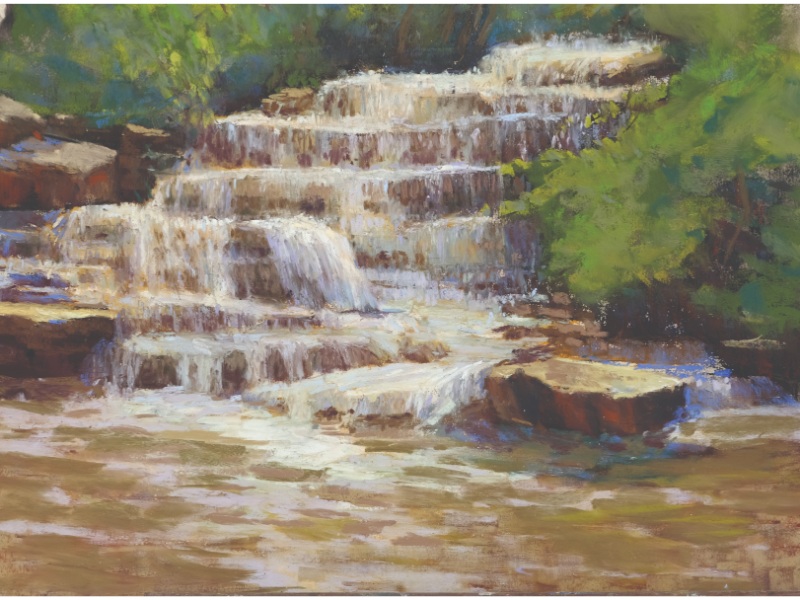
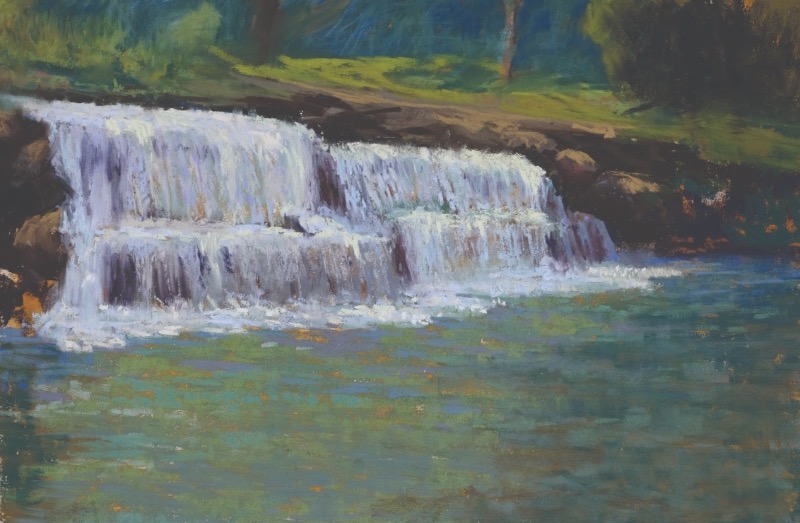
Only when the design feels solid does she move on to thumbnails and decisions about value and color harmony. She begins by squinting, reducing the scene to three values. Rocks and water dissolve into abstract masses of light, middle, and dark. Seeing in shapes — rather than objects — clarifies movement and placement. The focal point reveals itself.
LUMINOSITY THROUGH RELATIONSHIPS
With pastel, it’s tempting to grab the brightest white or light blue stick and attack the falling water, but Wasson cautions against that impulse. “Luminosity isn’t about brightness — it’s about controlled contrast.” To create glow, she places complementary colors in similar values — yellow and violet, red and cool green, blue and orange — next to contrasting values.
Edge variation is equally important. Hard, soft, lost, and broken edges introduce rhythm and flow. A crisp edge might define a sharp drop; a softened edge can suggest mist dissolving into air. “I work slowly,” she says, “layering thoughtfully and stepping back often.” That pause — that physical distance — prevents muddy color and over-blended passages that kill freshness.
METHOD AND MARK-MAKING
Wasson’s process follows a clear sequence:
- Squint and reduce the scene to three values.
- Create thumbnails to test composition and pinpoint the focal area.
- Choose a color harmony. Limiting your palette unifies the painting.
- Lightly sketch the composition on a warm-toned ground. The warmth can subtly energize the cooler passages of water and shadow.
- Block in darks first, middle values next, lights last. If you need to make adjustments after placing your lightest light — rarely a pure white — deepen a few strategic darks rather than simply add a brighter color.
- Know when to stop, which is probably earlier than you think.
Throughout, she uses directional marks to reinforce form. Vertical strokes describe falling water. Horizontal marks suggest ledges and pools. Broken, irregular marks imply spray and turbulence without rendering every droplet.
Pastel, with its tactile surface and direct mark-making, lends itself beautifully to this variation — but only if the artist resists overworking. Pastel rewards restraint.
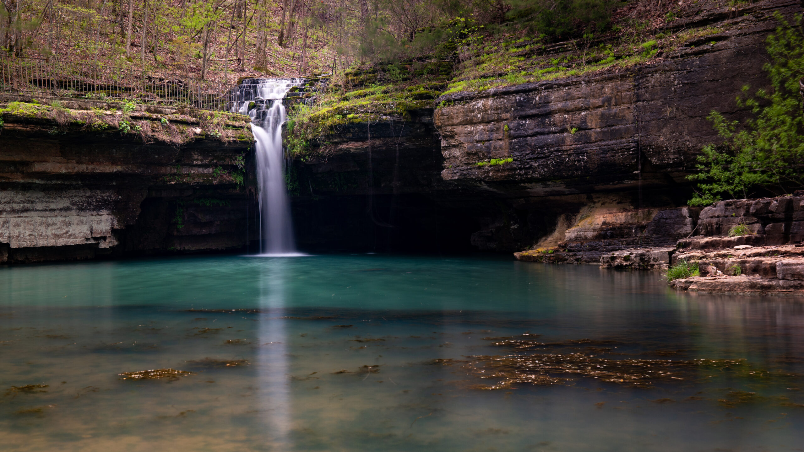
And if you’re looking for the perfect place to put Carol’s lessons into practice, the Ozarks are calling — with cascading waterfalls, rugged bluffs, and endless plein air inspiration. Don’t miss the Plein Air Convention & Expo May 14-18, right in the heart of it all — grab your spot now!
