Pastel Today has some great advisory board members and Albert Handell is one of them! You’ll meet them all in the coming weeks. (To see who’s on the Board, click here.)
I’ll be asking each of them the same question:
What pastel stick (colour and brand) can you not do without? Why is it so important to have it in your palette?
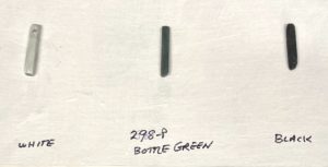
Today, I put the question to Albert Handell who couldn’t help himself: He offered the three pastel sticks he can’t do without!
This was his answer: “I like to have three NuPastel colours – white and black for crisp lines and 298P bottle green as my drawing tool to begin with.“
Okay Albert, tell us more!
I asked Albert why he used a green colour to start his piece. I was curious why he wouldn’t use say the black to do the initial drawing instead of the dark green. His response was that he uses bottle green instead of dark brown because the green colour is better for outdoor work (while brown is better for indoor work). He finds the black too dark to start with and saves it and the white pastel for accents. He went on to say that when you find something you like, that’s it. Stick with it!
Albert tells his students: “Experiment all you want but when you find something that works, stop! Stop experimenting and get painting. No more experimenting…unless you get bored.”
“There’s not enough focus on painting,” he exclaims. Experimenting can be just a distraction. “As they say in Brooklyn, that’s bullshit (and you can quote me on that).”
Albert uses an assortment of colours when he works. He prefers Sennelier pastels for the darks. He also likes using Unison Colour and Schmincke pastels. And he likes using Terry Ludwigs to do large areas like skies as “the squares work better.” But when he needs a harder pastel, he turns to his Rembrandts.
Thanks, Albert!
What do you think about Albert’s choices? Feel free to leave a comment on the blog here.
Stay tuned next week to hear the answer to this same question from another Advisory Board member!
Gail
PS. Have you seen Albert’s self-study class on Mastering Pastels? It’s marvellous to see him take us through the process of a painting!
________________________________________________________________
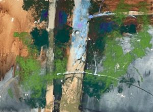
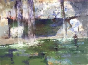
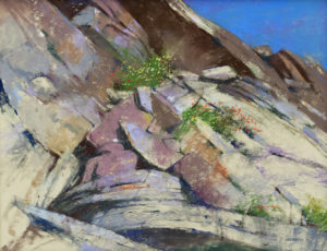
Check out these beauties in the Pastel Artist Canada exhibition!
The 31st Annual Purely Pastel Exhibition features the work of artists from Canada and internationally. It’s about to close (18th June) but happily, it’s all online for us to enjoy.
Click here to see all the award winners, all accepted entries, and the jurors’ comments.
___________________________________________________________________
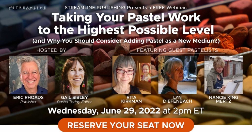
I will be co-hosting a FREE webinar with Eric Rhoads on 29 June 2022 at 2pmET. It’s called Taking Your Pastel Work To The Highest Level! and it’s going to feature these three top pastellists: Nancie King Mertz, Lyn Diefenbach, and Rita Kirkman! Click here to save your seat!
