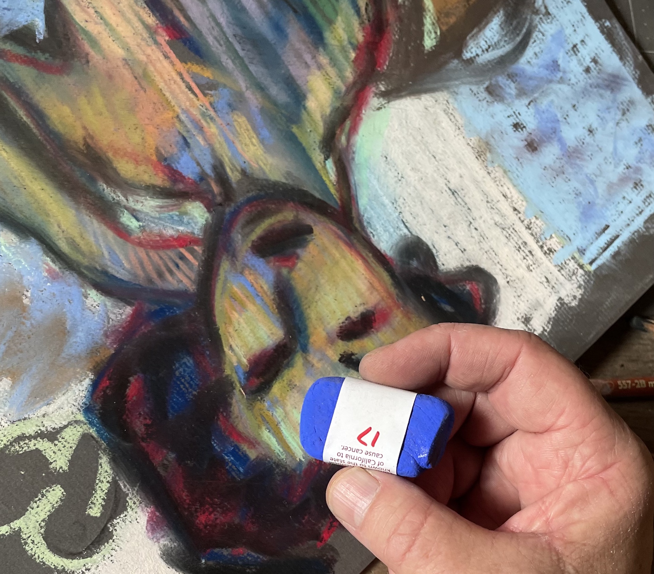
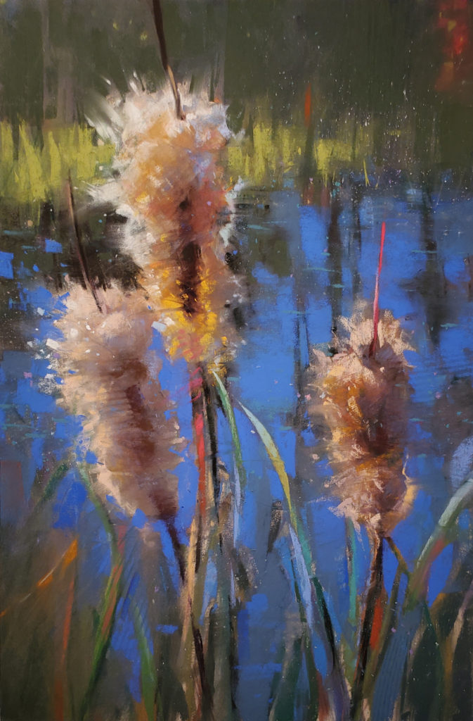
It’s Friday again! (How does that happen so fast?) And Friday means we find out the answer from annother advisory board member to THE question which is…. What pastel stick (colour and brand) can you not do without? In other words, what’s your favourite pastel stick?! And the person who’s up next to answer the question is Casey Klahn. His response: “Diane Townsend Terrages 17. It’s a French Ultramarine Blue in its greatest intensity.”
He continues, “I see this as the most intense pastel I’ve used, and it’s like a “power tool.” If I were a carpenter, it’d be my favourite tool.”
Ohhhh Diane Townsend makes the cut again! (You can see all the previous answers to THE question here).
Right, let’s dig into Casey’s answer. I asked Casey how he’d arrived at this pastel as his favourite.
“Long ago, I determined that ultramarine blue was the most intense colour, and it strikes a chord with me. I guess, since then, YInMn Blue has a legitimate claim to this, but I’ve never held a stick of that colour so who knows? Matisse used Ultramarine Blue when he made his cut-outs. The four Blue Nude cut-outs are this blue, on white. The best colour contrasting with an achromatic ground. It’s beautiful.”
With his response, I wondered out loud if Casey had used a different blue before discovering the DT17.
“I can’t recall. I probably came out of the womb holding a pastel stick of French Ultramarine Blue in my hand.”

Are you getting the feeling that Casey really likes his Ultramarine Blue, especially this particularly intense ultramarine blue?!
I was curious, and asked, Why is it essential that it’s such an intense blue?
“About week three of my online courses on colour, or whatever subject I’m teaching, my students become aware that I’m not after the “most intense colour” in a given painting. I mean, sometimes I am, but I let the painting tell me whether it needs full intensity or not.
What my students discover is that I’m interested in intensity as a property of colour; even low intensity is an intensity, seen as a continuum. However, on those paintings that need the most power, I go to the blue.”
So then I asked Casey, How do you use this blue in your work?
“One method of using a colour in an abstract way is to violate the local colour – make sure not to use or choose the actual colour of an object. When you free the painting from representing things, you are freer to use colours as you wish. Blue will pop forward if the motif is shown to be abstract. If you must paint a scene as an artifice, or as a representation of visual reality, then probably most of the time a blue will recede in space. Not always, though.
Colours exert a strong force on any kind of painting, and a blue that is not modulated – not killed by mixing – will proceed or advance in importance. This confounds some because it does not respect the “rules of temperature.” I often answer with an interesting observation: a blue flame has more energy, and is hotter, than an orange flame. Why is this? Blue is partially described by light – the spectrum of light – and it pierces distances better than red (police lights, for example). It has to do with the comparative frequencies and wavelengths, of the light that is blue vs. the light that is red.
If you think it through, intensity is a primary component of colour, and is present in a pastel stick. Temperature is illusory. It works, but I look for temperature last, if ever, in my paintings. The hues have individual identities, right?”
And this all started with me asking Casey about his favourite pastel! Lots to chew over yes?
Let us know your thoughts as a blog comment.
______________________________________________________________________
Her trademark style is the Beauty of Imperfection
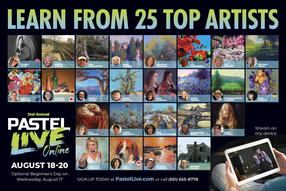
So who am I speaking about? Nationally recognized and award-winning artist, Jennifer “Jen” Evenhus, IAPS-MC, PSA-MP, NPS-DP.
Jen uses her trademark style to reveal the soul of a subject with bold colour and design. Known for her fun, informative, and often mind-blowing workshops, this Pastel Live 2022 faculty member will show you how to infuse your work with new life and energy using new colour groups and the magic of negative painting!
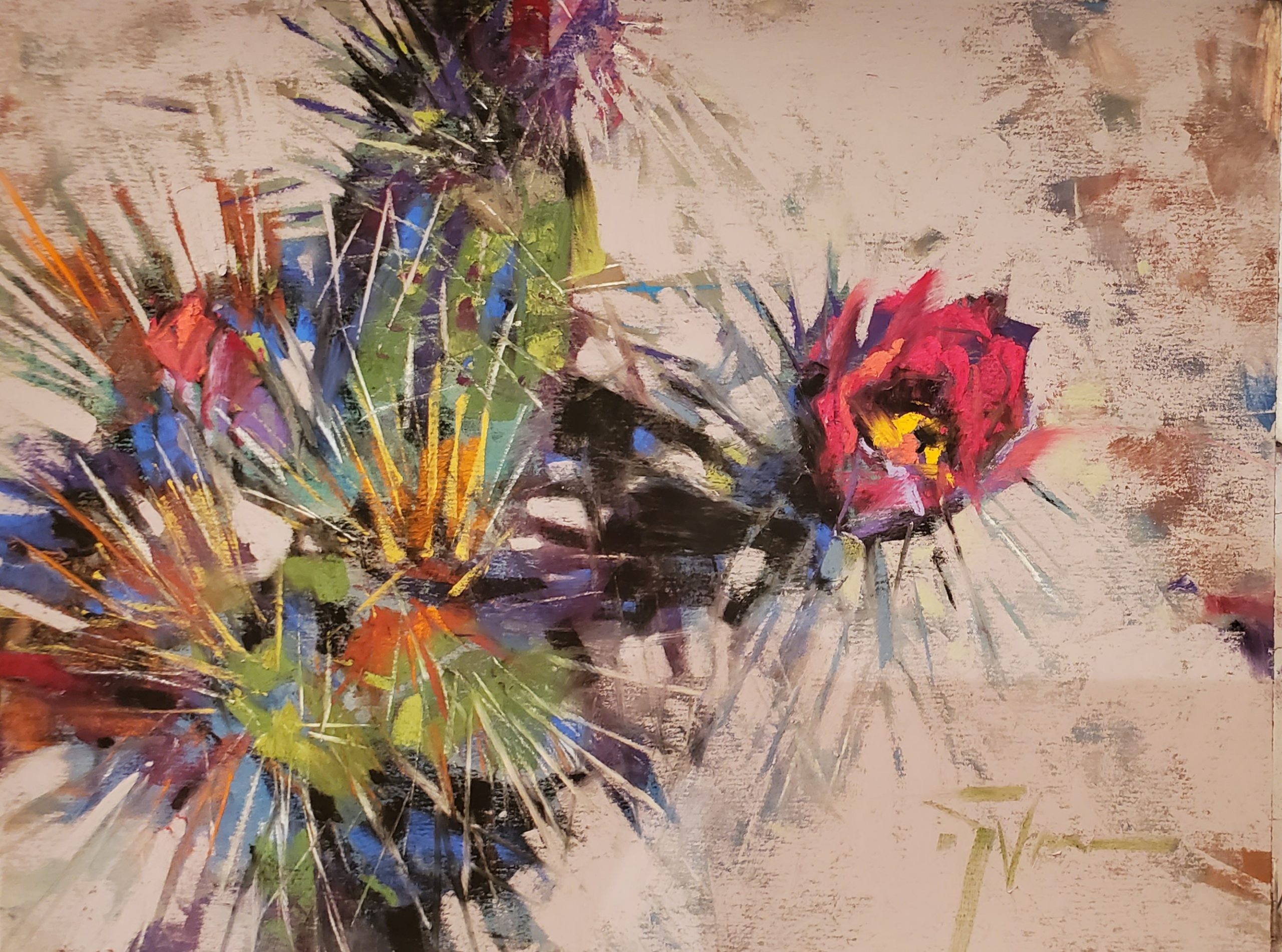
Jen often considers paint itself as her subject and is fascinated with the painterly effects one can achieve with pastels. Her work is contemporary with abstract leanings as she discovers the magic in her subjects with simplification and exaggeration. Jen wrote a fabulous blog a few years ago which really digs deep into her process.
Jen is a Pastel Society of America Master Pastelist, International Association of Pastel Societies Master Circle Member, Northwest Pastel Society Distinguished Pastelist, and Pastel Society of the West Coast Signature Member.
I do hope you’ll join Jen, me, and 23 other artists at Pastel Live next week. It will be an extravaganza of learning…all with pastels!! Click HERE to learn more. Don’t miss the discounted rate which ends after midnight PT on 14th August.
And that’s it for this time,
Gail
