Hey hey, it’s Friday, and no matter if you work Mon-Friday, Wed-Sun, or some other five-day arrangement or even every day (I’m trying to cure myself of this habit!), there’s always something about Fridays that brings a feeling of excitement in anticipation of the weekend. And, a Friday here on Pastel Today means it’s ONE question day. So let’s get to it with Advisory Board member, Casey Klahn!
The question we’re putting to the Board member is this:
Do you have a favourite pastel hack—a clever trick or shortcut that you’ve introduced into your process?
Casey’s response?
“Actually, I’ve identified two techniques that I’ve developed and I’ve given them names: one is called Optical Neutral and the other I’m calling Pastel Distemper.
Optical Neutral is vertical open strokes using complementary high-intensity hues. The result is an optical neutral. It’s similar to what Signac and Monet did, only they were using dots.
Pastel distemper is maybe a poor description and yet I am sticking with the term. It involves removing heavy layers of pastel with a soft round brush and keeping the area as is.
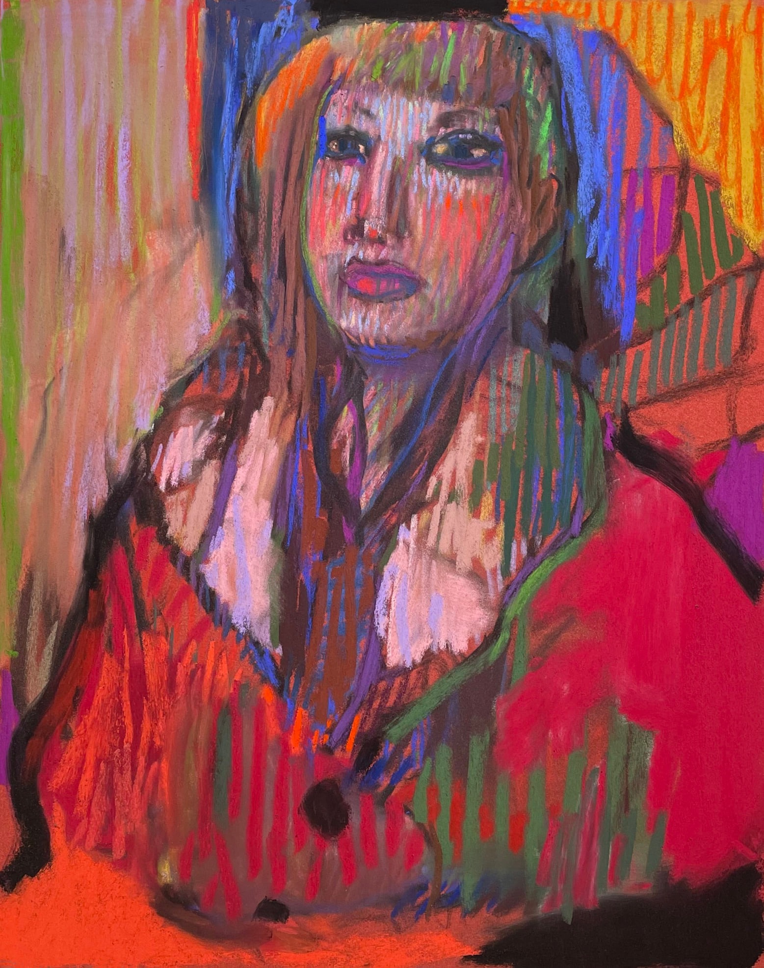
The Portrait of Mallory shows a lot about the Optical Neutral method. You could say this technique is a response to Impressionism, Op Art, and Minimalism. The Impressionists used broken colour and they often used complementary contrasts of hues to activate their painting surfaces. Fast forward to our contemporary times. Very powerful and abstract art has been made using strong geometry and simple structures. Bold lines and bold print and digital-era colours abound. My response is to place geometry and colour power into my representational motif.”
Wow, so when did you start using the Optical Neutral method?
“I think I must have been thinking of making a neutral place on a painting and got the inspiration to open the strokes when using neutralizing complementary hues to allow the power of both a primary and a strong secondary to interact. We’re aware that mixing these two kinds of colours will create a neutral mixture, but when I made strong gestural vertical lines of, say a red and then a green – and both at full intensity and in middle values – a powerful Pop! occurs. Yet, if seen from a distance, or if seen quickly, they average out to a neutral visual experience.
Once you notice the obvious red and green play of open vertical lines of colour in Portrait of Mallory, you begin to look around the painting at other more nuanced interplays of open vertical strokes. Sargent identified verticals as gestural in nature and I live by that.”
Fascinating Casey! And yes, I can see exactly what you describe in the portrait.
Tell me more about Pastel Distemper.
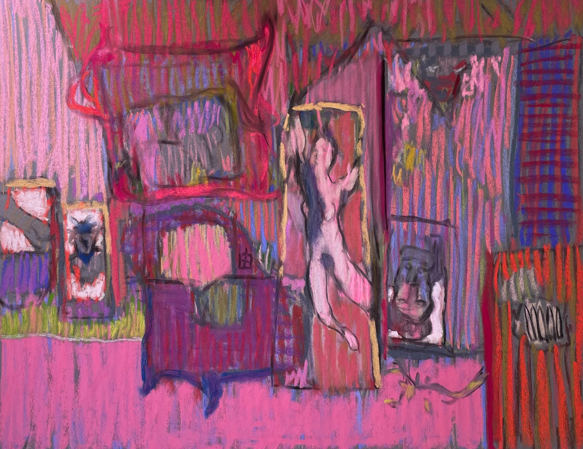
“Pastel Distemper. Edgar Degas did a couple of things that were new at the time and that I’m thinking about when I use the following technique. He used the medium of distemper, which is a glue-based medium rather than an oil-based one. It can be considered analogous to whitewash but could be used in a pale blue to colour a large wall. Degas enjoyed the effect of the medium on paper. Another strange move he made was to blot the oil from oil paint and then use it semi-dry.
Distemper means fundamentally to upset or derange and that matches what I’m doing. What I’m doing is very simple though. I build up layers starting with semi-hard pastel sticks and ending with soft sticks. Then I remove the pastel with a soft round brush and leave the work as is. I like the effect of subtle colouration without the fraught feeling of lots of impacted layers. It contrasts well with regular layers of colours creating an area of dissonance or of quiet.
Observe in New Figure how her legs have been brushed off but her dark legs remain in contrast to the rest of the figure.”
Oh my gosh, Casey, these are marvellous hacks and I hope Pastel Today readers are inspired to experiment and take a risk using your pastel hacks!
![Casey Klahn, "Green Robe," 2022, vine charcoal, dry ground, pastel and pastel distemper on La Carte, 10 1/2 x 10 in. Shows pastel removal techniques, while the red/green treatment on the far side of her hair [left] shows optical neutral work.](https://pasteltoday.com/wp-content/uploads/2022/09/Casey-Klahn-Green-Robe-2022-vine-charcoal-dry-ground-pastel-and-pastel-distemper-on-La-Carte-10-12-x-10-in..jpg)
William A. Schneider wins the Lora Block Award
Juried by Master Pastellist Amanda Houston, the Spirit of Pastel International Juried Exhibition sponsored by the Pastel Artists of Oregon runs until the end of September at the Chehalem Cultural Center in Newberg, Oregon, USA. You can see the whole show here.
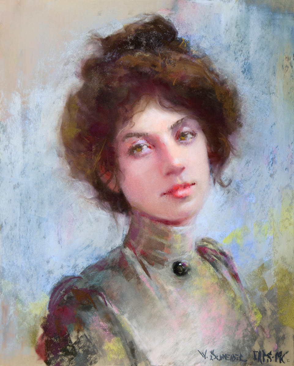
Waiting for the Sundance Kid by William A. Schneider, PSA-MP, received the Lora Block Award (4th Place). William commented, “When I saw the model in the antique high-necked blouse, I immediately remembered the movie, Butch Cassidy and the Sundance Kid. I imagined her as the romantic love interest in an edgy retelling of the iconic Western story.”
And that’s it for this time!
Gail

