Felicity House is up for our Friday ONE question feature so buckle up! It’s all about the colour of paper you use.
The question?
Do you have a favourite pastel hack – a clever trick or shortcut that you’ve introduced into your process?
Felicity’s answer?
Always let the paper work for you …. Choose the colour wisely.
Now if that doesn’t make you curious…
So I asked Felicity to go deeper into what she meant and how best to choose the colour of paper to use. Ohhhh there are a lot of ideas here!
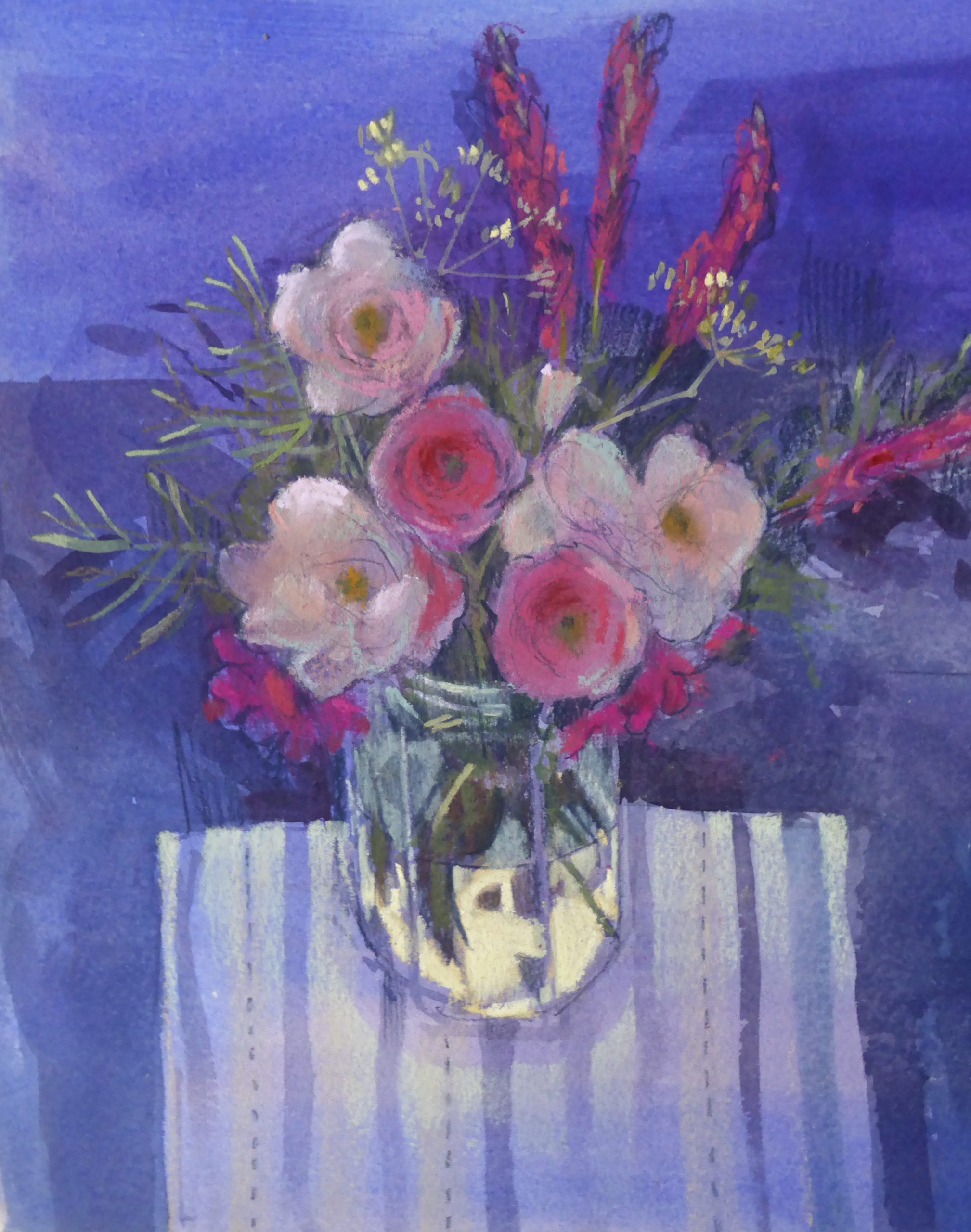
“If the subject has a dominant colour then you could choose paper which is that same colour and concentrate on pastelling the other areas in order to build the picture quite swiftly ie the subject is a warm stone building … choose that colour of paper.
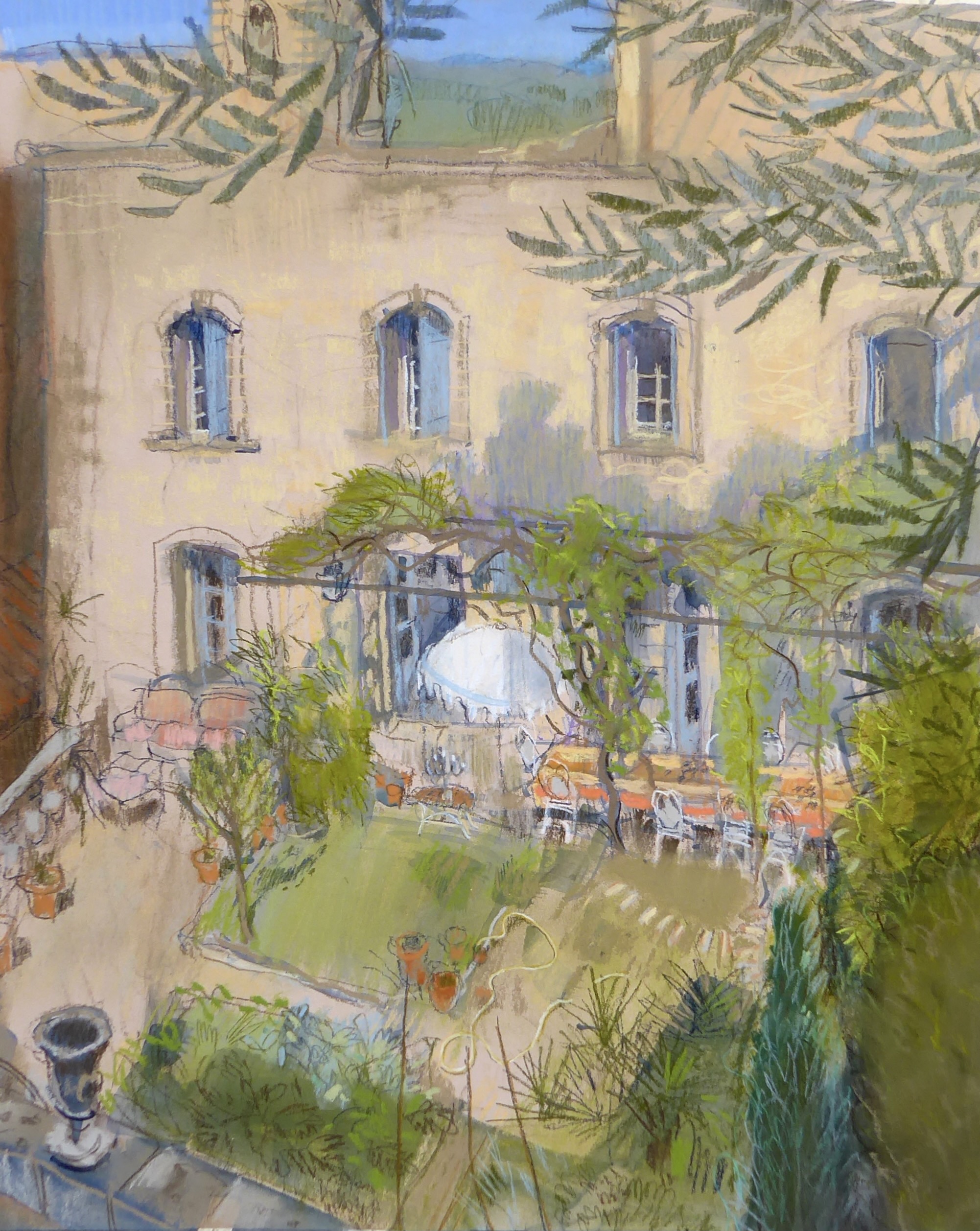
Does a dark interior dominate? Then use dark paper.
Conversely, you could choose the opposite colour of paper (to the dominant subject colour) which will result in a vibrant picture. For example, if you have blue objects, use yellow paper support.
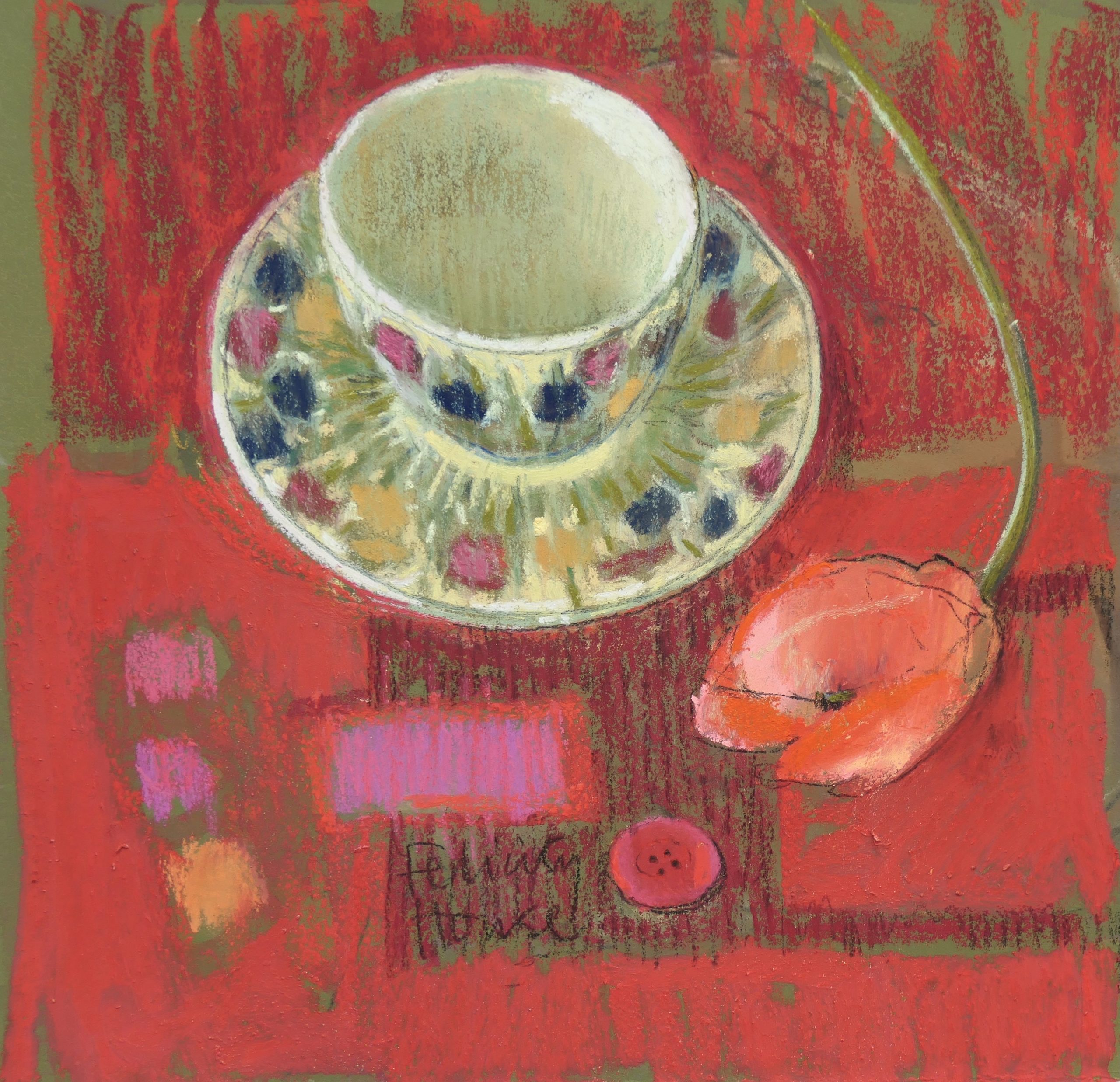
A warm colour paper works well with a cool subject.
Likewise, a cool coloured paper works well with a warm coloured subject.
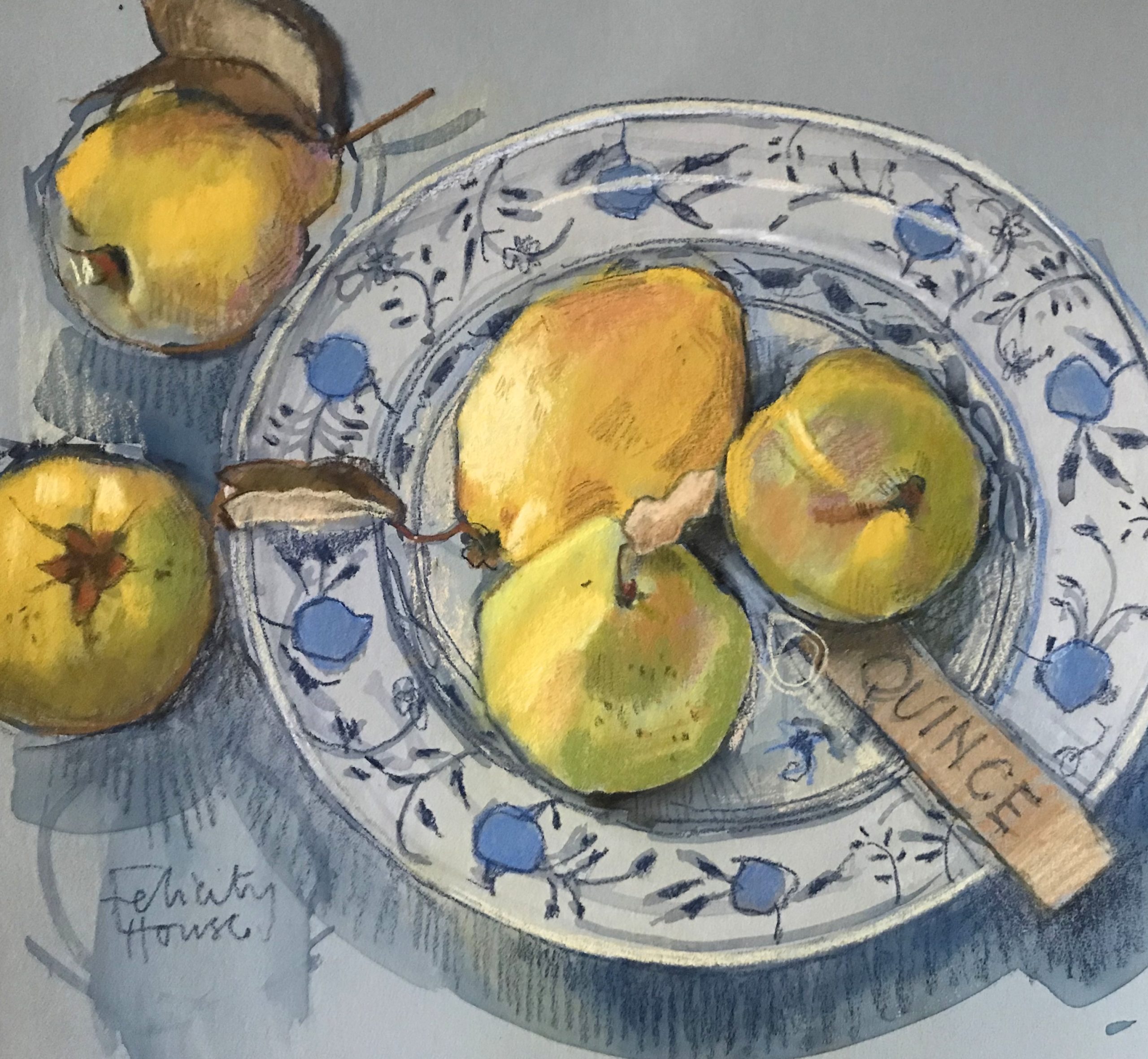
Using a mid-toned paper means you can work well in pastels with darker tones to begin with and finish with the light colour highlights to obtain a painting with a full tonal range.
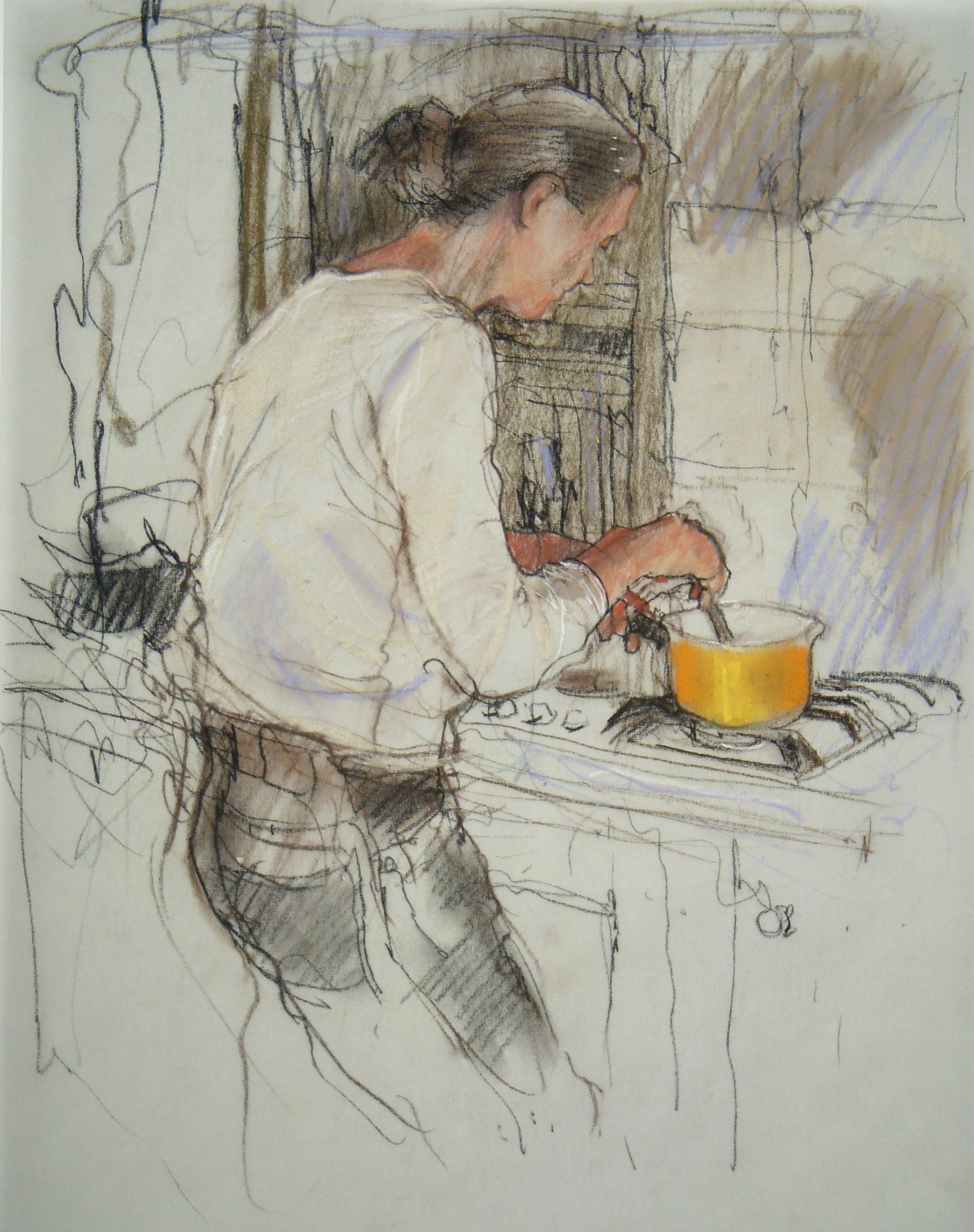
A light colour of paper enables you to concentrate on drawn marks if that is important to you.
Thinking about the colour of the paper before you start can:
- Save you time
- Give cohesion to your picture
- Makes you think about whether line drawing or colour impact is how you will be working
- Helps give you a useful warm/cool contrast
- Provides a new challenge – it’s exciting to work on a different colour – what will happen? How will your pastel picture develop on an unexpected colour support?
Lots of papers like Art Spectrum Colourfix can be wiped and re-used, which again gives you an interesting colour, pattern, or shape which can work with a new subject.
Of course, you can paint your own paper/support in watercolour or acrylic which gives you the opportunity to have a paper in a colour that’s not manufactured. Or create graduated colour washes as appropriate to your subject for working on in pastel.
On location, I always carry a folder containing different colour sheets of pastel paper so I can choose the most appropriate one for the subject. For the studio, I might buy some colour papers I usually don’t consider. It’s good to take risks and try things out.”
Ohhhh Felicity, thanks so much for sharing your pastel hack about the many ways to think about how to choose what colour of paper to use!
________________________________________________________________________
Don’t miss entering the PleinAir Salon!!
If you’re thinking of entering a pastel painting this month, today is the deadline!! You could win an award!
Check out July’s plein air pastel winner. And here are two Honourable Mentions from July to inspire you:
Have a look at all the winners.
Make sure to enter HERE!
And that’s it for this time!
Gail
PS. To honour National Day for Truth and Reconciliation (also known as Orange Shirt Day)…

