Here in the Northern hemisphere, in countries that actually experience seasons, Fall is definitely in the air as we slip quickly into October. And to entice you to create Autumn paintings, I’ve collected seven pastel paintings to inspire you!
Each artist has contributed a few words about their painting and/or painting Fall in general. I’ve also linked the artist’s name to their website so you can easily explore more of their work.
Let’s check them out!
In alphabetical order…
“Fall is a special time for me. I’ve always lived in places with four seasons, and the Fall has always been my favourite with cool, crisp temperatures, and incredible color palettes. One key to keep in mind when painting fall is neutrals prevail. It is this use of dominant neutrals that sets the stage for more saturated yellows, oranges, and reds, and in turn their complements of blue and violet.”
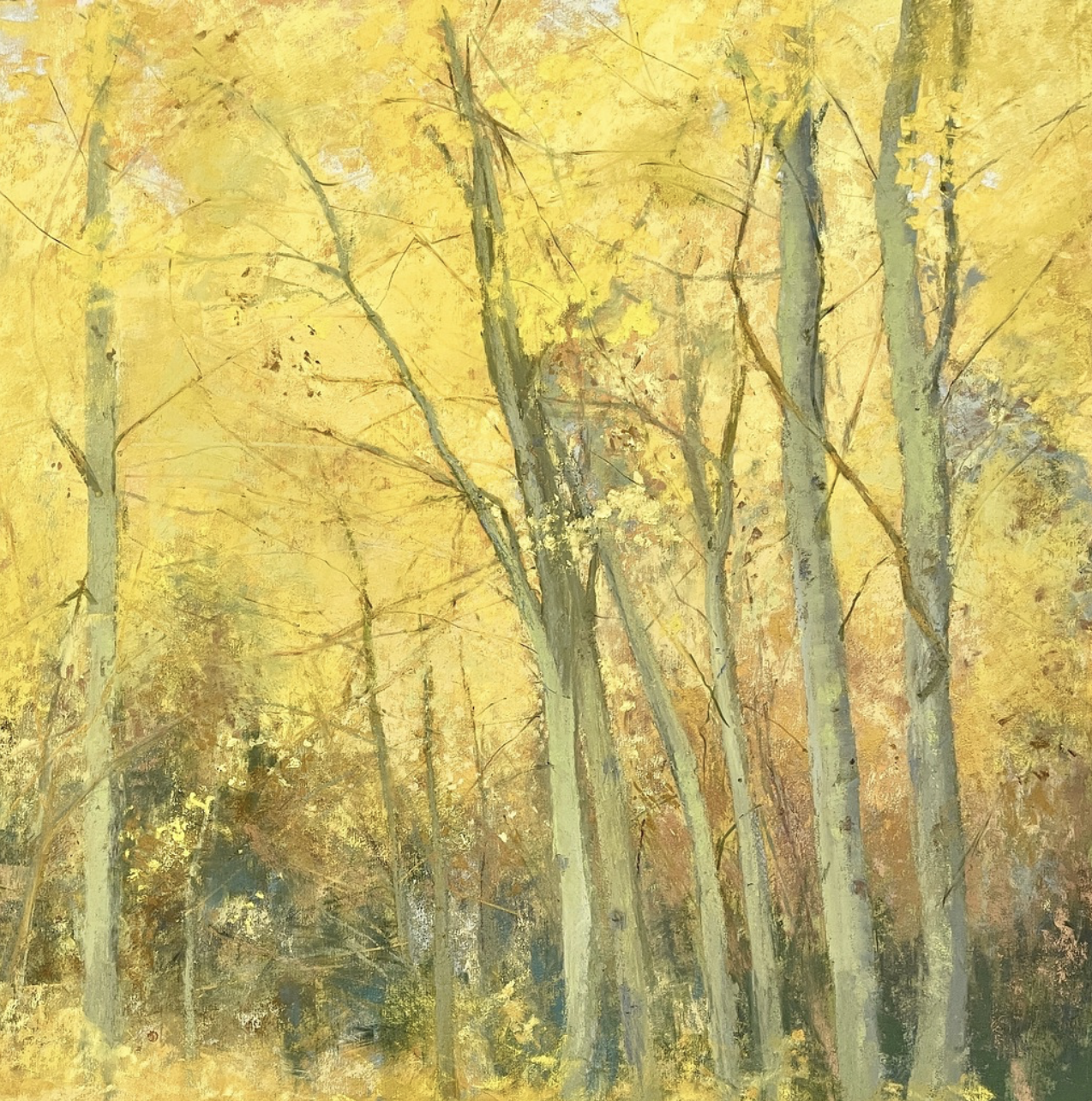
“I came upon this Autumn scene and was overpowered by its blaring palette of saturated greens, strident yellows, reds and cobalt blues. Instead of trying to recapture what Mother Nature had already conveyed perfectly, I moved the dials all the way over toward muted ochres and glowing gold. I selected one rich flavour from the whole spice rack in front of me. I can always go back to choose another flavour for another recipe. Next time.”
Clarence Porter, Advisory Board member
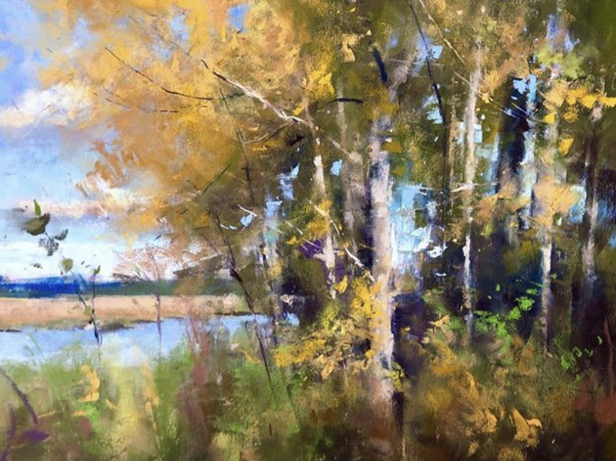
“Of all the Cootes Paradise pieces, “Walk in Cootes Paradise-IX” is my favourite. It came closest to evoking the feelings I had on that day. To capture the depth of colours I was seeing, I needed to see the colours underneath the colours: not just the reds, oranges, and yellow greens but the cool colours like the olive greens, purples and blues. Pastels allow us to layer colours on top of colours, just like in nature. PS: I consider myself to be a kind of representational fauvist. I love representing environments and I love colour play!”
“Autumn’s Last Glow was created on Sennelier La Carte paper, sienna. This pastel paper is perfect because of its warm colour and the soft edge quality it creates.
The photo reference was from a trip to the hill country of Texas, where the grand, old oaks have such a presence. The warm evening light was such a contrast to the cool, shadowed grassland. I do not start with any preconceived ideas of what my colour palette will be, I enjoy placing marks of pastel and letting my intuition be my guide. I do work towards the mood I want to create.
As always, I begin by sketching lightly with a dark NuPastel, carefully developing my value shapes and movement with a trail of darks. I feel it is important to maintain the value shapes throughout the painting process. Each value shape was built slowly with layers of various colours that were close in value and temperature, employing gentle transitions between the darker, warmer shapes and the cooler, lighter shapes. This gentle transition from light value shapes to the darker value shapes is created by placing some marks from the warmer into the cooler areas and vice versa.
Most important was building slowly to the brightest hits of light. The slow transition of light makes for a more complex, sophisticated ambience of mood.”
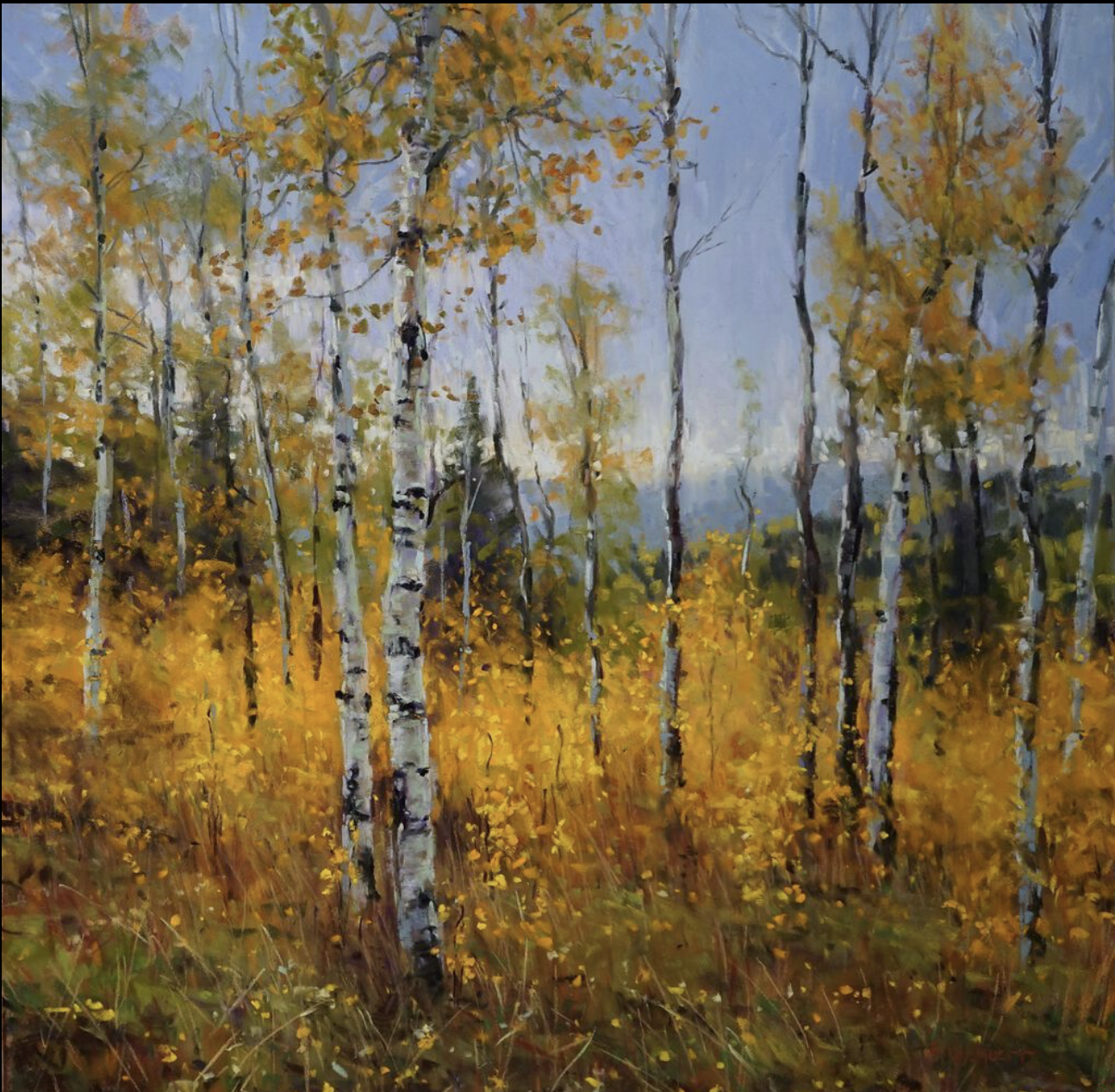
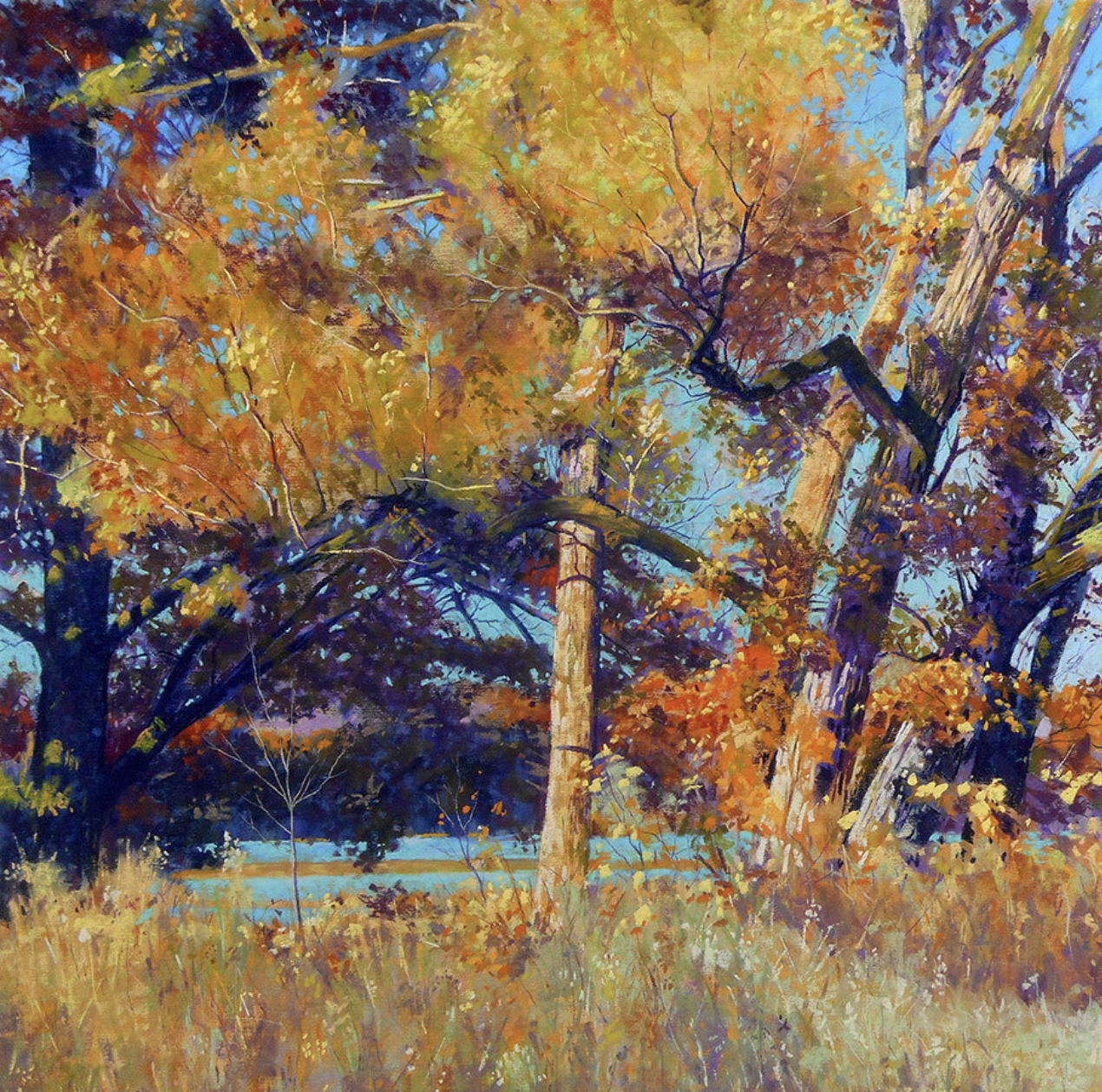
“I was teaching in Colorado in the Ridgeway area and I scheduled the workshop hoping to coincide with the peak of Fall colours. I had a few days before the workshop to go out painting. It was on the cusp of winter and I remember it was cold!
San Juan Gold was done from photos. I love the feeling of space that we glimpse through and beyond the aspens. I was reminded that you don’t always need sunny days, as much as I always hope for them. Overcast weather means local colours show more.”
Maureen Spinale. You’ll find more of Spinale’s Autumn paintings in her guest post for HowToPastel.
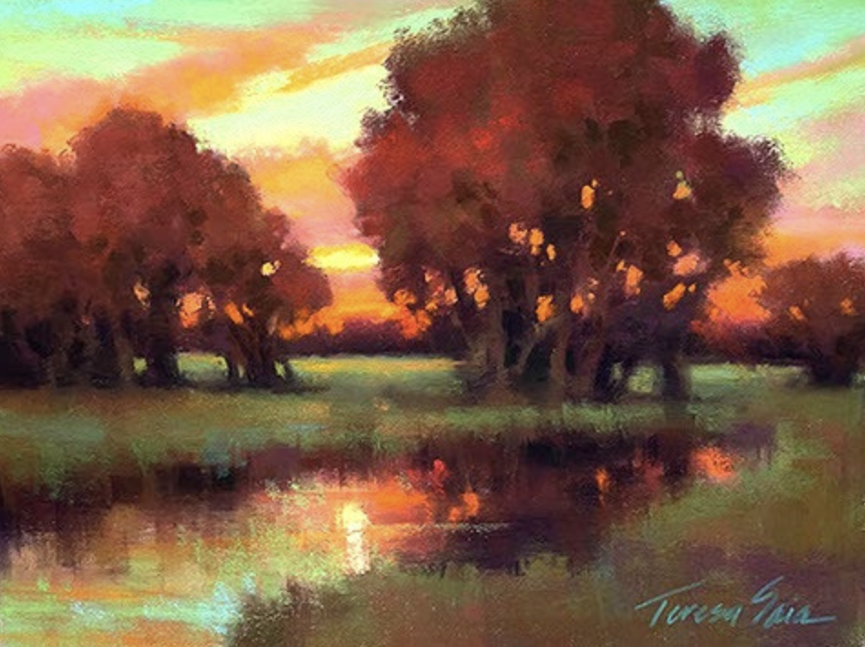
“Bliss is one of those paintings that almost painted itself. Layering different values of yellows and greens, I could almost feel the colour of that day as I was painting. Autumn painting can be a challenge. See not only orange. See red, burgundy, browns, ochres muted greens. They’re all there, which makes for blissful painting.”
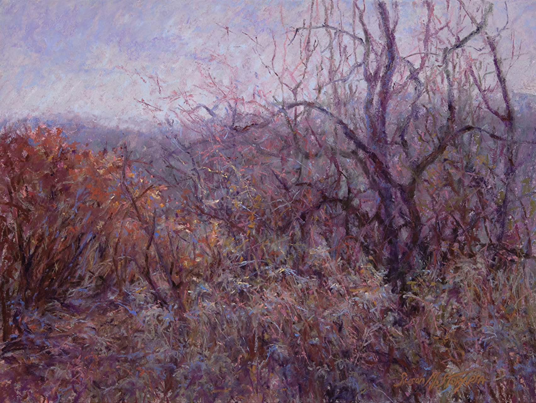
Susan Story another artist who wrote about trees.
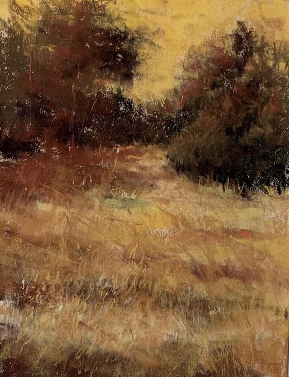
“We all love to paint the bright warm colours of autumn. With painting an entry for the Pastel Society Of America’s Annual Exhibition in mind, I wanted to paint fall differently. I looked deeper into the cooler side of the season and the various textures that are revealed. When painting any season I observe closely to find the unexpected.”
Many of these artists have shared their work and words on HowToPastel. Just do a search on their name and their guest post will pop up! I’ve mentioned a couple of them above as they directly relate to our theme of Autumn paintings.
Let me know if you’ve been inspired!
________________________________________________________________________
It’s Fall Color Week in Maine, USA
At this very moment (6-13 October 2022), a group of artists are in Maine painting in beautiful Acadia Park.
Here are some awesome photos taken by Ruth Sanderson at this year’s event. They may make you wish you were there. I know I do!!
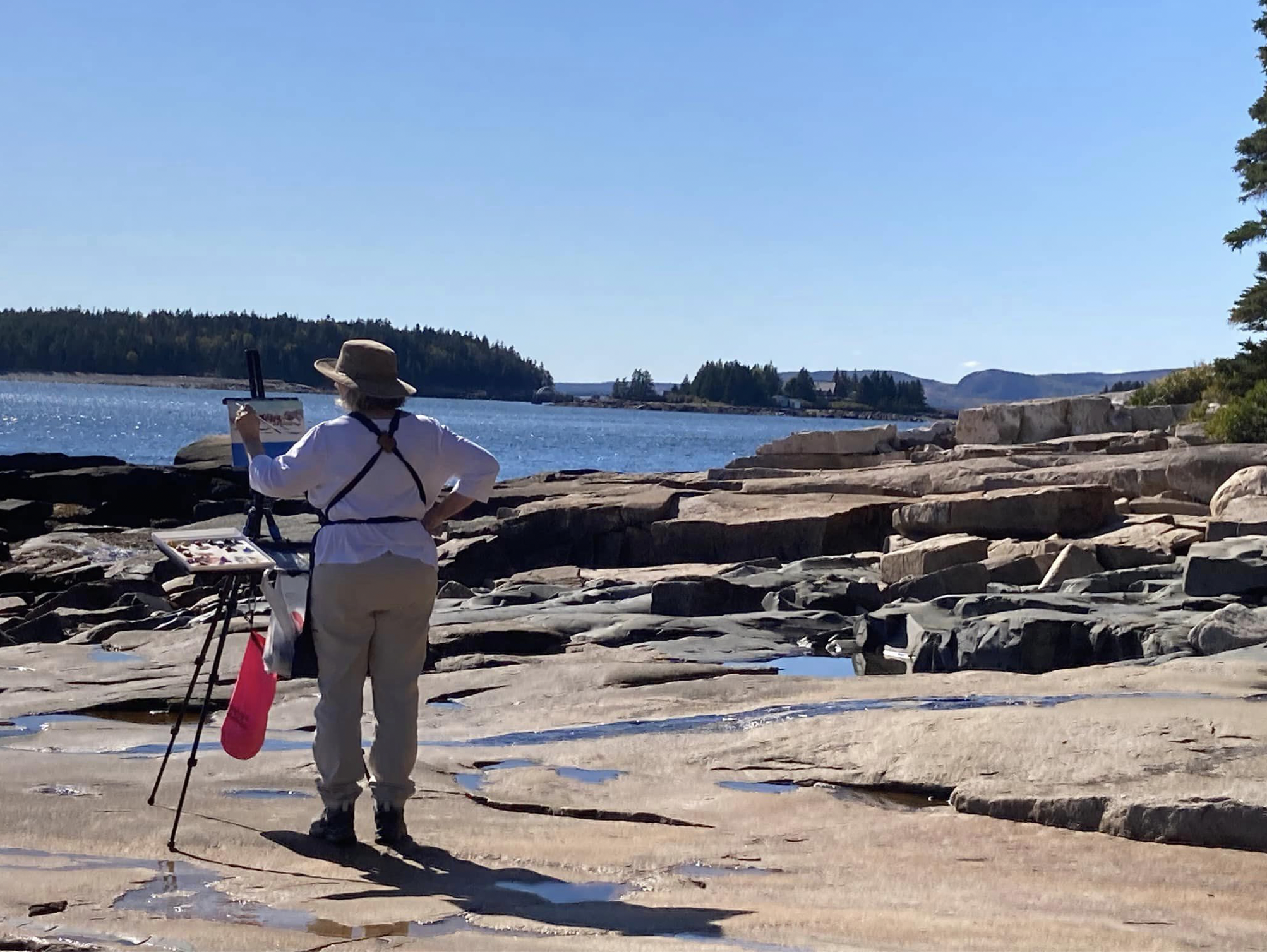
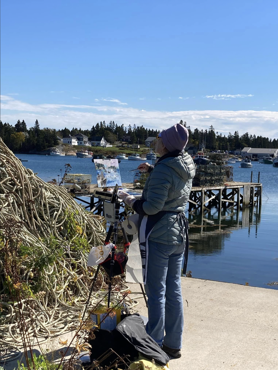
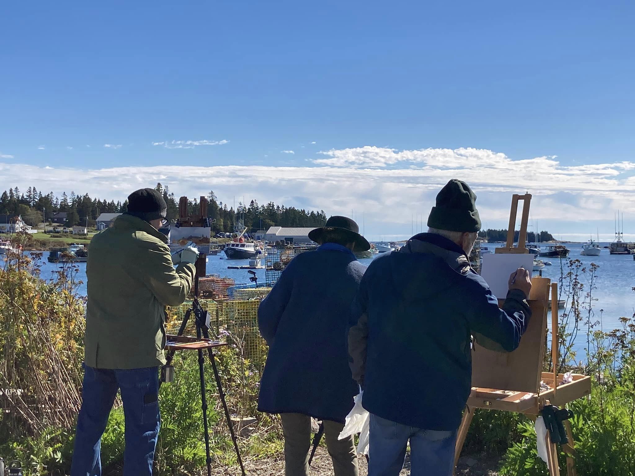
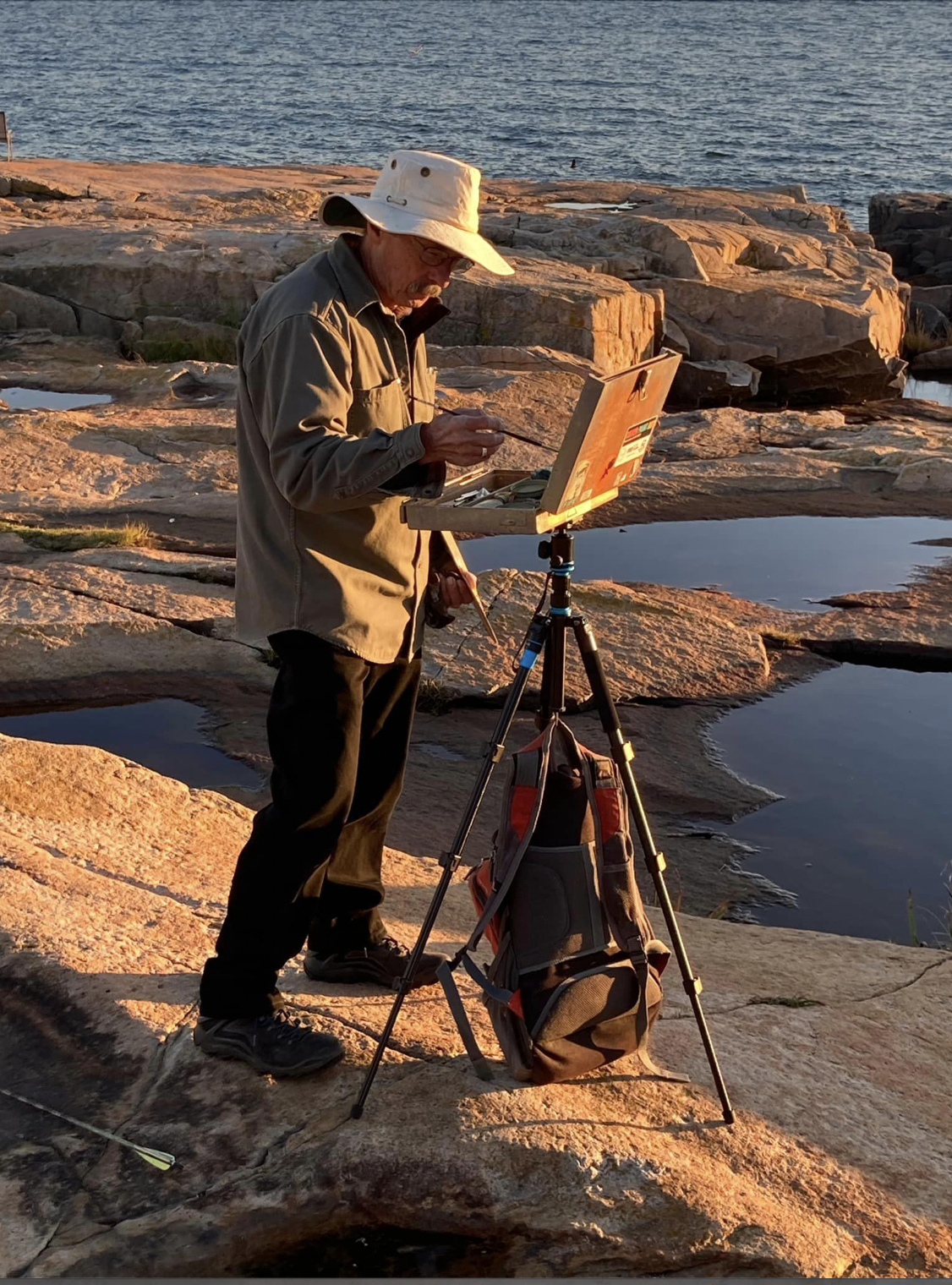
Fall Colour Week happens each year around this time. You can find info about this year’s experience here. That way you’ll be prepped and ready to join next year’s group!
HAPPY THANKSGIVING to our Canadian readers!!
And that’s it for this time,
Gail 🍁


