I’m delighted to report that the winner of the Portrait and Figure Award in the August PleinAir Salon is a pastellist! Go pastels! Connie Lynn Reilly not only won the Portrait Award, but her two other entries ended up in the Top 100.
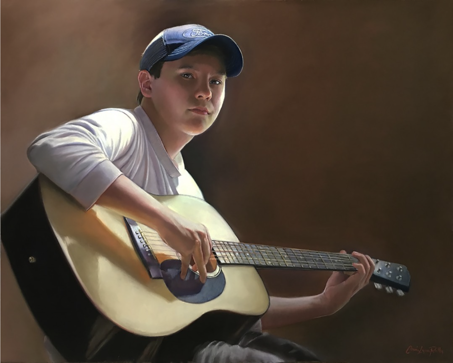
Let’s have a look at her winning painting:
Connie Lynn Reilly writes about her inspiration for this piece.
“My inspiration was the dramatic lighting on my model. My grandson Bryan was my model for the painting and he had just begun playing the guitar He was learning to play the melody of his favourite songs and thus the title “Melody.” The whole mood depicts his gentle spirit.
In painting portraiture, lighting is key and I love it when I can “capture the light” it in my paintings. I stress this to my students!
I used a new surface in this painting – Ampersand pastel board. For many years I have used Canson Mi-Teintes paper and more recent Pastelmat. I had to learn the nuances of the new, more textured surface which is quite different from what I was used to. It presented a challenge for me technically but I began to see that the harder pastels worked best with this textured surface.
The Ampersand pastel board is a very versatile surface for pastels. Wet media can be used on it as an underpainting and then layer pastel on top. For this particular piece, I used the grey-coloured board with only pastels.
I like working on a neutral surface like grey because I get an immediate reading of my values, colour hues and temperature. I did not do an underpainting with any other mediums for this piece. I paint in layers and this surface takes layers well.
The one problem I had was getting the dark tones to stick/stay on the surface. I typically do not spray my pastels with fixatives because I don’t like the colour shift when sprayed. The newer fixative sprays have improved and the Sennelier spray is very nice and I don’t see a colour shift. So I did spray the darker background with fixative.”
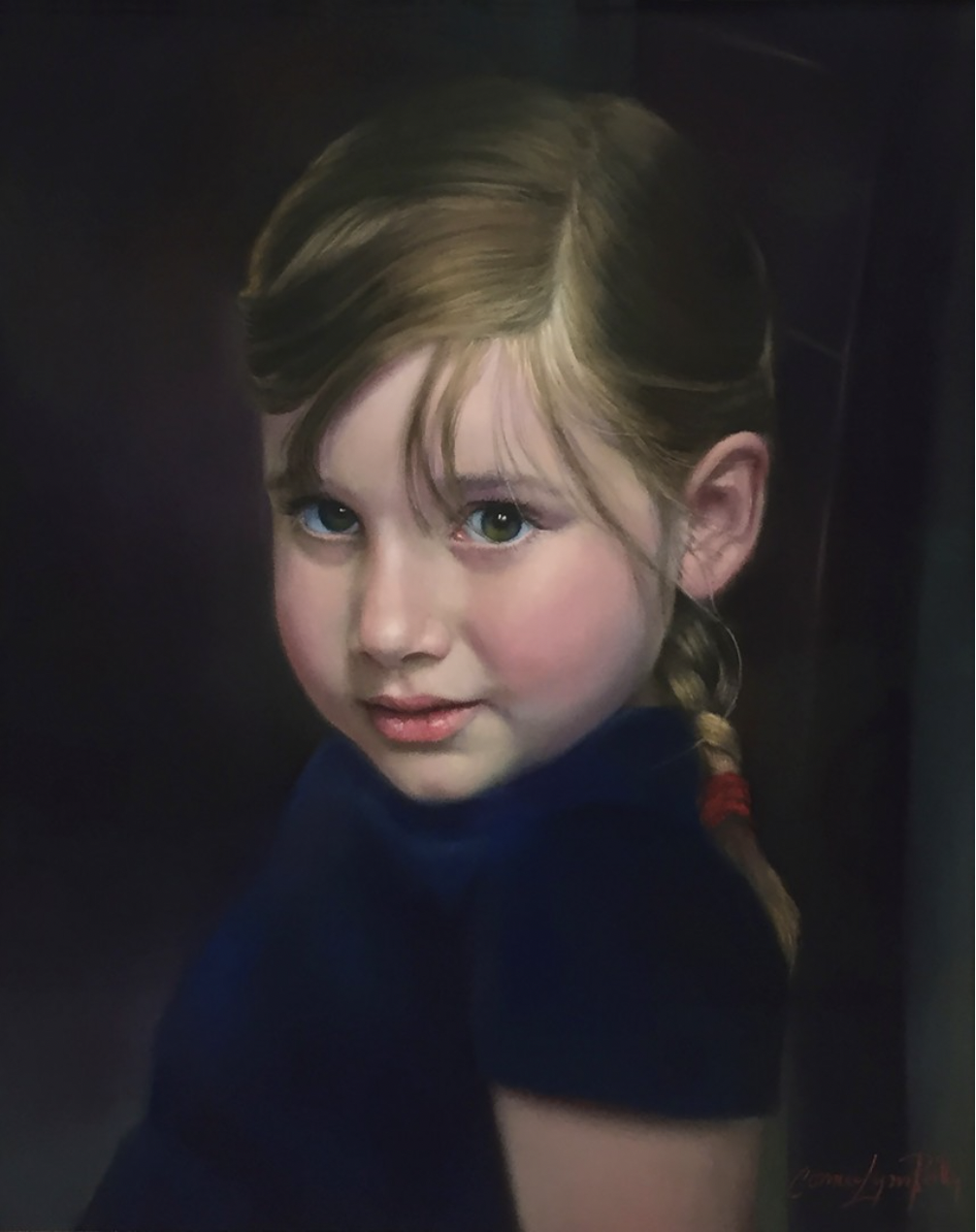
Speaking of a dark background, have a look at one of her paintings that made it into the Top 100 selection.
Connie Lynn Reilly had this to say about her win:
“This is my first time entering the PleinAir Competition Figure category. I was very excited when I received the announcement that all 3 of my entries were finalists! Then I was ecstatic to receive the email saying my painting “Melody” had won the “Best Portrait and Figure” category!! Thank you from the bottom of my heart to Lori Putnam and Plein Air Magazine! I feel very honoured to be selected for this award.”
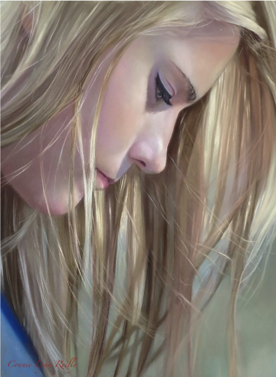
And here’s the other entry that ended up in the Top 100:
“I tell my artist friends and students to keep painting new art and keep entering art competitions. What may not get into one competition may get into another. Put in your 10,000 hours of painting the things you love to paint and success will come to you. Don’t try to paint what is popular or like someone else. Be yourself. Seek places to enter that are in your genre of art and Never, Never give up.”
Words of wisdom. Thank you, Connie and congratulations on your award!!
Check out Connie’s website for more of her work.
Have a look at all the August winners.
Maybe this is YOUR month to win! Make sure to enter before the end of the month!
_______________________________________________________________________
Casey Klahn talks about his Autumn painting
Did you catch my article on Seven Autumn paintings to inspire you? Here’s another Fall painting that gives a different perspective on the season.
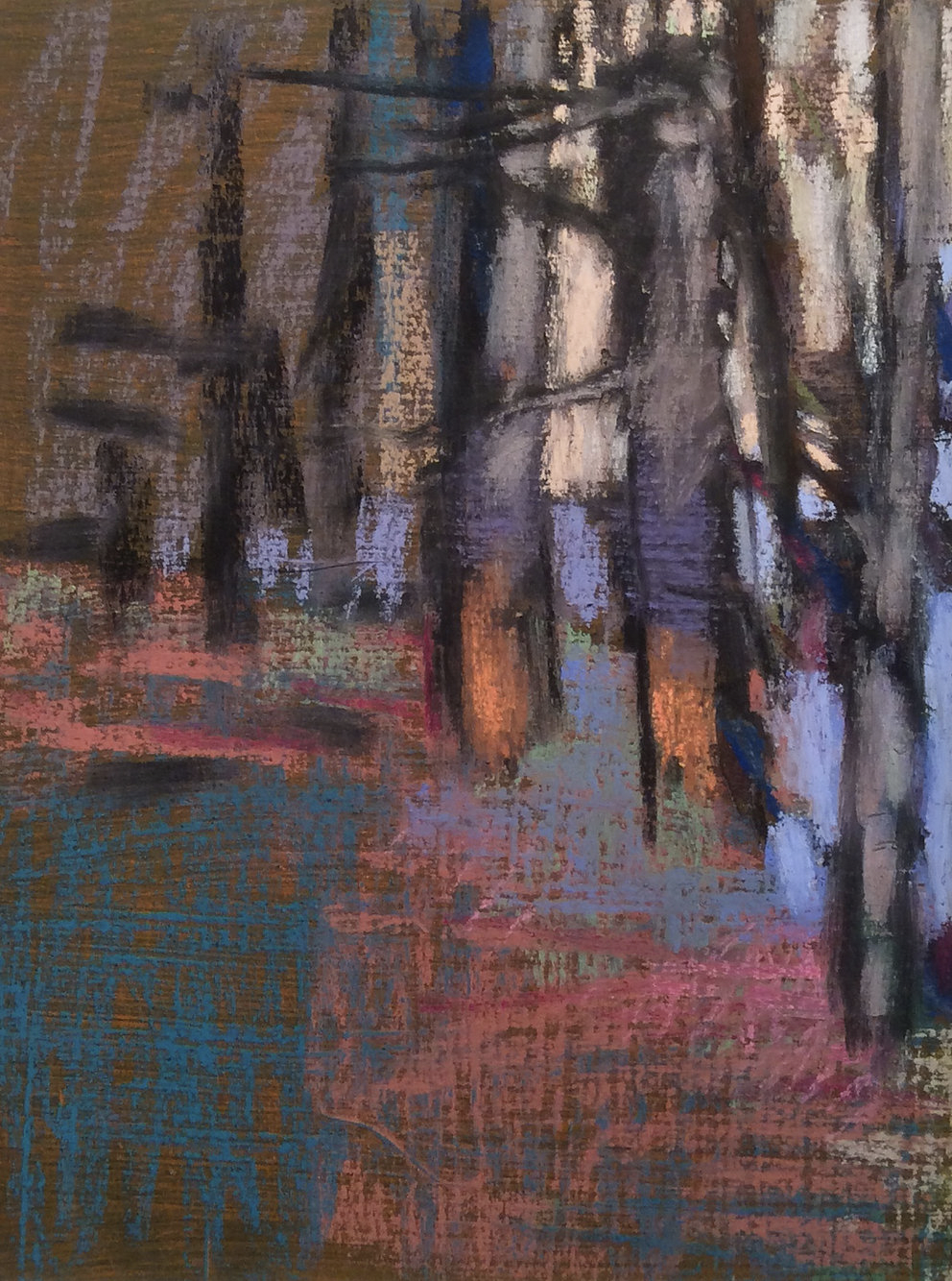
Here’s what Casey Klahn, one of our Advisory members, had to say about his painting. Read on!
- Colour choices
Wolf Kahn said that while orange is a vulgar colour, nature nonetheless gives us an excuse to use it. I think about that often when it’s time to paint Autumn scenes. It’s time for: Orange! In Charlie’s Fall Forest, I found a place to put some seasonal orange, even though it’s an evergreen forest scene.
Other colours include the two other secondaries of green and purple. Also, I used a dusty, dark rose, and a tertiary blue-green, and the pale blue-violet light analogizes with the purples and also contrasts with the umbers and light yellow-orange in the sky.
- Abstracting Autumn scenes
This small work was done using hand-prepared Rives BFK heavyweight paper, and I used a chipper brush to get the laid paper look. This set me up for the raw and natural appearance of a cold October forest. Over time I have learned to make the texture of this surface less rough, but I’m very glad I did make those rough papers because I could get a mood that spoke to the seasonal change.
- Neutrals
Neutrals anchor the Autumn palette because nature is beginning the process of dying; emptying out colours and devolving towards white. I don’t use neutrals (greys and browns) to attenuate the intense colours, instead, I see them for their own potential. Browns have a red phase, or a yellow phase. Add those to blue-grey, olive green, green-grey and low-intensity violets (Mars Violet or aubergine) and you have a harvest basket of low-intensity colours with which to play.”
Thanks Casey!
And that’s it for this time,
Gail

