It’s Friday!! And that means it’s time to put the ONE question to a member of our Advisory Board. Today, we get into what could be called, Colour Theory for Dummies.
We start with a whole new question which is:
What painting or artist—either historical or contemporary — has made the most impact on you? And why or how?
Today, Emma Colbert shares her response. Take it away Emma!
****
“George Seurat’s A Sunday on La Grand Jatte was first seen by the public in the eighth and final Impressionist exhibition in 1884. This piece shows pointillism at its best and is impressive when seen in person. But that’s not how I first explored this painting.
Many museums have fantastic websites where you can zoom in on master paintings in super detail. Before I got a chance to visit much art in person, I would sit and explore them in digital form. This painting in particular blew my mind when I looked closely. I would say that it’s by no means my favourite painting in the world, probably not even in my top 10. But it’s maybe had the biggest impact on my work.
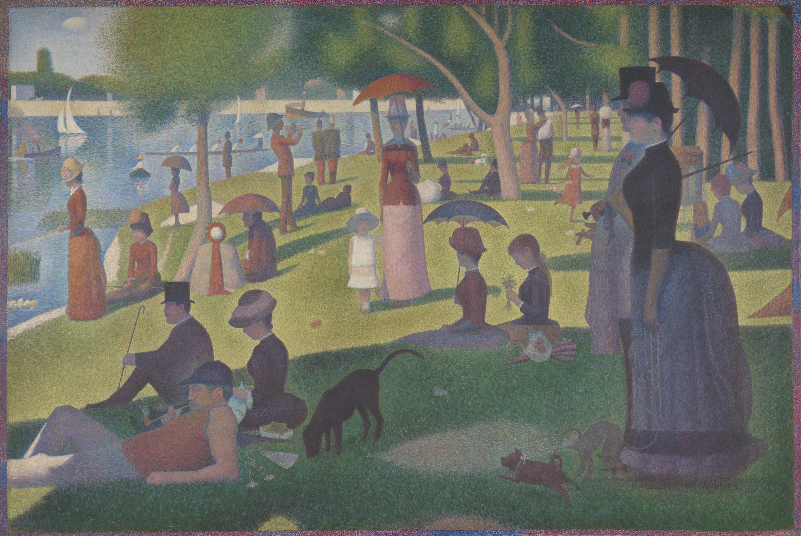
I had tried to educate myself more through documentaries and books but still did not fully understand how I could use colour theory in my work. Because Seurat didn’t mix the colours, but rather placed dots of colour next to each other, it meant I could clearly see how the complementary colours worked together. Light bulb moment! Seurat’s painting was like colour theory for dummies and I finally trusted myself to push and play with colour. I remember sitting with my laptop and this painting zoomed right in, laughing as I found complementary colours dotted everywhere. It was like seeing how a magician’s tricks were done.
Years later I managed to see the painting in person when I visited London and from across the large gallery space, my eyes did the colour mixing. When I got closer I could see the individual colours. It was truly like magic.
All of the Impressionist paintings were an education in colour theory to me. After that moment my relationship with colour changed in my work and although I don’t paint in an Impressionist style, the theory worked in my more realistic style too, be it in a more subtle way.
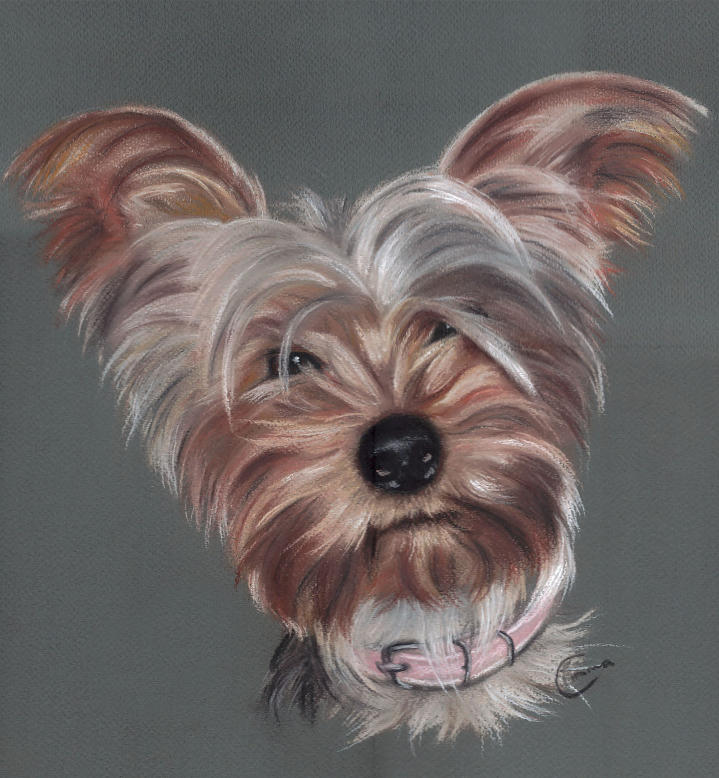
I wanted to share a very old piece from when I had just graduated as an illustrator and was starting my journey into pastel portrait commissions. Here I’m only using browns and greys and it looks rather dull. I’m also using cheap pastels and basic Ingres paper.
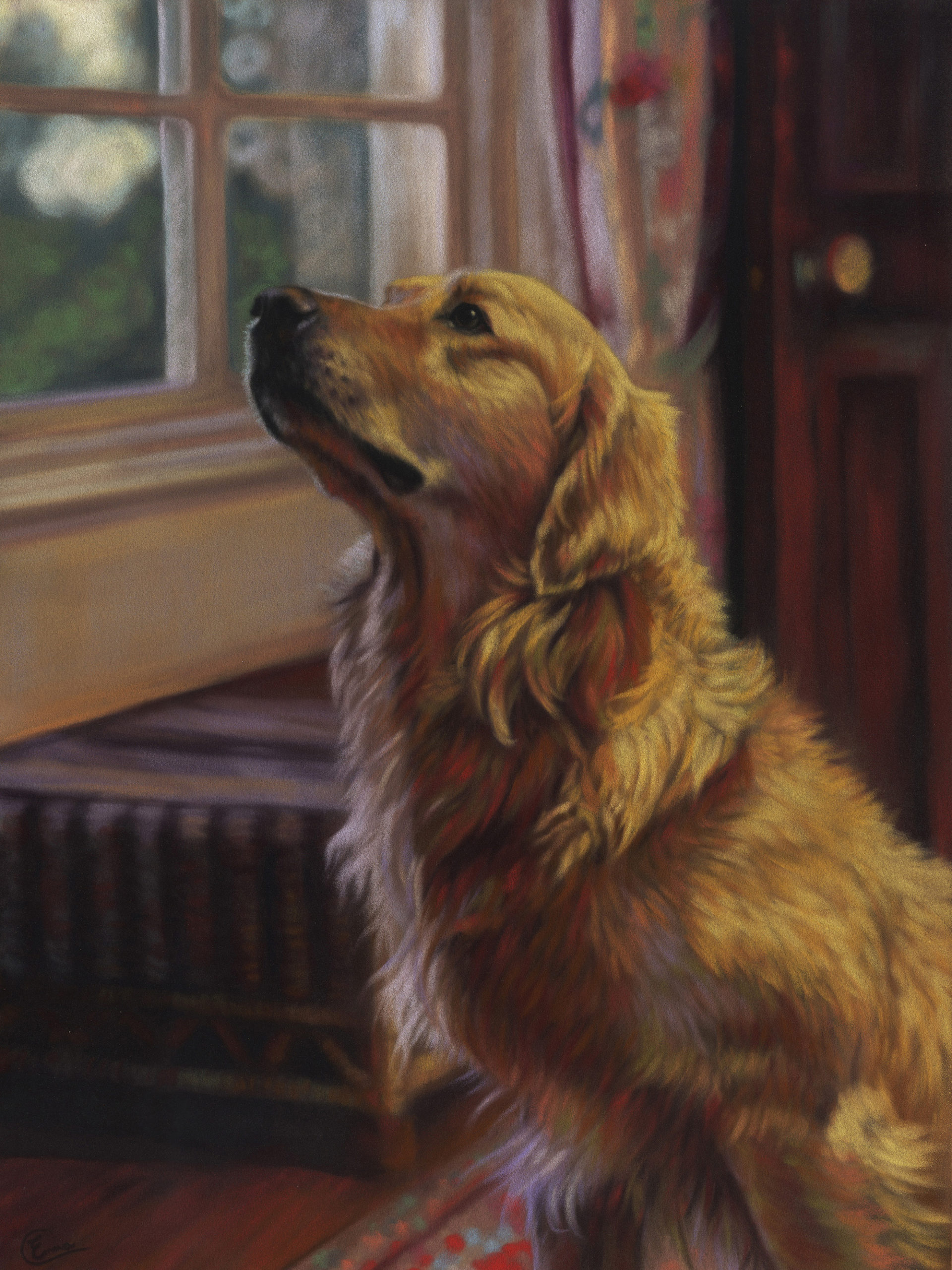
After colour theory clicked with me, I went on a bit of a colour binge like a child in a sweet shop. A lot of my work these days used complementary colours and quite obviously puts separate marks next to each other. I was playing with how far I could push it and still get a realistic outcome. These two were done on Velour paper and with the Unison Colour pastels, I had now invested in.
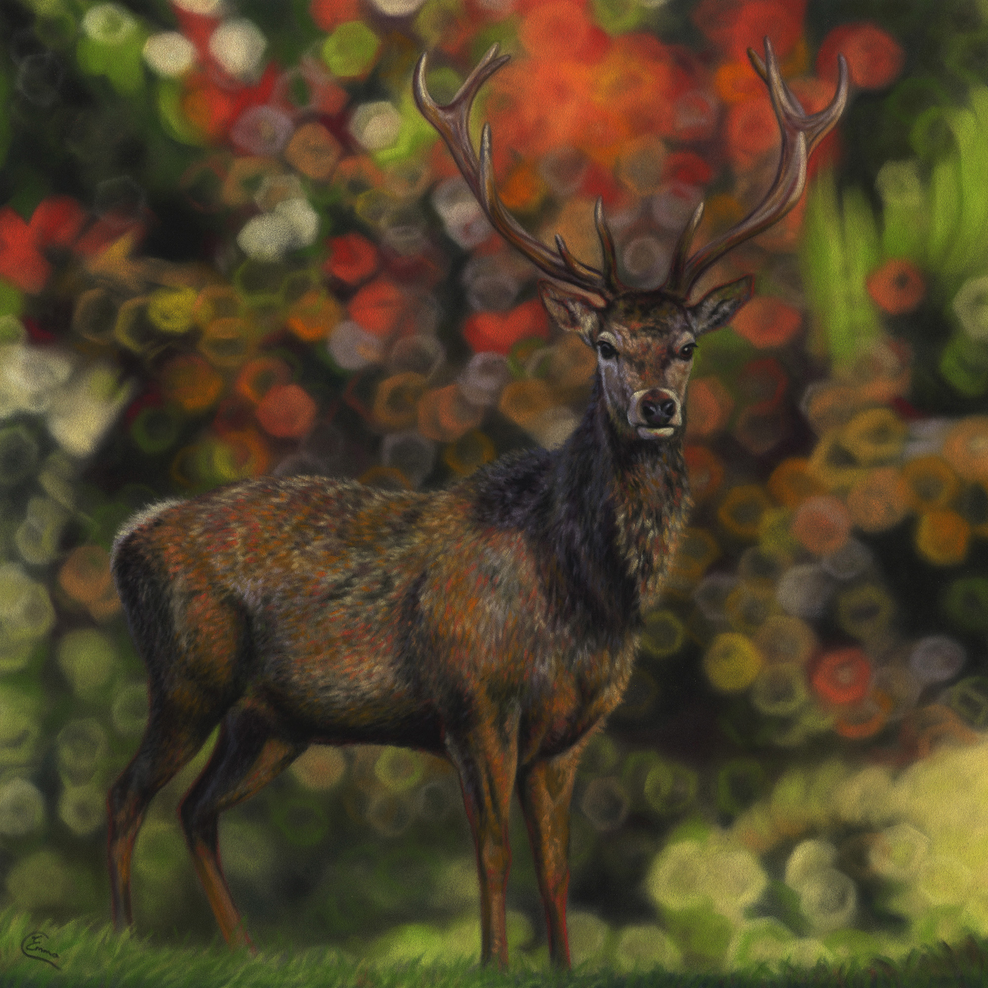
These images are more recent. I’m using different papers in these so my work has a slightly different appearance for that reason. But I’m also using colour theory much more subtly now. It’s the in-between tints and shades where I try to inject those colours now. My favourite colour combination is yellow and purple. You can see that influence in both of these paintings.
There is nothing that has been more influential to my style over the years than the paintings that taught me how to ‘see’ and use colour. And it’s a journey I’m still on!”
~~~~~
Emma, I LOVE that you had a lightbulb moment with Seurat’s painting. And I love the idea of Seurat’s paintings being a place of Colour Theory for Dummies!
Thanks for sharing your journey to colour understanding. I know Pastel Today readers will appreciate hearing how you came to it.
________________________________________________________________________
Don’t miss out on the Scottsdale Art School Auction!
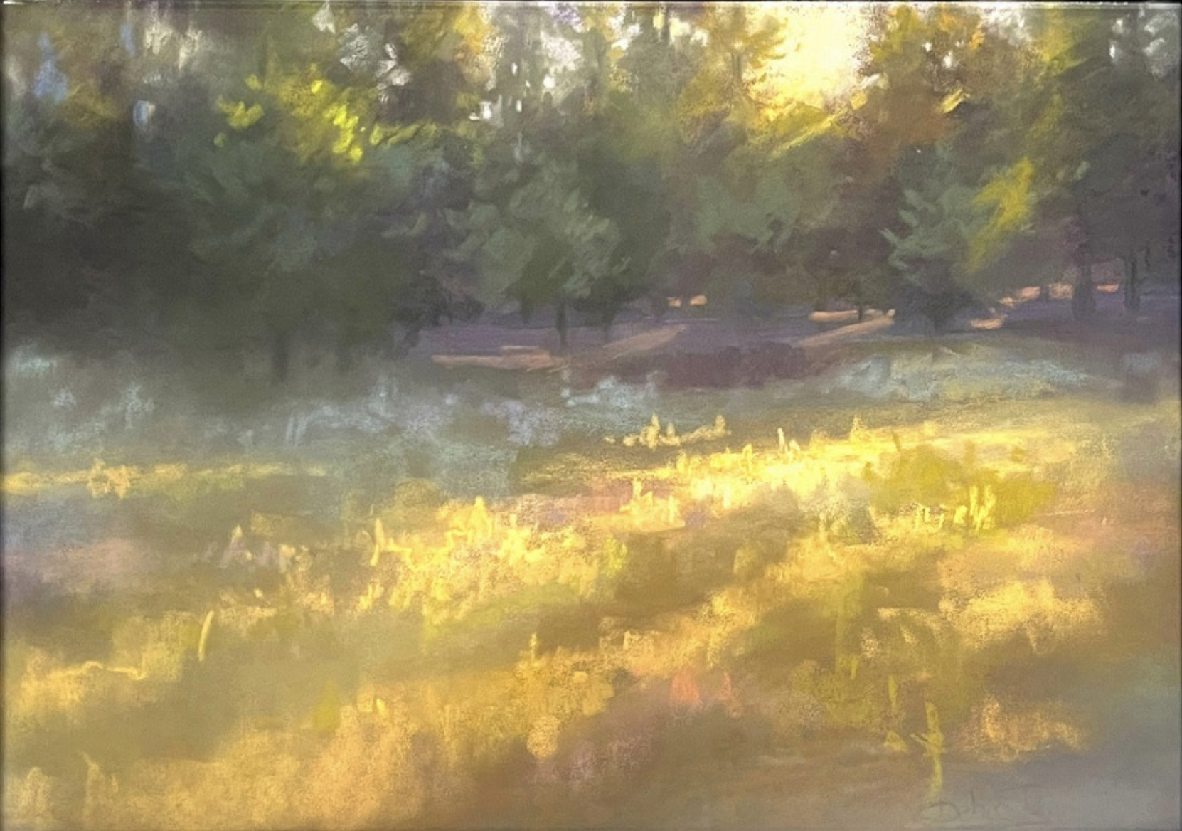
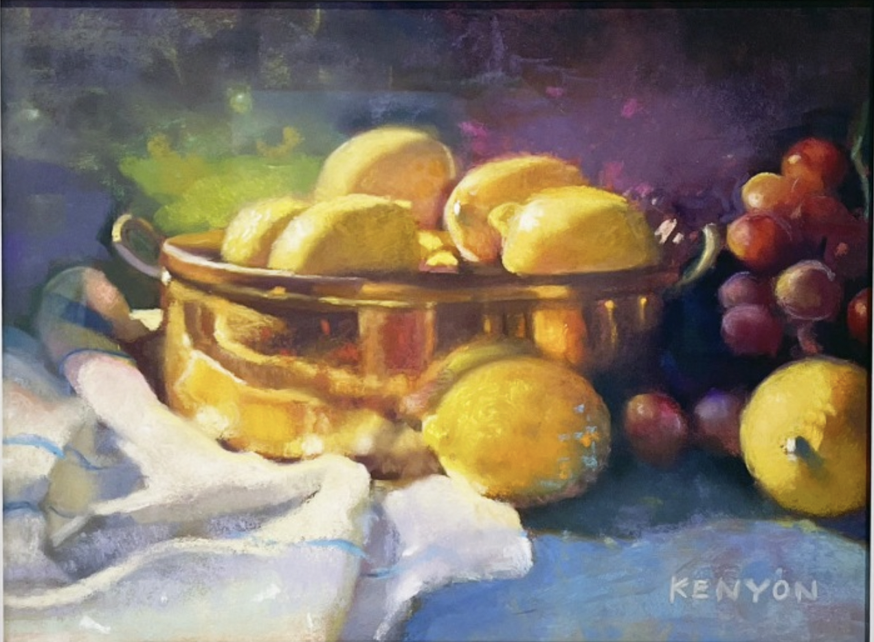
The Scottsdale School is renowned for its art instruction. For those unable to attend classes and workshops without financial assistance, the school has programmes to support them. The proceeds from the School’s annual auction go towards supporting these programmes. There are some FABULOUS pieces up for auction.
You can see all the work available in a flip book on the website (scroll down the page to find it), Even if you’re not interested in bidding, you’ll be inspired!
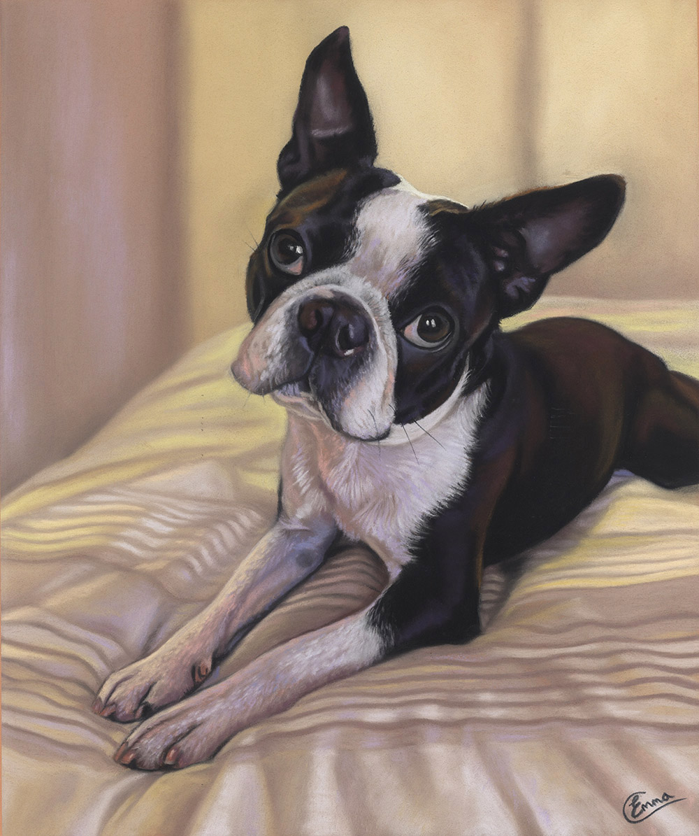
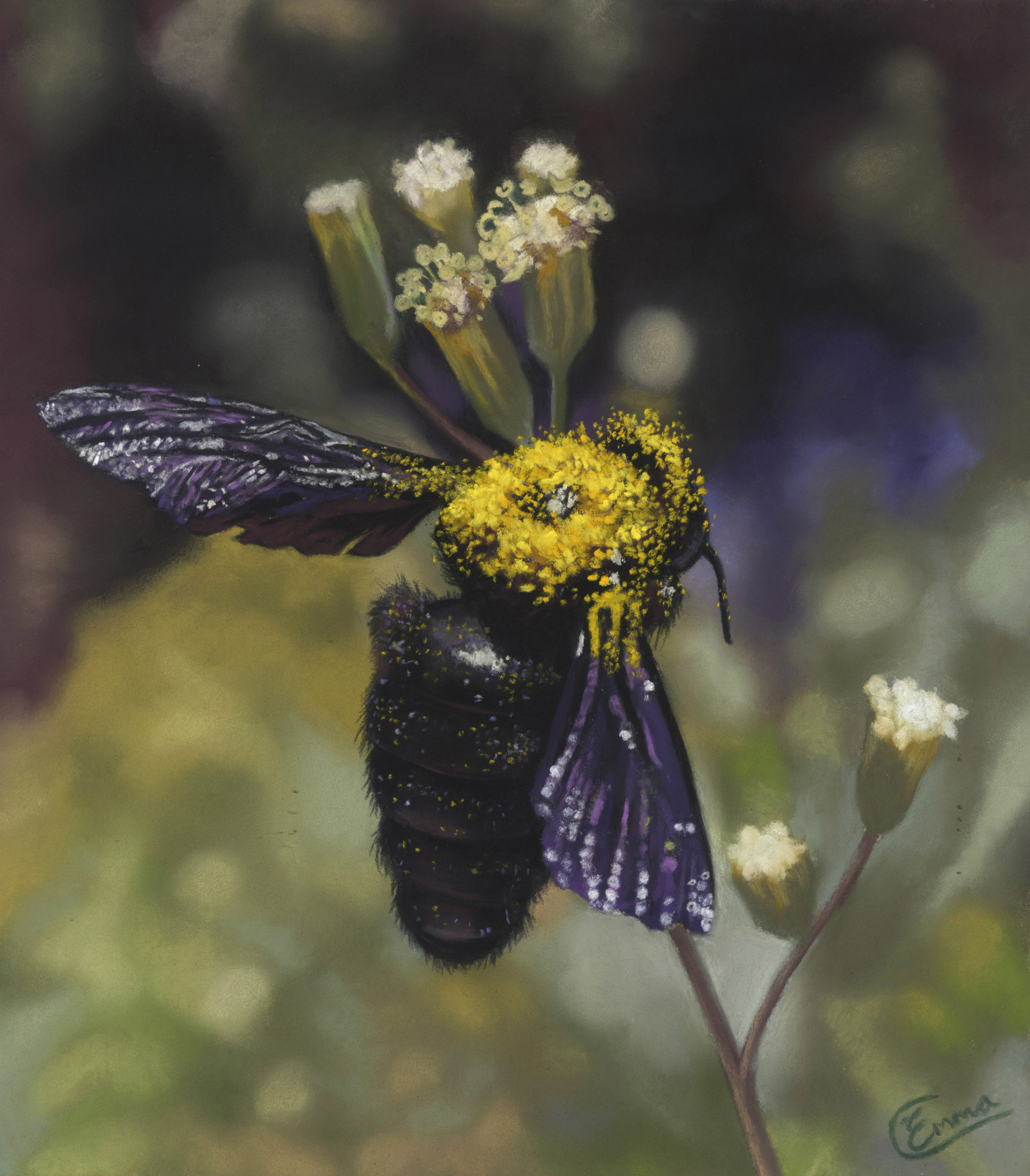
Here are two of the pastels ready for your bids!
And that’s it for this time,
Gail

