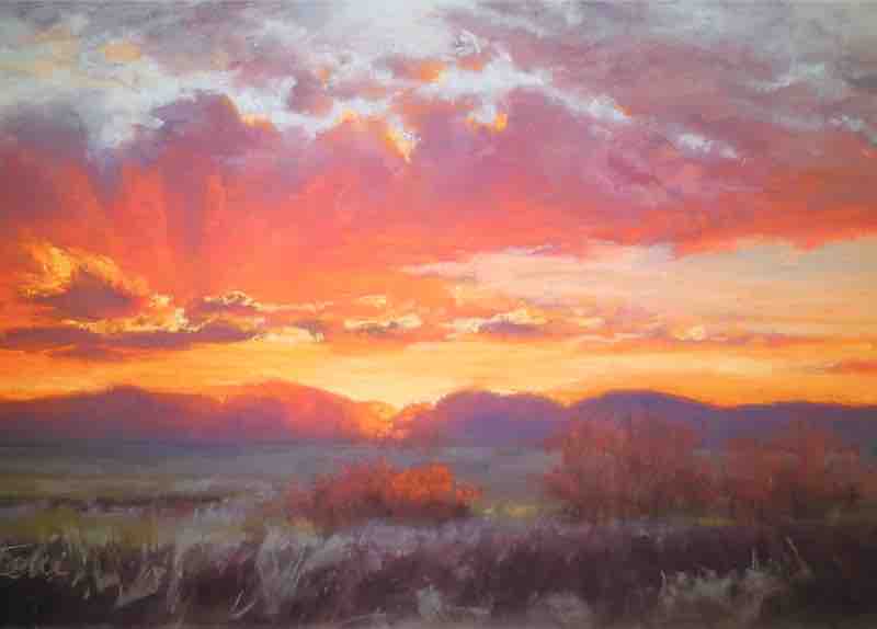
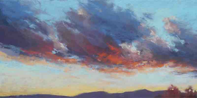
I imagine sunset and sunrise to be a love story between Night and Day. During this mystical, liminal time, I see two lovers coming together and parting, their romance displayed in an endless show of captivating color. In this piece, the sky is a story of their love affair; the earth plane is not as important, serving only as the stage to show off the unfolding passion.
By Tobi Clement
As a plein air artist, I have a love-struggle relationship with painting skies. All the aspects I love about them — the ever-changing cloud shapes and formations, the dynamic expressions of light, and the endless variety of color and moods — are the same elements that make them a challenge to capture successfully.
Like many artists, when I began painting outdoors I often felt rushed and overwhelmed by the sheer volume of visual information. In time, I relaxed into the process, and my ability to “see” deepened. The joy of painting outside took precedence over my expectation of achieving a “finished” painting. And with this realization, my AHA moment arrived.
I now focus on creating simplified paintings or studies — loose, abbreviated compositional sketches in which I capture the visual notes I want to emphasize in the piece — as well as making a thorough and explorative color story, and taking lots of photographs. This newly defined roadmap for painting en plein air has given me the freedom to take a more spontaneous approach to my work, resulting in dynamic colors, simplified shapes, and bold marks.
PASTEL TUTORIAL | CAPTURING THE MAGIC OF THE MOMENT
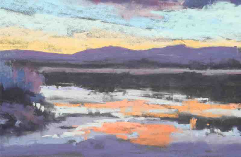
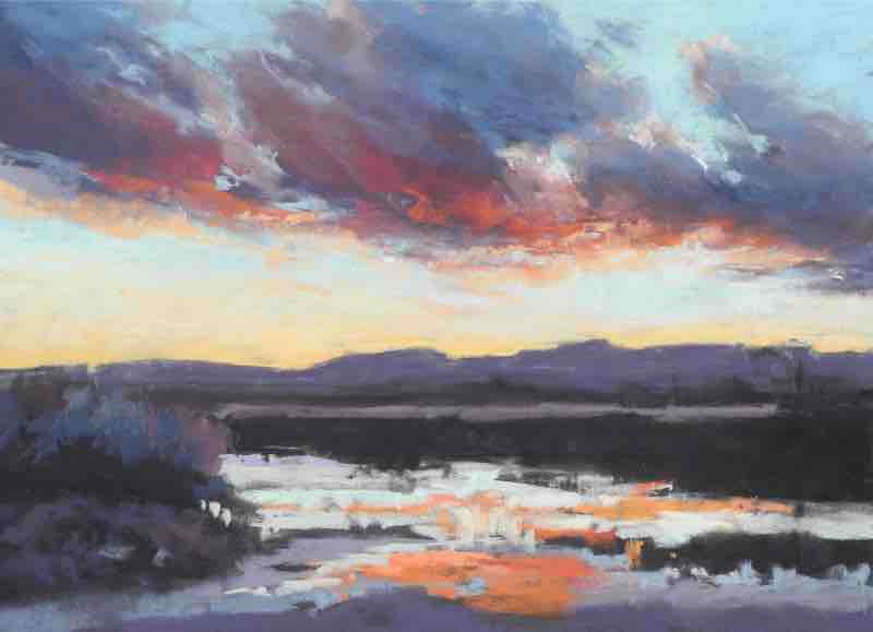
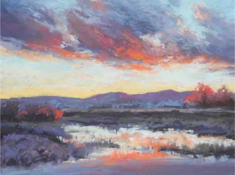
Views of the Scene
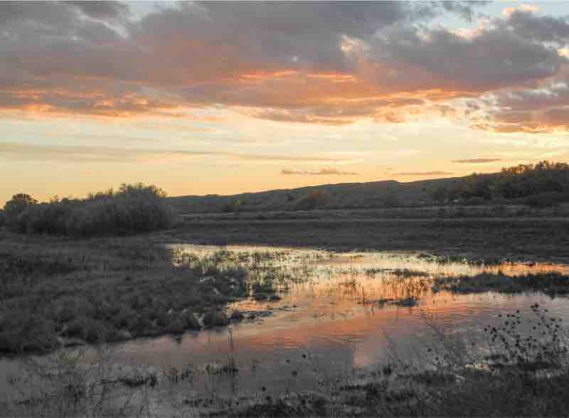
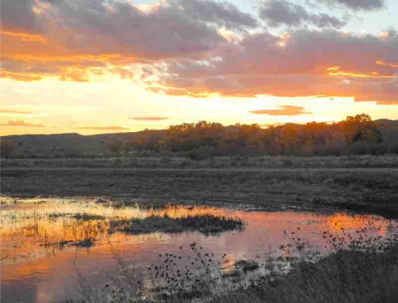
I spend a lot of time painting in the Bosque del Apache Wildlife Refuge, so I know how quickly a scene can change. To be ready for the sunset, I choose my painting location the day before and allow myself ample time to set up. The abstract colors and patterns of the clouds’ reflections in the water grab my attention so I choose to make this the focus of my study. The second photo (below) demonstrates how the light changes dramatically as the sunset evolves. I opt to stick with the diffused light that I saw at the beginning of the sunset, even though more vibrant light and colors continue to emerge.
Step 1
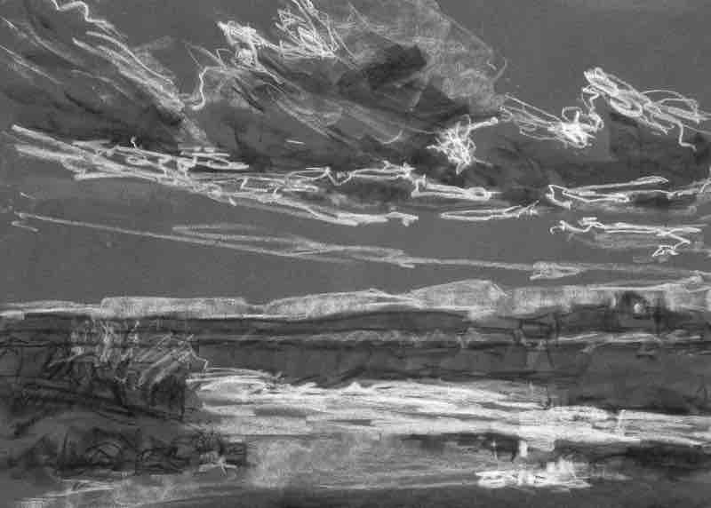
Because the sky changes so quickly, I don’t take the time to work out an overly detailed value study in a sketchbook. Instead, I use four values of Prismacolor NuPastels — black, white, 219-P, and 239-P — to work out a basic value and composition sketch directly on my pastel paper. I always work on a dark paper (Clairefontaine Pastelmat in anthracite), as I appreciate seeing the richness and subtle undertones of pure pigment on dark paper. Because it’s only a sketch, I’m not concerned with it being perfect. I use it as an opportunity to note the interesting shapes, patterns, and value shifts before the light changes. At the same time, I make a mental note of the overall mood that I want to convey. The value sketch and my memory will help me stay focused throughout the study.
Step 2
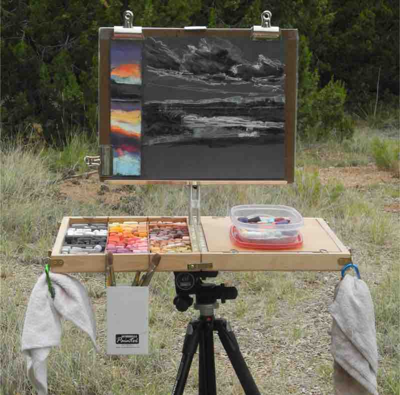
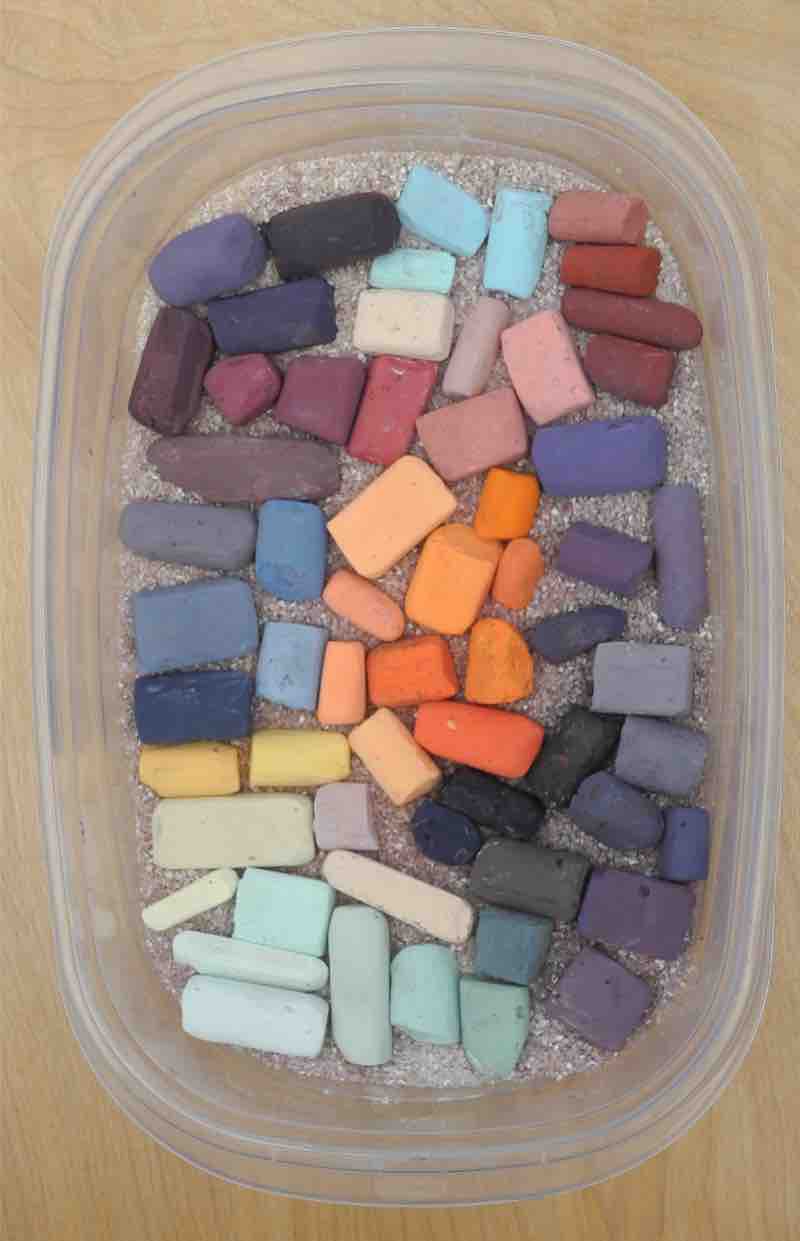
I select a palette of colors, then work quickly in space I left to the side of my value sketch to create a harmonious color story that connects the sky and earth planes — again, I work directly on my pastel paper. (I’ve also left space along the bottom for testing colors and marks in following stages.) I start with strong colors for the first layers, knowing that as I build layers my colors will become more subtle. I try to imagine the colors that are behind what I am actually seeing and build those big shape colors back to front. I also consider the colors that are in the sky and how they impact the earth plane. I gather the selected pastels into a small Rubbermaid container and arrange them in the order that I am going to apply them. Corn grits keep the pastels clean and protected. When it’s time to go home, I tuck the container into my backpack and the colors are ready to go when I return to the piece back in my studio.
Step 3
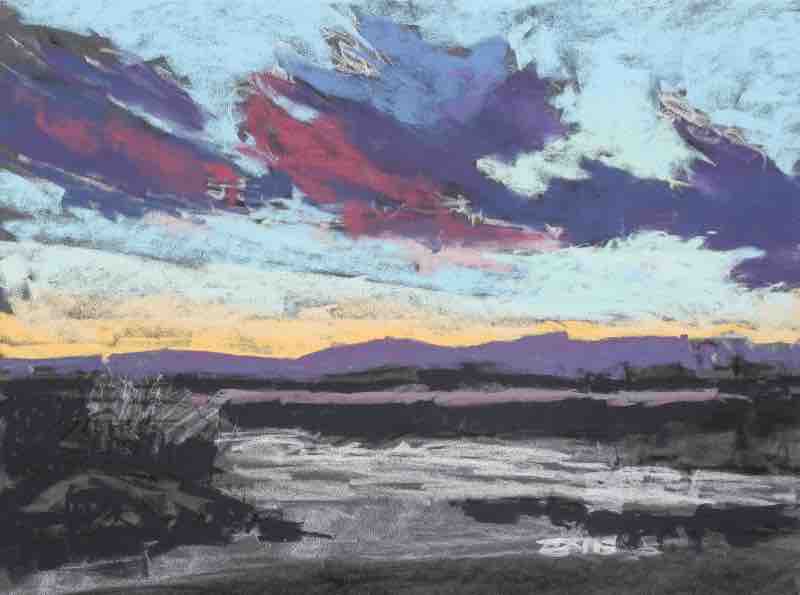
Turning back to the value sketch, I move from the top to the bottom, blocking in the large cloud shapes and working the layers back to front with my pre-selected pastels. Not all of the colors I’m putting in at this stage will be seen in the finished work, but they will have an impact on those in subsequent layers nevertheless. For example, even though I may only leave a bit of dark color peeking through in an area, I’ll need it as a visual reference when determining the values of the layers that follow. This process is not about choosing individual colors in isolation; rather it’s about determining the relationship of all the colors and how they’ll work together.
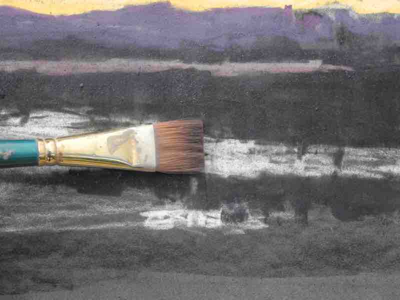
Step 4
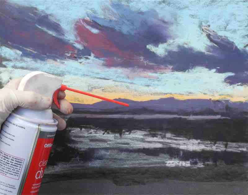
Pastel dust sometimes falls to the bottom of the painting, muddying the colors and filling up the paper’s tooth. If this happens, I use canned air to blow off the excess particles so that the surface can receive clean layers of pastels.
Step 5
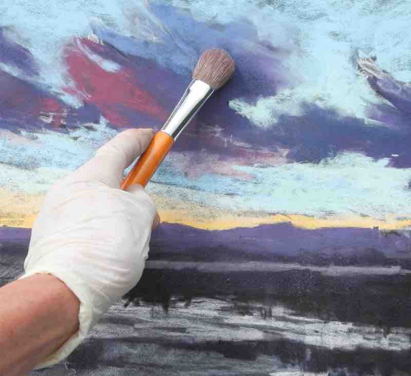
I like to use brushes to manipulate the pastel on the paper. A soft round works for softening and pushing the pastel into the surface, or for gently merging layers together. Flats can be used to create brush marks, as well as soften edges. One advantage of using this paper is its smooth surface, which can hold many layers of pastel without beating up the brushes. Once several layers are built up, the pastel can be pushed around like paint.
Step 6
As I build up layers in the cloud forms, I move quickly and allow my energy to be expressed through my mark making. I weave the background sky color in between the cloud forms so that the clouds are an integrated part of the sky, then finish up with the brighter accents of colors. I don’t worry about the details in the earth plane as it’s more important to focus on capturing the excitement of the sky and its unfolding reflections.
Final Step
A plein air study is a roadmap, not the destination. I respect the freshness of what I have painted in the moment and am confident that it captures the visual details and essence of the place. I’ll leave it to my “intellectual artist” side to work out how to make improvements in another painting back in the studio, with my study, color story, and photos for reference.

