Remember how, as a child, you’d lie on the living room floor with crayons and draw bold squiggly lines — free-spirited and imaginative? That joyful, unrestricted feeling is exactly what pastel painting can bring back. In this Art School Live broadcast, artist Aaron Schuerr talks about how pastel lets you reclaim that creative innocence — only with more sophistication and artistic intent.
Getting Started and Choosing Paper
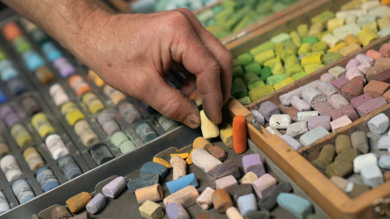
Paper choice is key. Aaron uses PastelMat, mounted securely on a board with spray adhesive. Lightly colored, warm-toned pastel paper adds subtle depth without harsh contrast — perfect for plein‑air portability and studio use alike.
Composition Practice
Aaron breaks down how to move from a plein-air sketch to a studio composition: balancing verticals, horizontals, and diagonals in a harmonious puzzle. He uses landscape elements like cliff faces, flowing rivers, and framing trees to lead the eye and build intimacy.
Working with Color & Tone
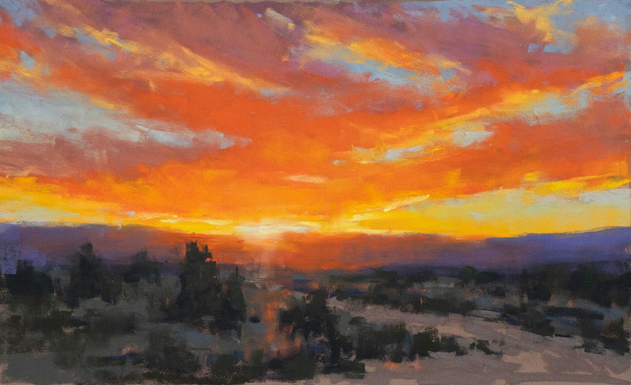
Pastel is all about layering gently, starting with middle tones before adding darks and highlights. Aaron stresses temperature shifts — cooler, lighter tones recede, while warmer, darker forms advance — maintaining visual cohesion across distance.
Overcoming Challenges
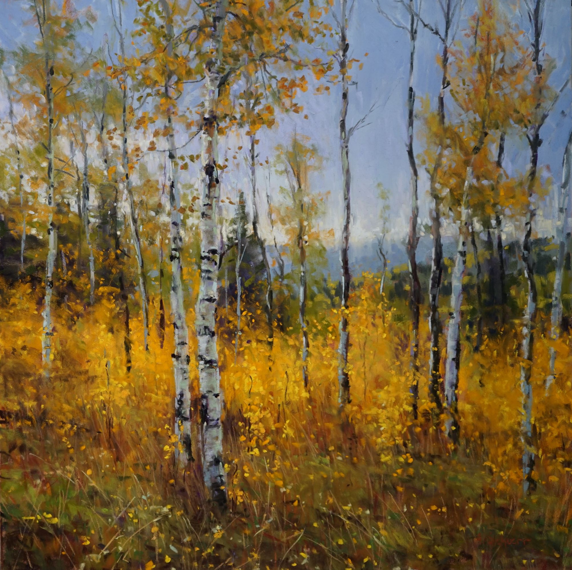
Aaron demonstrates grouping distant trees to maintain unity and prevent value confusion. A limited palette helps maintain harmony, while careful value relationships prevent visual overload.
Finishing Touches and Fixatives
In the final stages, Aaron suggests light stroke refinement and leaving areas of paper visible for vibrancy. He also advises cautious use of fixatives — experimenting to avoid dulling luminous color.
Why It Matters
Schuerr reminds us that pastel painting isn’t just about the finished product — it’s about reconnecting with your creative joy. Whether you’re a seasoned artist or a beginner, pastel lets you play and reconnect with the pure pleasure of making art.


Great tips! Gorgeous pastel paintings! Thank you! I have been inspired!!!