It’s Friday so it’s time to ask “the” question to another Advisory Board member. This time it’s Nancie King Mertz who’s on stage. (We started last week with Albert Handell. Read his response here.)
Here’s the question:
What pastel stick (colour and brand) can you not do without? Why is it so important to have it in your palette?
Nancie’s answer?
“I use the Richeson brand, specifically the 4 Signature sets they had me select. All are numbered, not named, so ANY of the very dark pigments I can not do without.”
Hah hah. You’re not getting off that easily Nancie! I asked again:
Nancie, if you had to pick ONE stick, which would it be?
“There are a couple of my Richeson darks I can’t live without – a very dark green that is good for foreground shadows in the landscape. The greyed purple is good for shadows in the middle ground to cool and recede them a bit.”
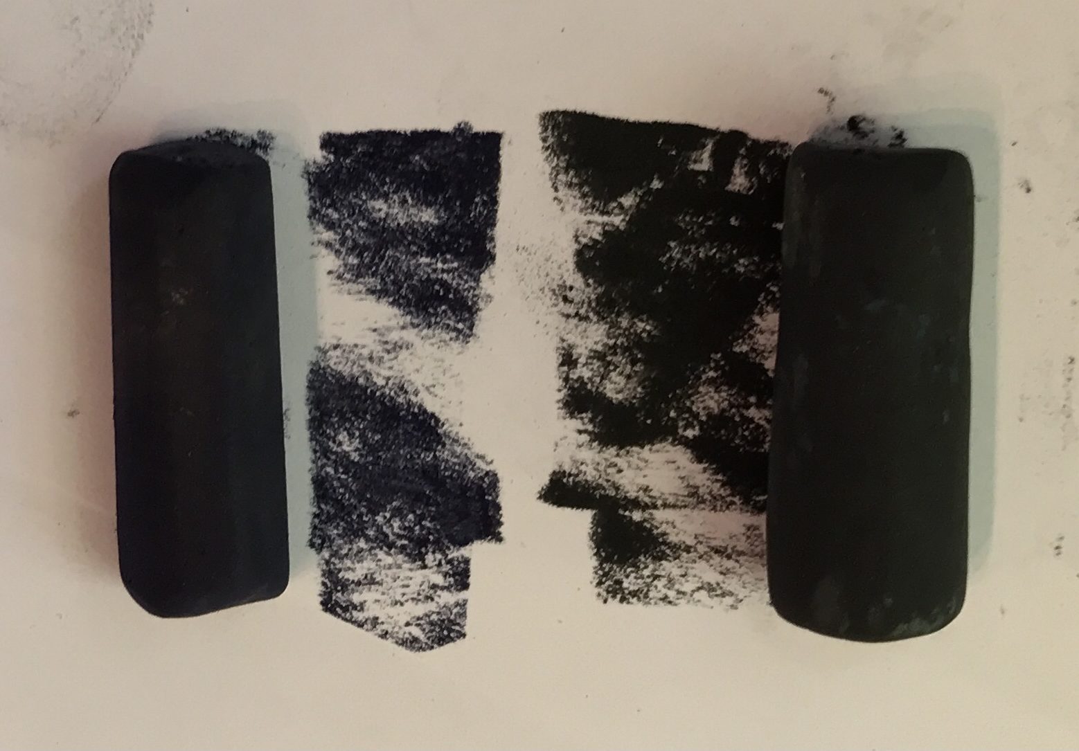
Gail: So why are they so important?
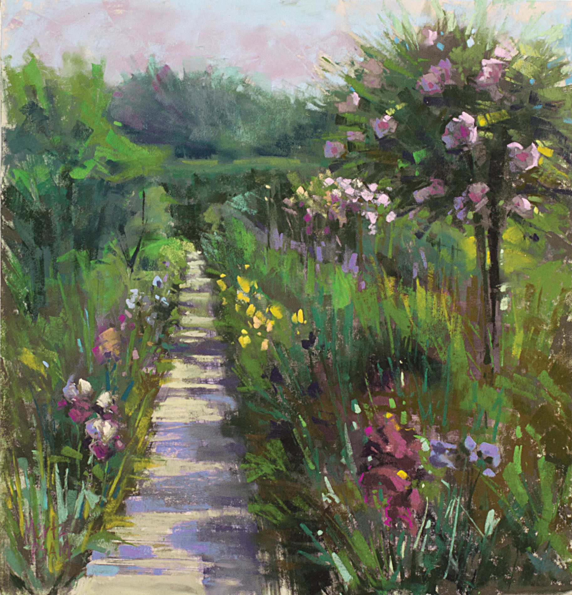
Nancie: “I try not to use the darks in the background in the final stages of my painting as strong contrast in the background can make the distance pop forward. My underpainting that consists of darks washed into the surface with denatured alcohol, tends to be rather dark to start overall, but then the dark in the distance becomes a minor once I start building with the mid-tones. Best to use mid-tone or greyed values in the distance to achieve atmospheric perspective. I save my lights for last, as dessert!
I feel it’s important to include a full value range in my work to give a strong sense of space and define important elements and where they are placed in that space. One of my students did not have a good selection of darks in her pastel box and after a plein air session exclaimed: ‘My painting is lost in mid-tone Hell!’
Gail: You mentioned you have FOUR sets with Richeson. I’m curious! Would you tell us a little more about how you came to select pastels for your sets?
“The IAPS Convention before COVID, I walked into the Richeson booth at the Materials Fair and was handed a box to select 80 pastels that I would use for the Urban landscape. I chose many darks and colours that reminded me of the patina of old bridges and metal structures. I threw in a few options for the abundant plant life around the city too. The selection was a hit so they had me choose an Atmospheric Landscape set of 80 that has natural-looking greens and muted tones for the distance. For this selection, they shipped all 500 sticks to my studio for me to test and compare.
In the winter of 2020, they again shipped all 500 sticks for me to select two Coastal sets of 80: a Lush Coastal Foliage and a Stunning Skies & Water set. I was headed to Georgia (USA) to teach a workshop and then to the Panhandle of Florida to teach at Plein Air South and also do the 10-day invitational Plein Air Forgotten Coast event. We were just sliding into the Pandemic so we had to return home with the car still full of the new pastel sets! They have, however, been very popular since, as the wide variety of greens in the Foliage set and the bright sunset colours in the Skies & Water provided a full range of the colours often missing from sets. I ship the four sets regularly from my studio and they are what I use in my studio, demos on Zoom, workshops, and Plein air sessions.
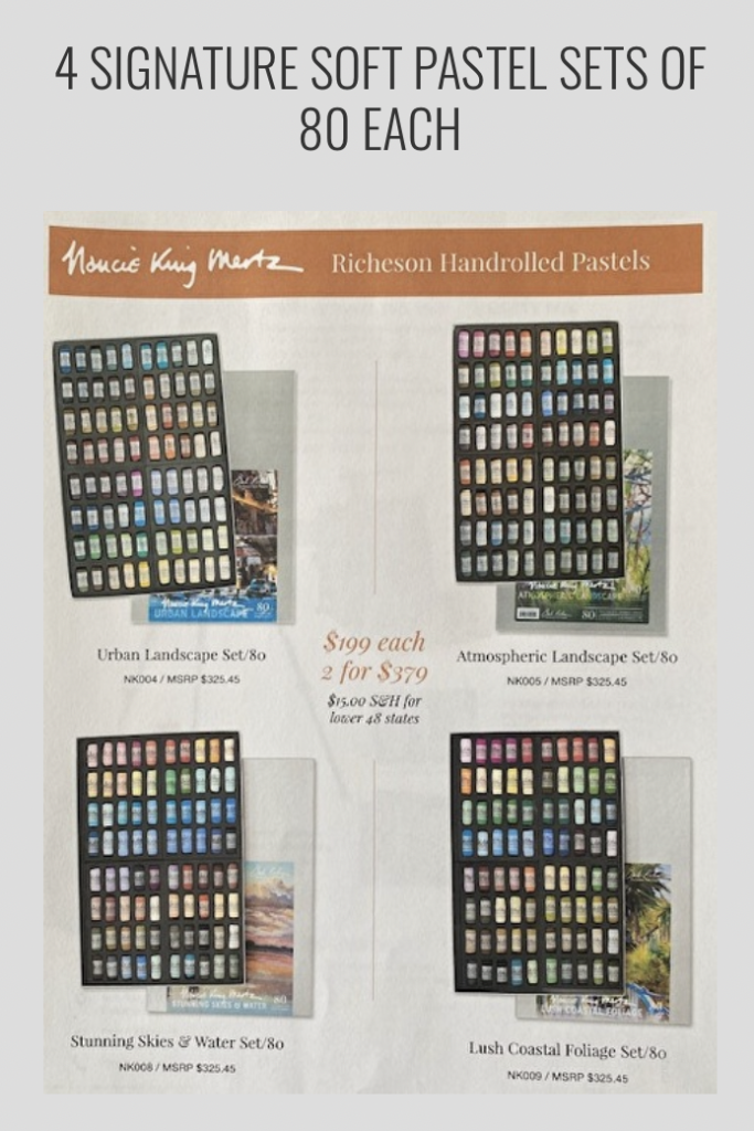
All sticks have had the papers removed, as I use the side of the stick like a brush, rather than the tip, so technically, I never know what colour I’m using but I keep my box somewhat organized by value so that I can “grab and go.”
A huge thank you to Nancie!
By the way, Nancie and two other top pastellists will be joining me for a webinar on Wednesday where we’ll discuss ways to uplevel your pastel painting. Click here to learn more.
All for now,
Gail
PS. Nancie has a video on painting a complex urban scene. It’s fascinating to see the piece come to life!! And, she’ll be presenting at the 2nd Annual Pastel Live virtual art conference, August 17-20, 2022 – join us both there when you register now!
_____________________________________________________________________
A Red Rock Walk Through With Dawn Emerson
Ahhhh be inspired AND motivated by this fabulous walk-through with senior juror Dawn Emerson who talks about 18 pieces from the 2022 Red Rock Pastel Society of Nevada Juried Member online Exhibition.

