A few weeks ago, in preparation for an article on painting Autumn, I reached out to the artists of eight pastel paintings I’d gathered. I asked them each to write something about their painting or about painting Autumn in general. When I received Judy Tate’s reply, I knew it was the start of its own article. Why? Because she’d written about the painting in question but also included a more current piece she’d painted with Autumn as the subject. The paintings were so different!
I loved this idea of reviewing one’s work from over the years, especially work of a similar theme, so I asked Judy if she had other earlier pieces on the subject of Autumn. It turns out that yes, she did!
So here’s her article showing how she moved from a more representational style to something more abstracted.
~~~~~
For me, there’s nothing more enjoyable than letting colour tell the story of a painting. And there’s no better way to do that than with the seasons. Of all seasons, Autumn is probably the “easiest” to encapsulate with those well-known combinations of yellows, oranges, and browns. But you can take it so much further. Those flashes of rich red berries, the deepest recesses of the hedgerow in the lushest nearly blacks and purples.
In the UK, we are now surrounded by Autumn and it got me thinking about how this season has inspired me creatively over the years that I’ve been painting. So I took a step back in time and went through my personal archive of paintings. I was quite surprised by “me” and my desire to be more abstract whilst still having a foothold in reality. This may just be how it goes or maybe it’s the way my brain is wired – scientist (by qualification) and artist (by desire) with an ongoing dialogue between the two sides of my brain.
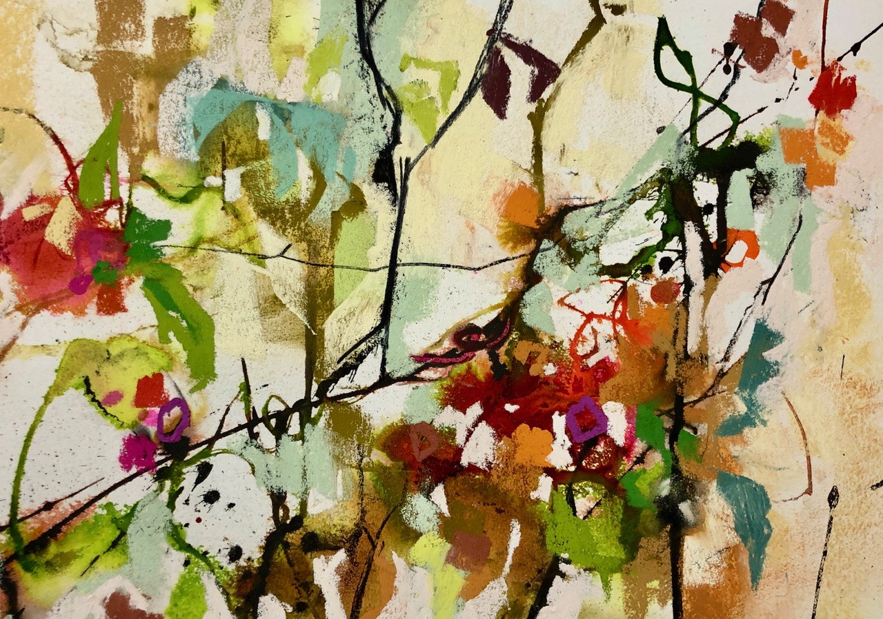
Most recently my interpretation of Autumn has been at its most abstracted with colour telling most of the story. Bold charcoal marks suggesting soft fruit vines with the colour saying the rest.
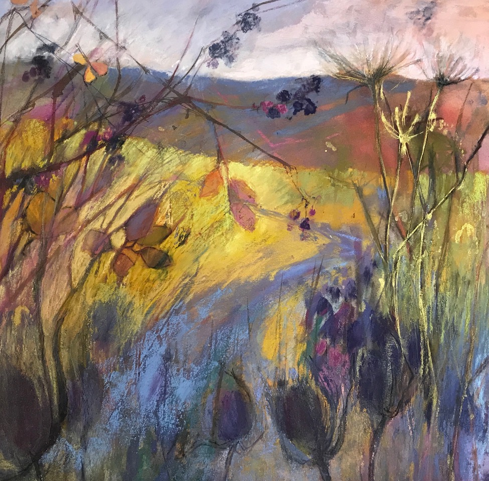
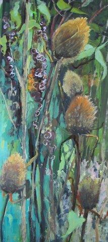
About two years previously, my thoughts about Autumn had been more grounded in an imaginary landscape – again with colour as the giveaway. High contrast of colour and an impression of “things at an end” also help set the scene. A muse which keeps reappearing in my work are the teasles – an Autumn staple.
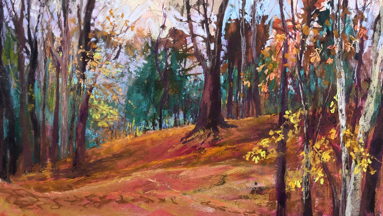
Going back another year and here is a rather traditional scene of an English wood in the Autumn. Some mild abstraction in the foliage and some heightened colour but apart from that, what you see is what you get.
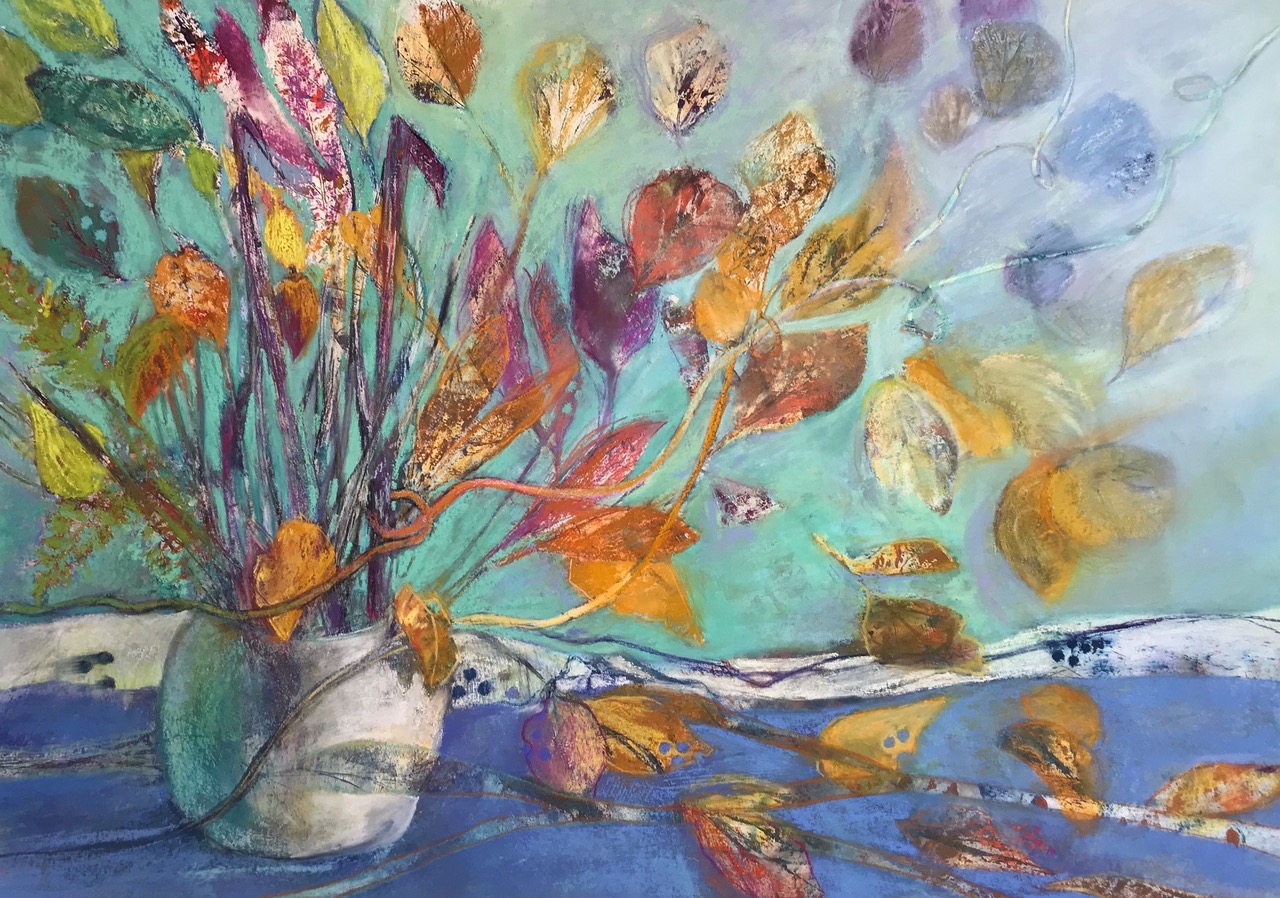
And then a wild card came out of the archive! Here really was the start of my meanderings into more revealing underpaintings – in this case, monoprinting with leaves.
Here’s a whimsical scene about the end of a cycle, the falling of leaves, the passing of time.
And going even further back, probably nine years, ago, a tiny whiff of abstraction. But it’s much more about capturing the actual colours, the actuality of the scene. And yet again, there are those teasles in the front row.
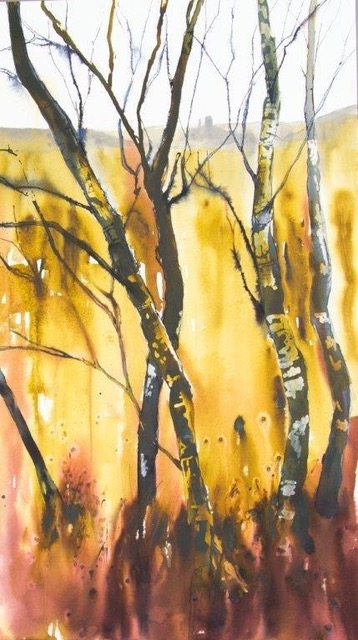
And here’s me before falling in love with soft pastels. A watercolour scene – local to where we used to live. Corfe Castle is in the distance. It was a very familiar view through the birch trees and here, the “only” point of reference to Autumn are the bare branches and the colours.
So many ways to tell my version of events – I had better get back to the easel! In fact what’s sitting next to my easel is my next subject for exploration, hopefully with bold underpainting and even bolder colours. Very Happy Days.
Judy, I LOVED seeing this progression of your way of painting Autumn through the years. It really shows the journey of where you’ve come from and an inkling of where you’re going. Thank you!
Be sure to leave a comment on the blog if Judy’s journey resonates with you!
_______________________________________________________________________
It’s not too late to register for Realism Live!
This incredible 3-day event starts today with Beginner’s Day. Remember, everything is recorded so if you can’t attend live, you can watch the replays. (Although the length of time depends on the level you buy, replays come with every registration.)
Okay, so there’s a dearth of pastel artists but that doesn’t matter. If you’re interested in advancing your knowledge of say drawing or colour theory, make sure you attend Beginner’s Day as Oliver Sin and Sarah Sedgwick will be covering these topics. And our very own pastellist Carol Peebles will be focusing on drawing from life, a skill we all want right?
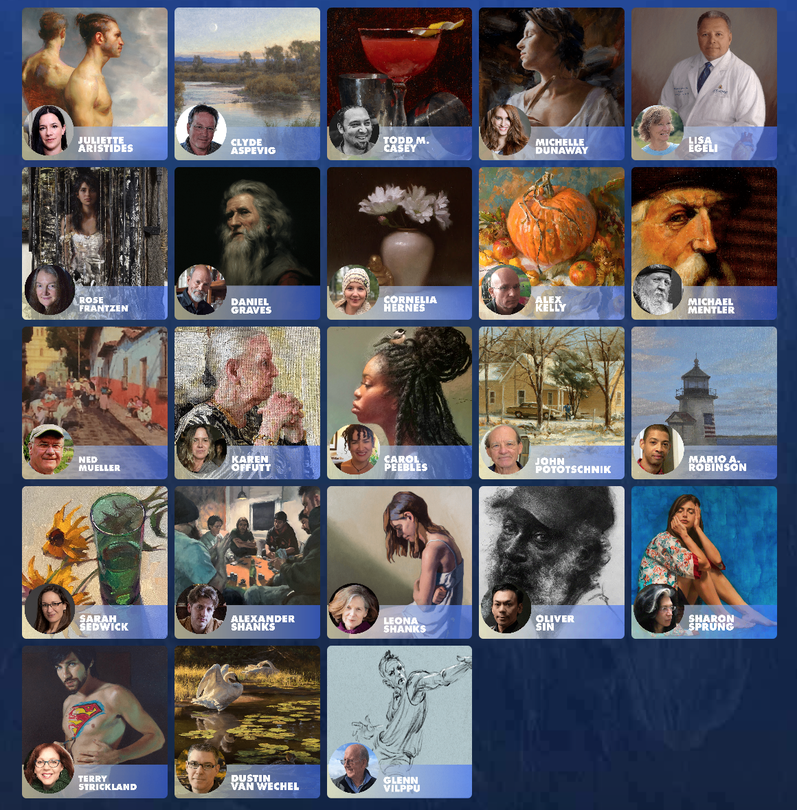
Other artists you may have heard of are Ned Mueller, Michelle Dunaway, John Pototschnik, Mario A. Robinson, Rose Frantzen, Clyde Aspevig, Leona Shanks, and Juliette Aristides (I love her books!). And this is just a handful of the faculty! So much expertise!
If you want to learn about portraits, landscapes, seascapes, still life, the human figure, wild life, you’ll find it at Realism Live!
CLICK HERE to find out the full details and to register!!
And that’s it for this time,
Gail
