It’s Friday and it’s time to ask another of our Advisory Board members the question of the day. Emma Colbert is up and she’s going to talk about choosing a colour palette before starting your piece.
And the question?
Do you have a creative prompt or easy-to-follow exercise that you use in your workshops or classes that you wouldn’t mind sharing?
And here’s Emma to tell us all about choosing a colour palette.
~~~~~
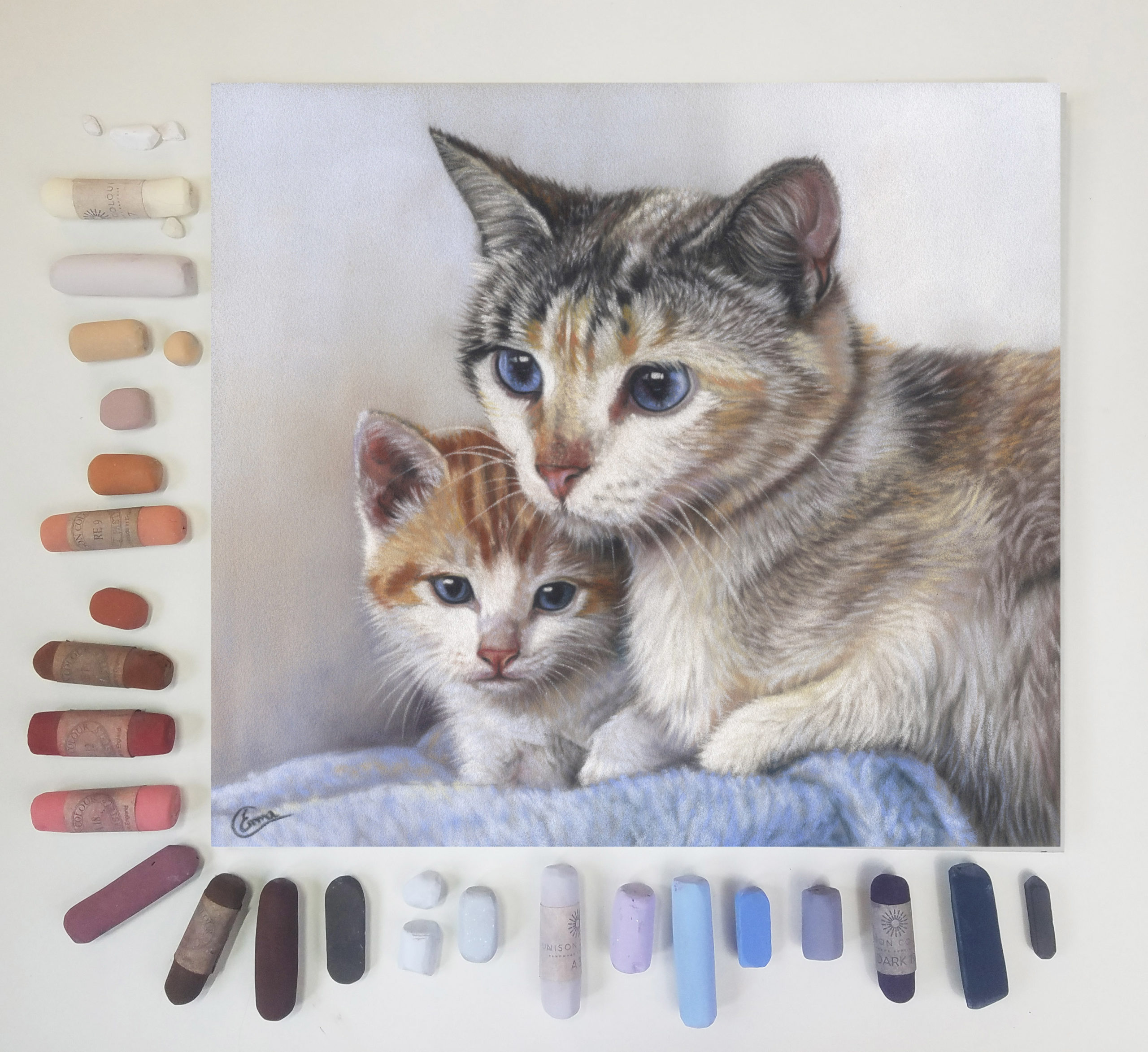
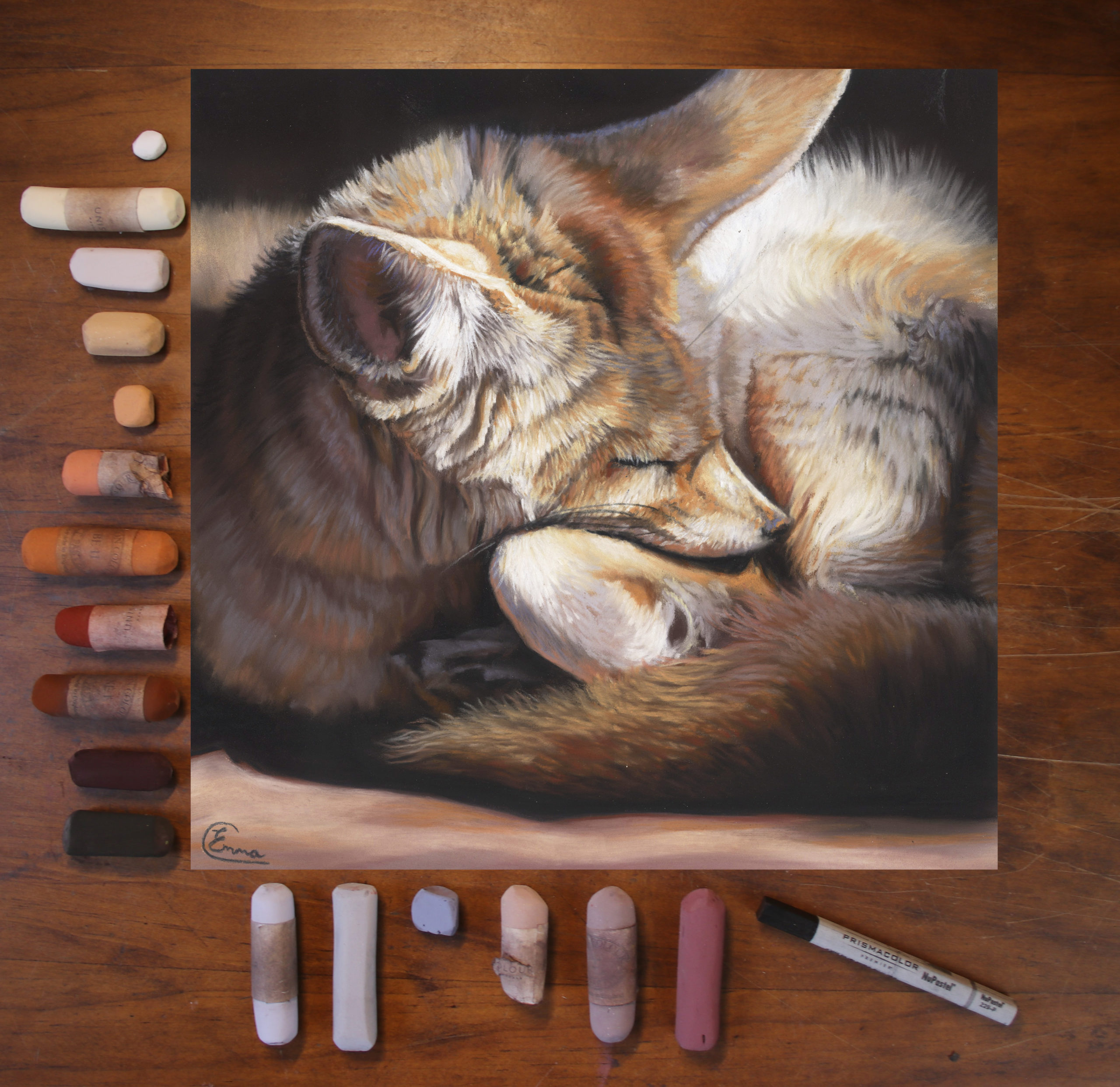
“The one thing I do each and every time I set up a new pastel painting, is to spend time choosing my palette of colours before I start to paint. Rather than just jump in with a couple of colours and then add as I go, I like to spend time thinking about the colour choices and how they might relate to each other in the painting. This creative prompt always helps me get past the blank page syndrome. By spending time analysing my photo reference I start my painting with a clear plan.
There are two main considerations I have when analysing colour. The tonal value – how light or dark the colour is – and colour temperature – how warm or cool the colour appears. That helps me a lot when choosing a colour palette to get started.
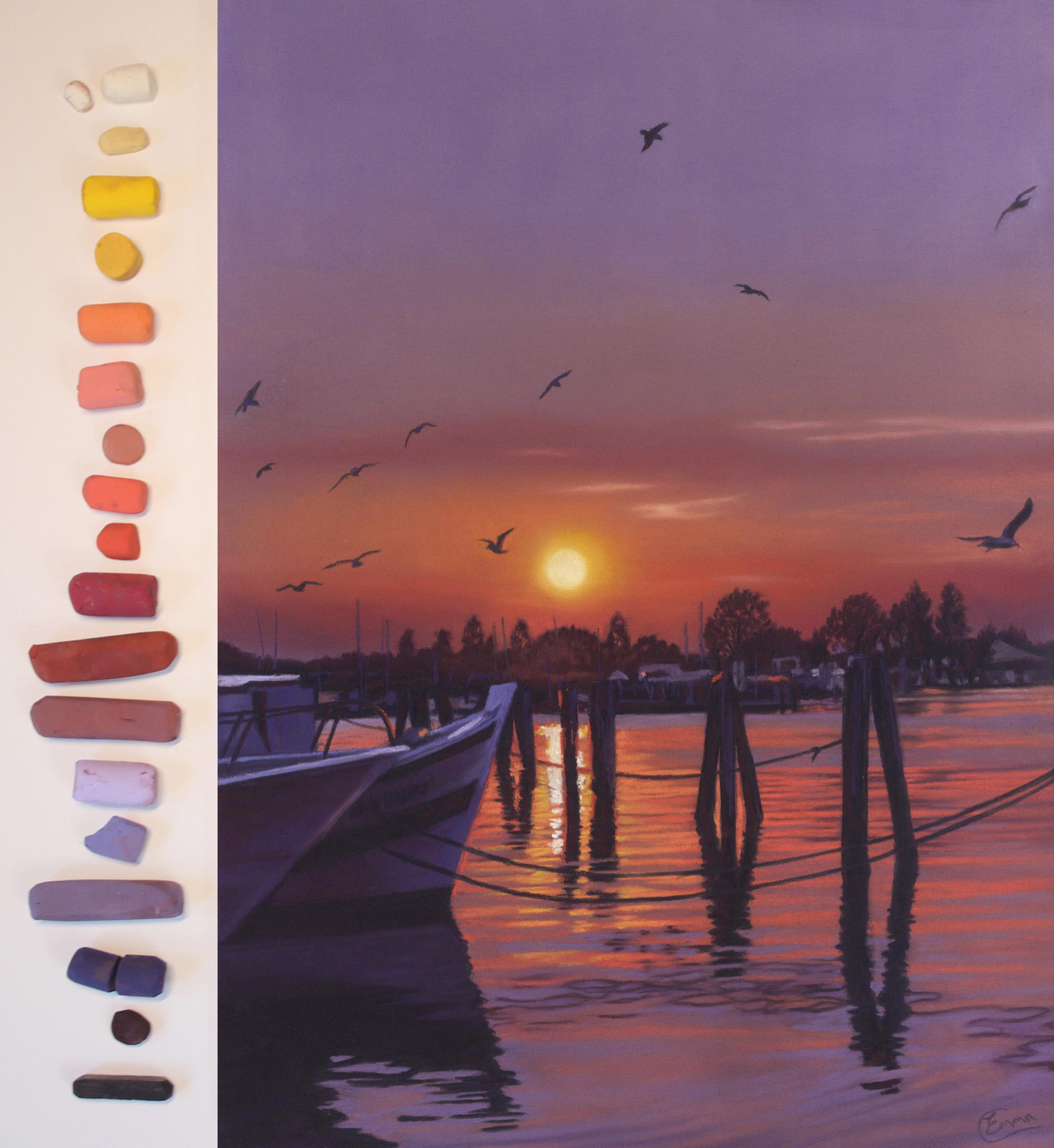
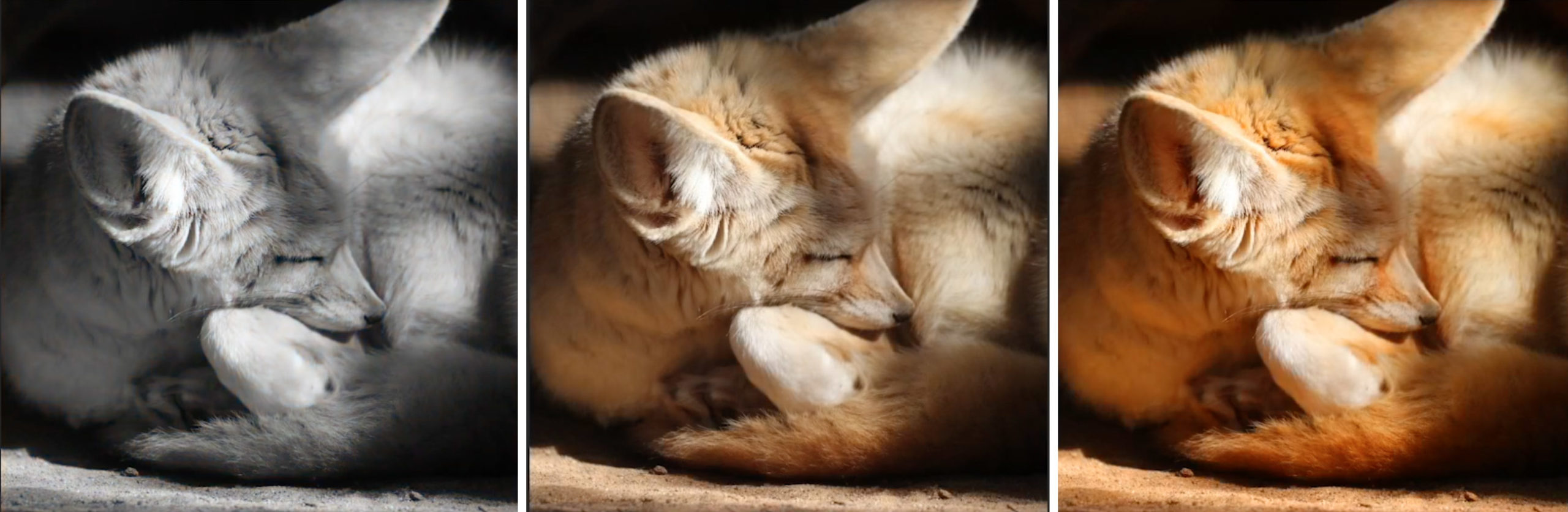
First, I look at my photo reference. Once I have established the direction of light in the reference, I know I need to treat areas of light and shadow differently in order to capture the effect.
When thinking of value, I start with the extremes. What are the darkest and lightest values in the reference? When choosing the mid-tones, I will think about how they differ in the reference between sunlit and shadow areas.
This leads me to colour temperature. A lot of the time when I’m talking about temperature, it will be in relation to the light and shade. Will my brightest warm highlight also work as the brightest highlight in the shadows? Often I need a cooler highlight colour for the shadows.
Perhaps I can bring in some blues or lilacs as complementary opposites.
These are all decisions I will think about from the start and I’m always aiming to include a bit of colour theory to enhance the colour harmony in my work.
If you struggle to see much colour in your photo reference, you can increase the saturation of it to give yourself some ideas on where you can push the colour choices. Alternatively, changing it into greyscale can also help you see more colour in the original.
Before starting to paint, I should have a range of light to dark values in both warm and cool tones. You can see that my palette tends to follow this pattern with the warm tones first from light to dark. Then a cool selection that relates to the warm colours, also shown from light to dark.
Of course, I’ll likely pick up a few extra colours as I progress into the painting. But the more I do this over the years, the better I get at choosing a colour palette that allows me to jump into the painting process with a clear idea.”
*****
Thanks so much to Emma for this jam-packed post on choosing a colour palette before you begin your painting. Emma has a very active YouTube channel. She has several videos on how she incorporates colour theory into her palette, and in each one, she talks about the same formula.
Here’s an example.
________________________________________________________________________
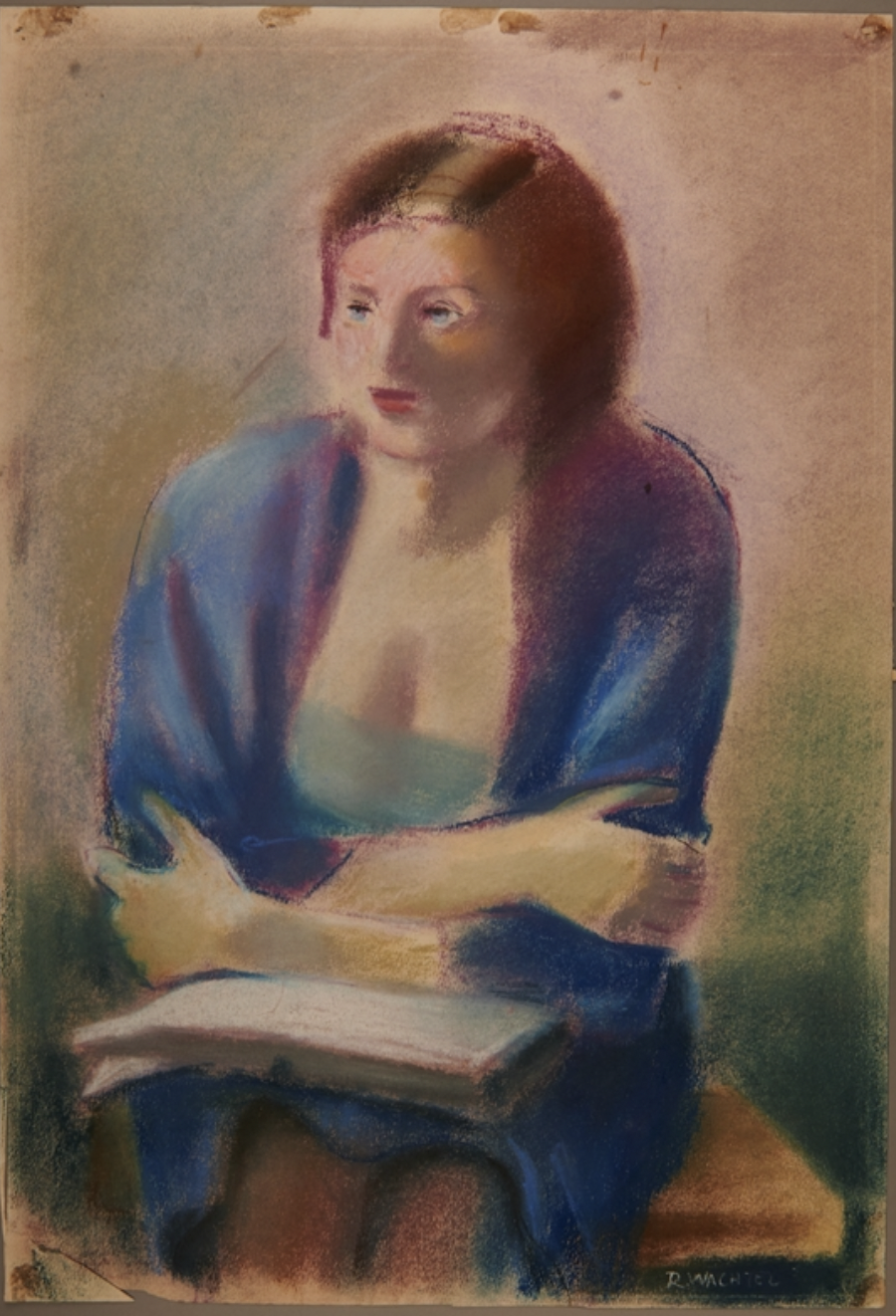
Honouring International Holocaust Remembrance Day
Today is a day to remember the victims of the Holocaust. The 27th of January, marks 78 years since the liberation of the Auschwitz concentration camp. To honour this day of Remembrance, I’ve chosen a pastel painting from the United States Holocaust Memorial Museum.
The artist, Roman Wachtel, fled Vienna with his family in 1938. Unable to get immigration visas, they stayed hidden in an abandoned farm cottage near the village of Ohain, Belgium until the end of the war in 1945. In the next two years, Wachtel repaid the kindness of villagers who protected and fed him and his wife by painting many portraits. Perhaps this sensitive piece is one of those portraits.
And that’s it for this time!
Gail
