We find ourselves on the First Friday in February (couldn’t help myself!) and so it’s time to hear from another of our Advisory Board members answering the current question. Clarence Porter is our guide today and his answer relates to the Fine colour wheel…(Okay, enough with the Fs!)
And you may be wondering, Gail, what’s the question?
Eh voilà!
Do you have a creative prompt or easy-to-follow exercise that you use in your workshops or classes that you wouldn’t mind sharing?
Get ready for Clarence’s answer!
~~~~
Like most instructors, I’m always trying to get participants to move outside their colour comfort zone. I tell them if the values are correct, the colours don’t matter. A good way of shifting out of a colour phobia is to start with the colour wheel.
One assignment I have students do is to produce two different paintings working from one reference image. For each, they choose six colours from the colour wheel. The only stipulation is that the six colours have to be outside the participants’ colour comfort zone.
I have two demos for you.
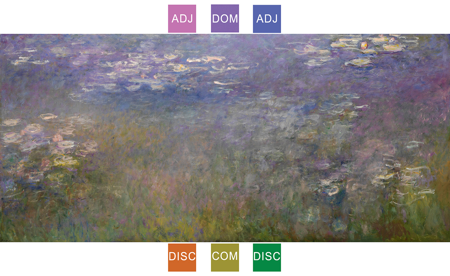
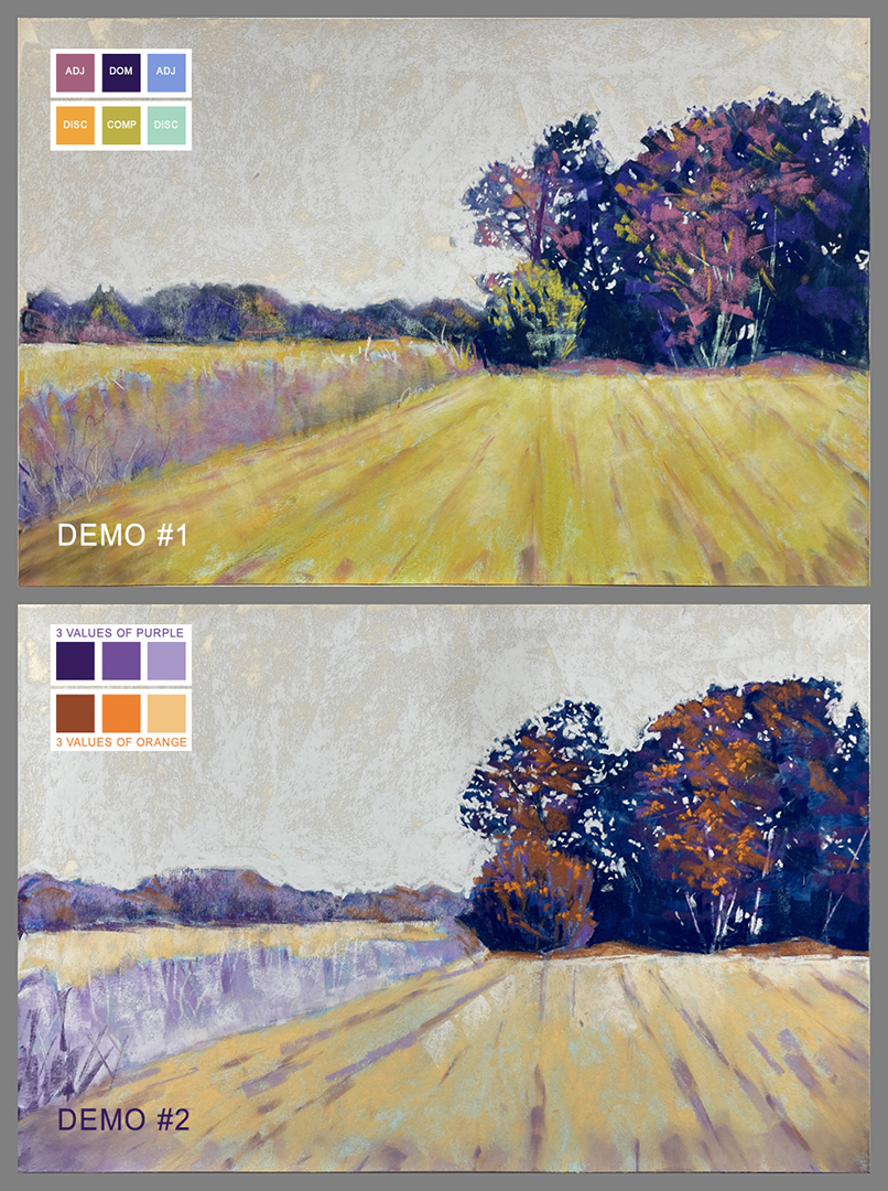
For my first one, I used an Analogous Colour Wheel but using a regular colour wheel also works.
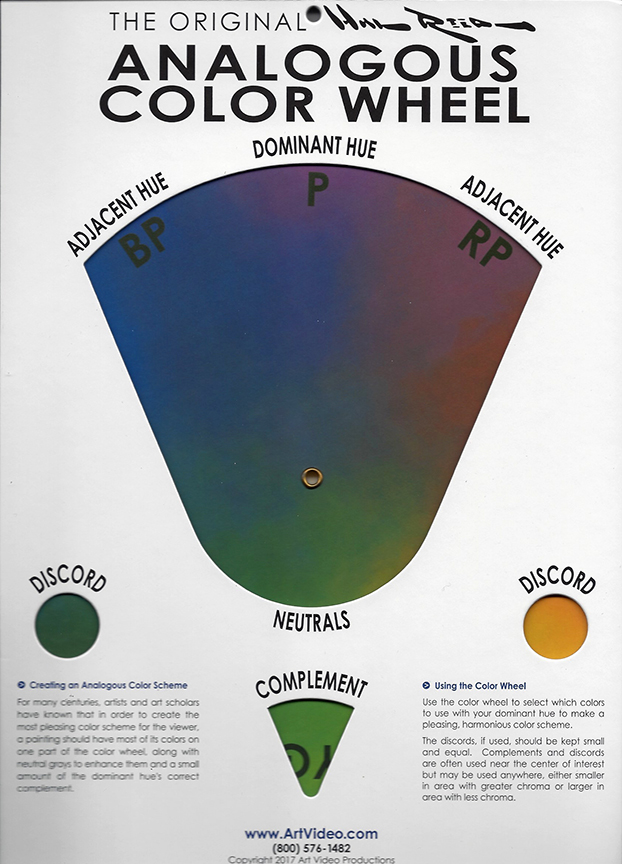
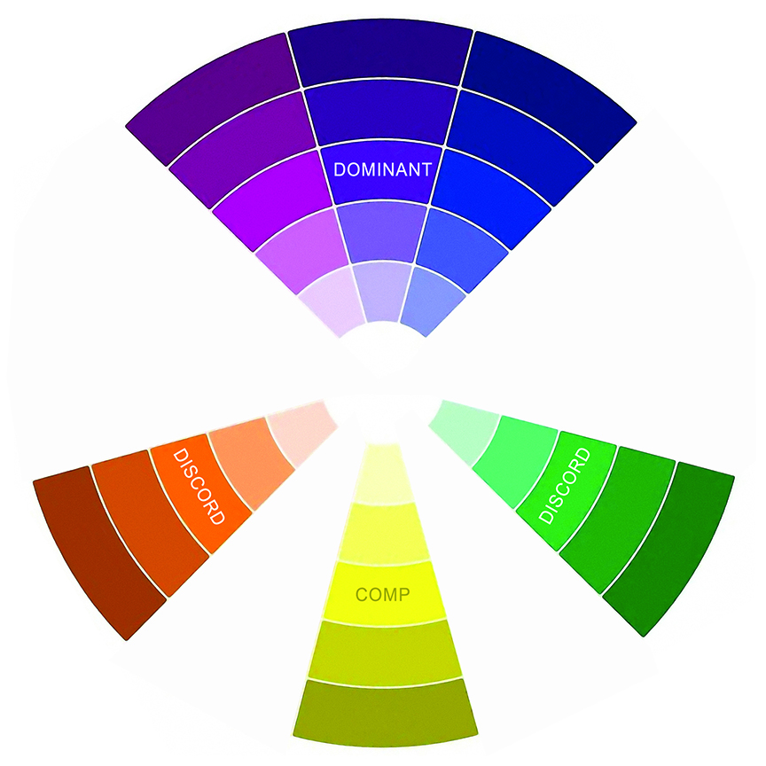
In the first demo, I chose a colour set of six similar to one of Claude Monet’s paintings of Water Lilies: violet (dominant colour), red-violet and blue-violet (two adjacent colours), one complementary colour, and two discord colours.
For the second demo, I chose three values each of violet and orange.
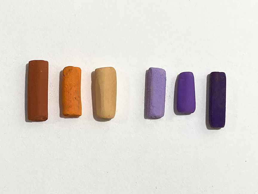
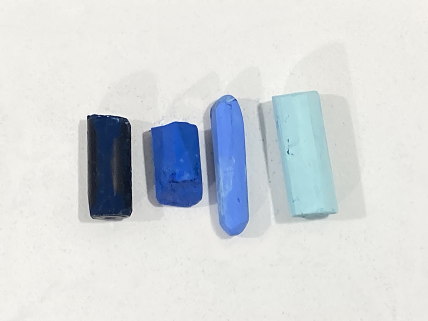
In both cases, I used four values of blue pastels with an alcohol wash for the underpaintings.
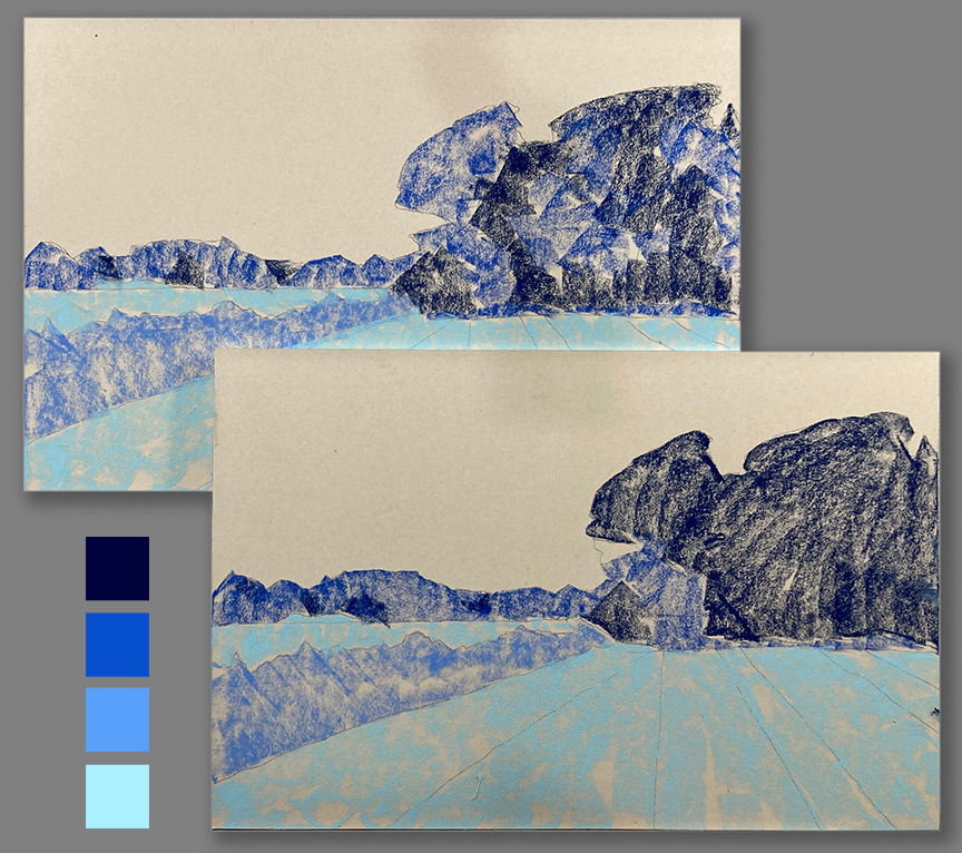
And here are the two final results.
If you feel stuck doing green leaves, brown bark, and blue skies, your colour wheel should become your next best colour friend.
~~~~
Thank you, Clarence! Such great advice. I particularly liked how you chose colours from Monet’s painting. Funnily enough, we are speaking about playing with colour in my IGNITE! Membership this month. Colour – it’s an ongoing topic, always so much to learn about it!
________________________________________________________________________
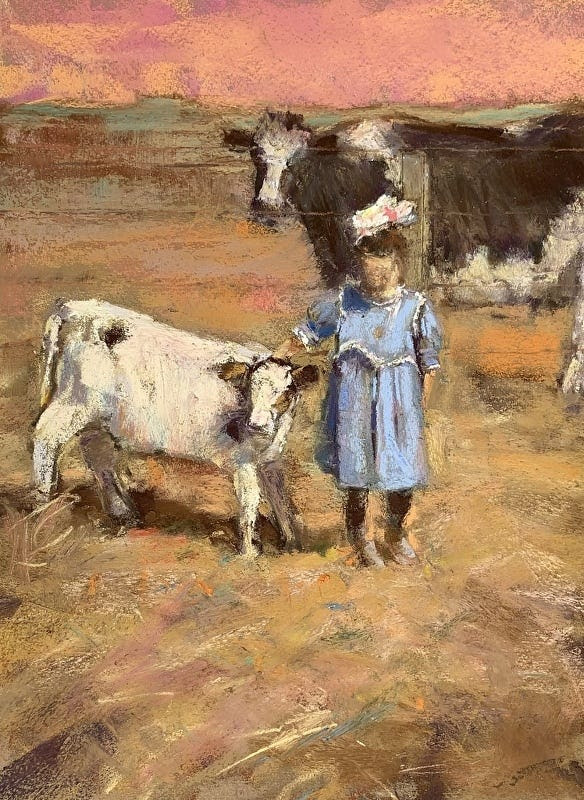
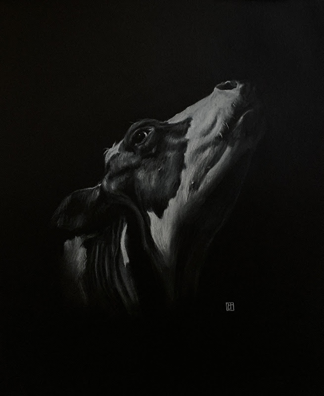
Two cows are the subjects of two outstanding awards
I smiled when I saw that the two outstanding awards for pastels in the BoldBrush November 2022 contest had gone to paintings that included cows.
There’s this one by Anne Gee…
And this one by Lena Noble…
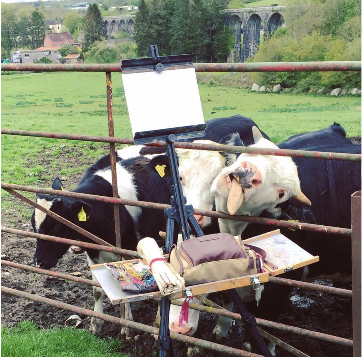
Speaking of cows, if you want to have a chuckle, go check out these artist encounters with cows and other animals!!
Here’s a teaser:
And that’s it for this time!
Gail

