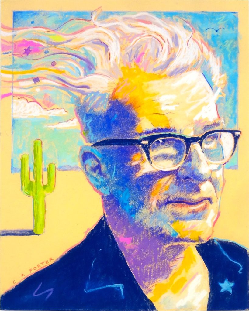
It’s Friday so you know what that means – it’s time to put the question to another Advisory Board member. It’s also Canada Day (1st July) so it’s fitting that we have Canadian artist Clarence Porter in our hot seat!
What question you may be asking. Well, it’s this:
What pastel stick (colour and brand) can you not do without?
(So far, we’ve had answers from Albert Handell and Nancie King Mertz. Keep a look out each Friday as more Board members answer the question!)
Right, let’s get to Clarence Porter’s answer!
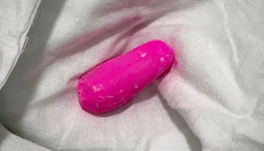
“Anyone who has seen my work knows there’s always a squiggle, a dash, or a partial outline of hot pink somewhere in my painting. That colour is a Diane Townsend Soft Form No.804.”
Oooooooo, let’s get more background on why Clarence Porter uses this hot pink pastel. I know there’s a story there somewhere! I mean to say…why make those marks at all?
“Years ago, when I worked with coloured pencils, my favourite pencil for adding my squiggles was a blue Prismacolor, No. 919. But the idea of adding my nonsensical marks was born out of a conversation quite a long while ago.
In my beginning days as a commercial Illustrator, Terry Steadham was a mentor, and I loved his illustrations. He always included geometric shapes and lines in his artwork, regardless of the subject matter. I always thought there was some deep hidden meaning to his marks that I did not understand. One day, I finally asked him why he put them in. He smiled and said, “because I can.” That is when I understood that art was not simply a reproduction process but a creation process. I now had greater latitude.
My hot pink squiggles are a continuation of my illustration days, carried forward to working with pastels. When I started with pastels, I heard about several pastel artists who like using purple as their background colour, so I thought working with a pink background would be interesting. I began covering masonite with a pink-tinted pastel ground, and then I would do my value under-painting over top of the pink, allowing the pink to show through.
In my first pastel sets, one of the colours spoke to me. It became the accent colour from then on: the Diane Townsend (DT) No.804. It went perfectly with the pink theme.
I’m still using pink as my base colour, and because I only use it sparingly, I’m still using the same DT pastel stick. It has been 12 happy, squiggly pink years.”
So cool. Or should I say hot?!
A big thanks to Clarence for letting us inside his signature squiggle process!
I don’t know about you but I’m eager to get squiggling on my next piece. What about you? Let us know by leaving a comment on the blog.
And that’s it for this time!
Gail
PS. I loooove hot pink!
_______________________________________________________________________
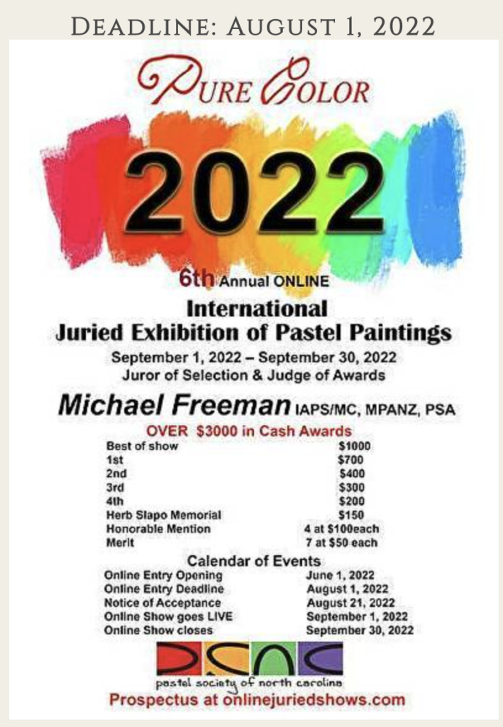
Pastel Society of North Carolina – Call for Entry!
Alert Alert! The PSNC has an open call for entry. You have until 1st August to get your image(s) in! The juror is Michael Freeman, an incredible photorealist artist from New Zealand.
Click here to get the full scoop and enter!
