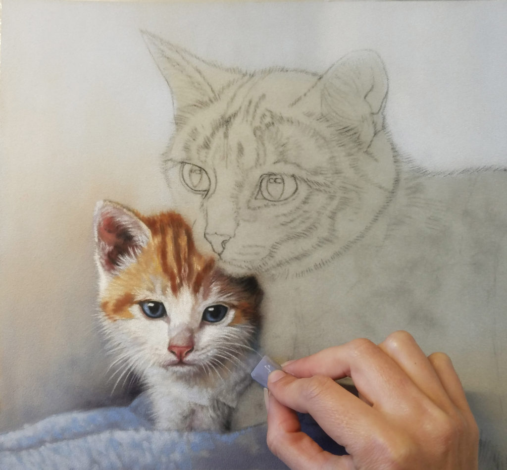
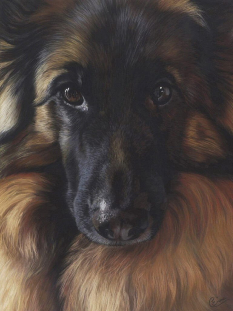
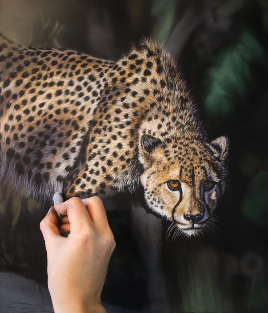
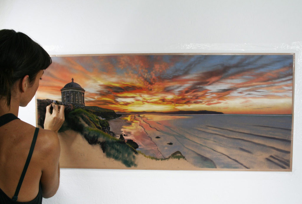
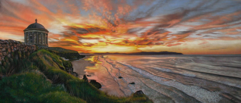
It’s Friday!!! Time to put our one question to another Advisory Board member. Today we have Emma Colbert who’s known for her paintings of animals both our home companions and those in the wild.
Right, here’s the question:
What pastel stick (colour and brand) can you not do without?
We’ve heard answers from Albert Handell, Nancie King Mertz, Clarence Porter, and Michele Ashby. I wonder what pastel Emma will choose?!
The answer?
– Unison Colour Grey 8 –
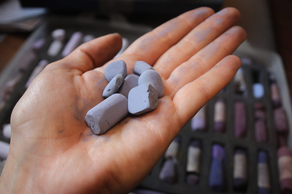
“I have many favourite colours that I return to again and again, but this one is my go-to shadow colour. Whether it’s within the fur of an animal or the dark shadow on a windowsill, Grey 8 is my favourite shadow tone. There are times I use it as a highlight on dark subjects like a black dog, or as the darkest value on a white subject. It’s rich and dusky but not as dull as a monochrome grey. I see it everywhere in the real world and always announce to my partner, there’s Grey 8 again!”
Ooooooh, tell us more Emma!
I asked Emma how long it had taken her to hone her choice to this one colour and brand.
“About 10 years ago I started to really work on my colour choices and a distinctive palette after investing in good quality pastels and giving myself a much bigger range of mid-tones. My aim was to stop using so much monochrome grey to create shadows and this colour quickly became a favourite.
Over the next couple of years, Grey 8 and a selection of other colours kept popping up in my paintings and when Unison Colour asked me to design a colour palette for painting animals, these colours were what I considered first. Grey 8 appears in so many different subject matters for me that it is one of the colours in the animal set that I would recommend for any artist’s palette.”
I followed this up by asking Emma: Did you have another favourite pastel before Grey 8?
“I now have many favourites other than Grey 8 but before I started to collect better quality pastels I was very limited in my colour choices. My work looked a bit monochromatic because I would use black and grey to darken colours. My main issue was creating light and shade. Grey 8 was a subtle stepping stone for me to step further into more vibrant hues and away from dull monochrome. I think this colour was a big turning point for me as before this I just did not see those extra colours in the shadows!”
I was curious if Emma has been surprised about how much she uses this colour.
“Because I film my work I get to look back at exactly what colours I use and when. Grey 8 has been a popular choice for many years and I can see it in a lot of my paintings. But it’s so versatile so it does not surprise me. There are now other similar colours like Unison Colour BV15 that I will use when I want a slight bit more hue and I love to make use of all my lovely colours.”
Finally, I asked Emma if she had a story to tell about Grey 8.
“You’ll notice in my photo of the pastel itself that it’s in tiny pieces. I never seem able to keep a full stick of Grey 8. I use it a lot and never seem to run out of it, but I never have a full stick. It’s a mystery!”
That made me smile 😊!
What are your thoughts on Emma’s Fav stick? Were you surprised? Let us know by leaving a comment on the blog.
___________________________________________________________________
The Silver Bowl That Begged To Be Painted!
Suzanne Godbout, a faculty member in this year’s August Pastel Live Online Event, loves painting metal with all its reflective qualities.
This painting caught my eye and I asked Suzanne to tell us something about it.
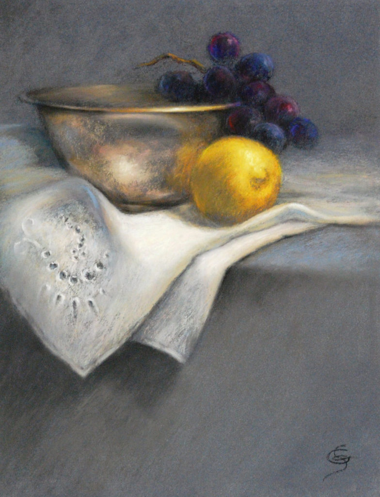
“It started out with the silver bowl on my shelves, staring at me, and the old family ‘serviette’ lying around, needing some use. Or was that all in my head? Regardless, I went ahead!
The composition is a strong element in this painting. The use of basic shapes – the rectangle brings stability, the triangle brings movement and the circle brings fantasy. The eye follows the diagonal leading to the lemon, and then the strong contrast with the grape stem leads us to the bowl, which in turn leads us to the cloth and its delicate detail. And the path works in the other direction too.
I chose Sennelier LaCarte paper because of the texture needed for the old silver bowl. It helps to create the subtle colours of the patina and oxidation. When applying colour very lightly, the underlayers are all visible – if you want that!
The blue-grey colour of the paper unifies the whole and showcases the colour scheme. Extra soft edges bring depth to the setting and keep us in the picture. This small still life just painted itself!”
Thanks so much, Suzanne! I can’t wait to see your demonstration at Pastel Live!!
Want to know more about Pastel Live and the 30 artists participating?! Then have a look here.
And that’s all for this time!
Gail
